Flexbox — the layout engine
The Flexbox is the Theme Builder's layout primitive: a self‑contained, nestable flex container that renders the exact semantic HTML tag you choose and lays its children out with CSS flexbox — nothing more. It's how you build header bars, footer columns, and body sections without reaching for the Section → Row → Column grid when all you wanted was "put these things in a row."
It lives on the Structure tab of the part editors and is exposed as one tile per HTML tag, so dropping it is also choosing its tag.
The Flexbox is intentionally available only inside the Theme Builder part editors (Header / Body / Footer presets). On normal Pages and Posts you build with Sections, Rows, and Columns — the Flexbox is the layout tool for chrome and templates, not page content. (Front‑end rendering of an existing flexbox is never affected; only the editor palette is scoped.)
Why a Flexbox, and not just columns
The Section/Row/Column grid is a 12‑column responsive system — perfect for page content, but heavy for chrome. A two‑item top bar (logo left, menu right) in the grid means a Section, a Row, two Columns, and the wrapper markup all of those emit. The Flexbox collapses that to a single element:
<nav class="fw-flexbox flex-row">
  …logo…
  …menu…
</nav>
That is the whole point — a clean, semantic DOM. You pick nav, you get a <nav>. You pick
footer, you get a <footer>. No div.row > div.col-md-6 scaffolding, no stray utility classes.
Choosing the tag
When you drop a Flexbox you pick its HTML Tag from the Structure palette tiles. The container is rendered with that tag verbatim:
| Tag | Typical use |
|---|---|
div | A generic grouping box (the default) |
header | The site header region |
nav | A navigation bar / menu row |
main | The main content region of a body |
article | A self‑contained block (a card, a post) |
aside | A sidebar / secondary column |
footer | The site footer region |
The tag is fixed by the tile you drop — there's no separate tag dropdown in the options (each
tag is its own palette tile, so choosing the tile is choosing the tag). In the canvas the box is
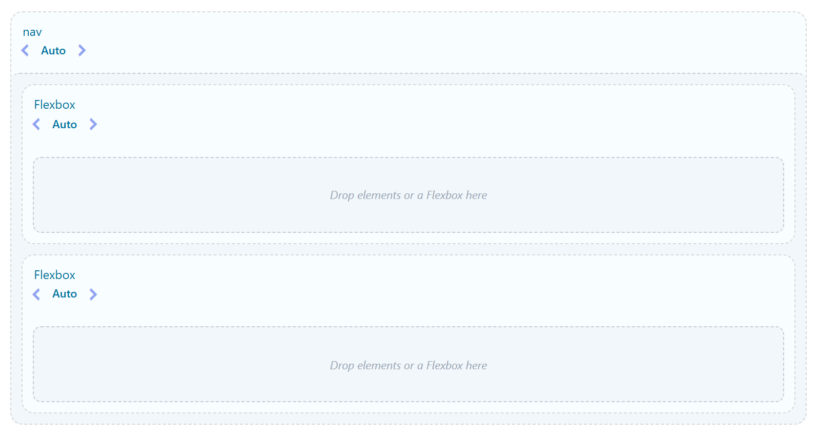
labeled by its tag (a nav box reads "nav", a div reads "div"), so the structure you're
building is legible at a glance.
The options
A Flexbox exposes the CSS‑flexbox model directly, in plain controls.
Direction
| Value | Effect |
|---|---|
| Row (default) | Children sit side by side, inline. |
| Column | Children stack vertically. |
Direction is the single most important switch: it decides whether the main axis is horizontal (Row) or vertical (Column), which in turn decides what Justify and Align do.
Justify (main axis)
How children are distributed along the main axis (horizontally in a Row, vertically in a Column). This is the control you use for "logo left, menu right":
| Value | Result in a Row |
|---|---|
| Start (default) | Packed to the left |
| Center | Packed in the center |
| End | Packed to the right |
| Space between | First item to the left edge, last to the right edge, gaps shared between |
| Space around | Equal space on both sides of every item (edge gaps are half the inner gaps) |
| Space evenly | Equal space everywhere, including the edges |
Align (cross axis)
How children line up across the main axis (vertically in a Row, horizontally in a Column): Start, Center, End, Stretch (default — equal heights), or Baseline.
Width (per child)
A Flexbox child is content‑sized by default in a Row — it shrinks to fit its content and sits inline. To make a child take a share of the row, give that child (when it's itself a Flexbox) a Width:
| Width | Renders as |
|---|---|
| Auto | Full width — the child spans the row (and wraps to its own line). The default for a nested flexbox. |
| 1/12 … 1/1 | A twelfths fraction (1/2 = 50%, 1/3 = 33%, 3/4 = 75%, … up to 1/1 = full). |
| Custom | An exact value you type (e.g. 240px, 30%). |
The Width control is a compact popover of fraction tiles and is itself per‑device — set a different width on the Phone / Tablet / Desktop tabs (see Responsive).
Plain elements vs. nested flexboxes. A content element (text, button, image) in a Row is always content‑sized and inline. The Width control applies to a nested flexbox container — that's how you build "a 1/3 sidebar next to a 2/3 main", with each side being its own flexbox.
Gap, spacing, and classes
- Gap — the space between children (main and cross axis, or set them independently).
- CSS Class / CSS ID (Advanced tab) — land a class on the container itself, the clean way to attach your own styling. (Per the framework's clean‑DOM rule, prefer this over classes buried in WYSIWYG content.)
Responsive (per breakpoint)
Every layout control is per‑device. Each one carries a small Phone / Tablet / Desktop switcher (the device icons that appear when you hover the option); pick a device tab, then set the value for that breakpoint. It's mobile‑first:
| Tab | Applies at |
|---|---|
| Phone (base) | all widths |
| Tablet | ≥ 768px |
| Desktop | ≥ 992px |
Phone is the base and applies everywhere; Tablet overrides from 768px up, Desktop from 992px up, and a device you leave blank inherits the smaller one. So the classic responsive header — a Row on desktop that becomes a Column on phones — is just Direction = Column on the Phone tab and Row on the Desktop tab. The same per‑device switcher is on Direction, Reverse, Wrap, Gap, Justify, Align items, Align content, Width, Align‑self, Order, Grow to Fill, and Min height — every layout control.
Under the hood each device value becomes a mobile‑first utility class (flex-lg-row,
justify-content-md-center, sc-cgap-md-3, fw-col-lg-6, …); the few values that can't be a class
(a Custom width, a per‑device Min height) emit a tiny scoped stylesheet keyed to the flexbox, so
there's still no custom CSS to write. See the responsive option
type for the full per‑device model, the stored value shape,
and the exact class output.
The layout options are grouped by role: Container (Direction, Gap, Justify, Align items, Wrap, Reverse, Align content — how this box arranges its children) and Placement (Width, Grow to Fill, Align‑self, Order — how this box sits inside a parent flexbox). So a single child can pull to the end (Align‑self) or reorder (Order) per device without touching the markup.
How children behave (the standard model)
The Flexbox follows standard CSS flexbox, with no surprises:
- In a Row, children sit inline and are content‑sized; Justify distributes them and any leftover space; give a nested‑flexbox child a Width to size it.
- In a Column, children stack and span the cross axis.
- Long content shrinks rather than overflowing (
min-width: 0is applied so a child can shrink below its intrinsic width and wrap).
<!-- Row · Justify: space-between -->
<nav class="fw-flexbox flex-row">
  <a class="brand">Auralis</a>          <!-- content-sized, pinned left  -->
  <ul class="menu">…</ul>               <!-- content-sized, centered gap  -->
  <a class="btn">Get Started</a>        <!-- content-sized, pinned right  -->
</nav>
Nesting
Flexboxes nest arbitrarily deep — a header flexbox containing a nav flexbox containing two
div flexboxes is normal and encouraged. This is how real chrome is structured (a top bar with a
left group and a right group, each with its own children). Each level is its own container with its
own Direction / Justify / Align / Width, so you compose complex layouts from simple, legible boxes.
In the canvas
The editor canvas mirrors what the front end will render so you can build confidently:
- Each box is labeled by its HTML tag.
- A width stepper (
‹ Auto ›) on a nested flexbox lets you step its Width without opening the modal. - Setting Direction: Row lays the children out side by side in the canvas; Column stacks them.
- Justify is previewed — set Space between and the children spread to the edges, exactly as they will on the front end.
- A nested flexbox set to Auto width fills the row (full width); give it a twelfths width and it sizes to that share.
Front‑end markup
On the front end a Flexbox renders as your chosen tag with a small, predictable class set:
<header class="fw-flexbox flex-row …your css class…">
  …children…
</header>
.fw-flexbox carries the flex container; flex-row / flex-column carry the direction; the
justify/align/gap choices are applied from there. Children that you gave a twelfths Width carry the
grid's column class. That's the whole footprint — no extra wrappers.
See also
- Headers & Footers — where you'll use the Flexbox most
- Body Templates — laying out a full‑page body
- Dynamic Content — the elements you place inside a flexbox