Page Builder
The Page Builder lets you compose pages visually from shortcodes (called elements in the UI), using drag & drop — no code required.
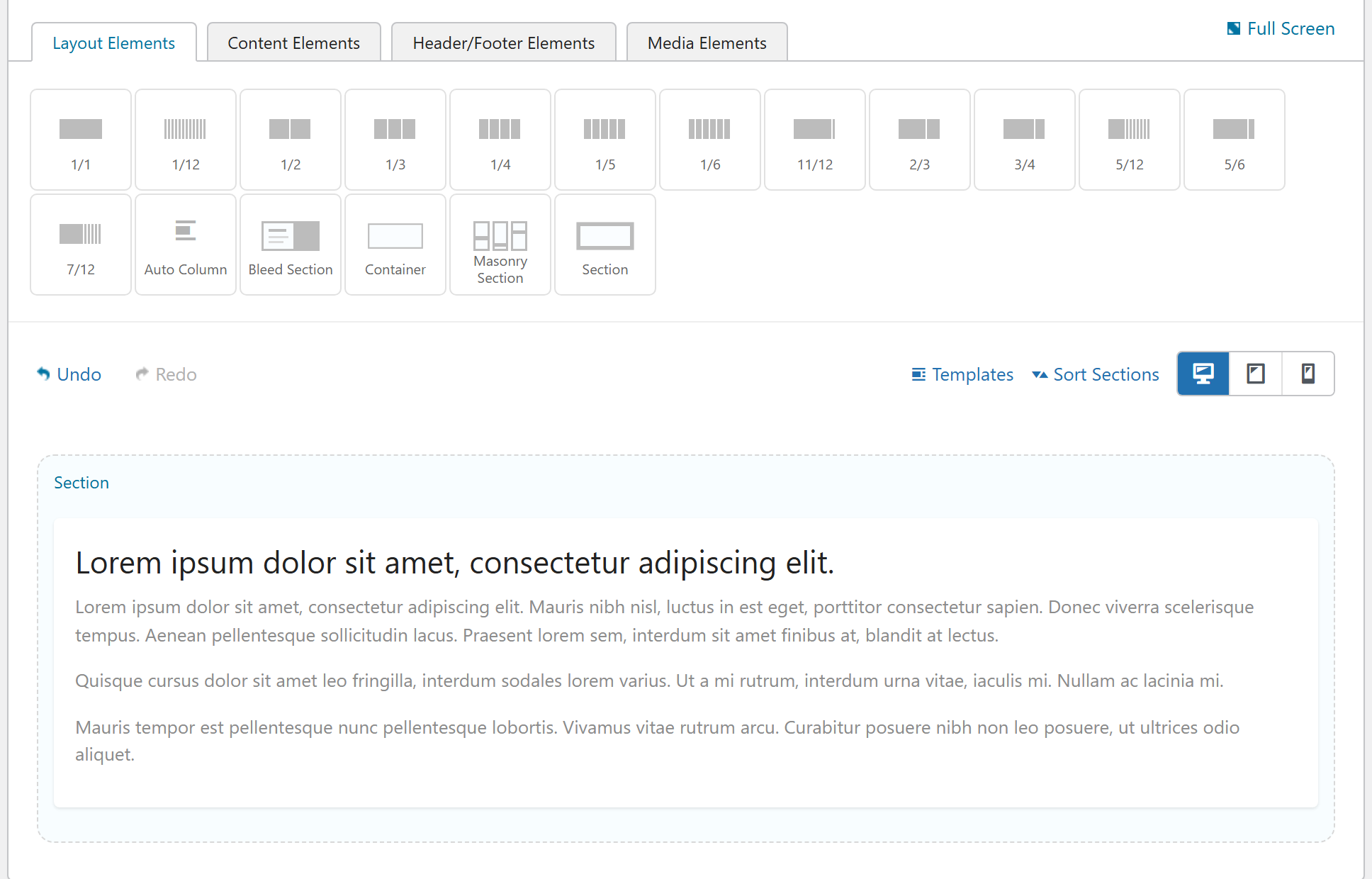
This page is the practical "how to use it" entry point. If you want to understand what the builder does under the hood — the stored JSON, how loose elements become a valid grid, how the front end renders, and the value-shape traps to avoid when you extend it — read the deep-dive pages linked at the bottom.
Enabling the builder
The Page Builder ships as the Page Builder extension (it lives inside the Shortcodes extension). Activate Shortcodes and Page Builder from Unyson+ → Extensions, then edit any page and switch the editor to the builder with the Unyson Builder button above the content area.
Basic workflow
- Open a page in the editor and click Unyson Builder.
- Drag an element from the palette — a Section, Column, or any content element — onto the canvas.
- Configure it through its options panel (the modal that opens when you click the element).
- Save / Update — the layout renders on the front end.
You don't have to build the full Section → Column → element nesting by hand: drop a content element straight onto the canvas and the builder wraps it in a column, a row, and a section for you when the page renders. That wrapping is done by the items corrector.
The element palette
Elements are grouped into tabs in a deliberate order — Layout, Content, Media,
Interactive, Components, Header/Footer — rather than alphabetically (see
FW_Option_Type_Page_Builder::sort_thumbnails_helper()). Every element has its own reference
page under Shortcodes / Elements.
Reusable content
The Snippets extension lets you save builder layouts and reuse them anywhere — as an
embeddable block ([snippet id="123"]) or as a global Section / Column template. See
Snippets and Global Templates.
Editing modes
- Desktop / Tablet / Phone preview toggle re-previews the canvas at each breakpoint so responsive column widths, offsets and masonry counts are visible while you edit.
- Bootstrap 3 Legacy Mode (Page Builder settings) changes how columns wrap — see Column widths & the grid.
Going deeper
- How the Page Builder works — the full data flow from a builder edit to rendered HTML.
- The builder JSON tree format — how a section / row / column / element is stored.
- The items corrector & editor-load gotcha — when
get_value_from_attributes()runs (and when it does not). - Migrating an option's value shape — the JS-side migration pattern that keeps old pages from breaking.
- Column widths & the grid — twelfths, the single
1_5fifth, and flex vs legacy wrapping. - The clean-DOM philosophy — why UnysonPlus output stays un-bloated.
See also
- Extensions overview
- Option types — the building blocks of every element's options