Column widths & the grid
A page-builder column stores its width as a top-level width key on the column item (sibling
to type/atts/_items), using an N_M fraction string with an underscore — "1_2",
"1_3", "2_3", "3_4" — not a slash. This page covers which widths are valid, the single
fifth-width special case, and how columns wrap (which differs between the default flex mode and
legacy mode).
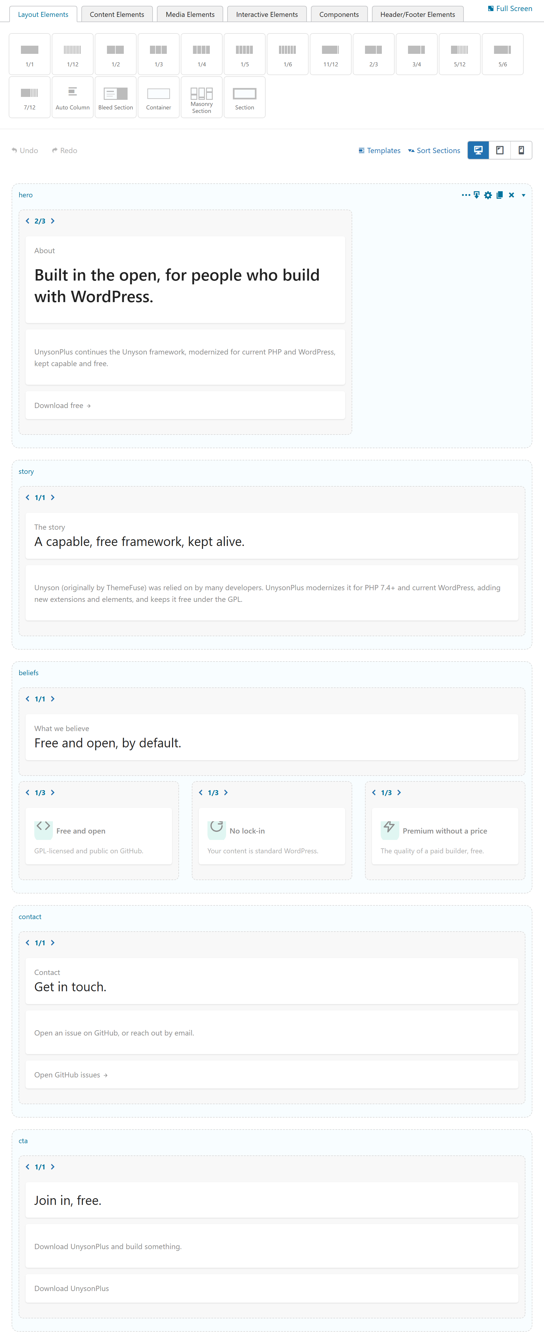
The Layout Elements palette offers the widths as ready-made column thumbnails (1/1, 1/2,
1/3, …); the "beliefs" band below is a real three-column (1_3) row on the canvas.
Valid widths
Widths are the usual twelfths, plus one fifth:
| Width key | Fraction | Notes |
|---|---|---|
1_1 | 1/1 (100%) | full width |
1_2 | 1/2 | |
1_3, 2_3 | thirds | |
1_4, 3_4 | quarters | |
1_6, 5_6 | sixths | |
5_12, 7_12 | twelfths | |
1_5 | 1/5 (20%) | the only supported fifth |
1_5 existsThere is no 2_5 / 3_5 / 4_5 — those are not valid widths; don't emit them. A 1_5 column
renders as fw-col-12 fw-col-sm-15 (the grid's fifth class = 20%), so five 1_5 columns
make a clean 5-across row with no CSS hacks. Don't use width:"auto" to fake equal columns — an
unrecognized width makes the corrector drop the column wrapper entirely.
Auto-flex (col) columns
A non-fraction width key — notably col, the Bootstrap 5 auto-flex column, or any custom key
without an N_M shape — contributes zero to the row's fill accumulator
(extract_fraction_from_column_width() returns 0/1). Auto-flex columns squeeze into whatever
space is left and always "fit", so they never force a wrap.
How columns wrap
The items corrector groups consecutive columns into rows using a virtual
_Page_Builder_Items_Corrector_Row_Container that accumulates each column's fraction. Whether
it actually splits depends on a setting, decided in column_fits():
Default — Bootstrap 5 flex mode (recommended)
With Bootstrap 3 Legacy Mode unchecked (the default), column_fits() returns true for
every column, so no auto-split happens: all of a section's columns stay in one .fw-row and
CSS flex-wrap handles the visual wrapping. This is what lets Theme Settings → Default Gap Y
apply spacing between wrapped sub-rows. The editor loads flex-canvas.css / flex-canvas.js in
this mode so the canvas matches the flex front end (equal-height columns, clean wrap).
Legacy — Bootstrap 3 mode
With Bootstrap 3 Legacy Mode checked, the corrector uses the original fraction math: it adds
each column's fraction to the row accumulator and starts a new .fw-row once the total would
exceed 1 (12/12). This loads bootstrap-3-legacy.css and reproduces the pre-migration Unyson
behavior — both pieces go together, so older content keeps its layout.
// _Page_Builder_Items_Corrector_Row_Container::column_fits()  (simplified)
if ( legacy_mode_OFF ) {
    return true;             // BS5 flex: never auto-split, flex-wrap handles it
}
$column_as_fraction->add( $this->accumulator );
return $column_as_fraction->to_number() <= 1;   // BS3: split when a row overflows 12/12
A developer-only static config flag disable_columns_auto_wrap (set by a theme) also forces
true, for back-compat.
Per-device widths
Columns also carry responsive overrides mirroring the base width: w_phone / w_tablet /
w_desktop (defaulting to "default"), plus offset_phone / offset_tablet / offset_desktop
and alignment keys (align_self, content_v, content_h). The Desktop / Tablet / Phone
preview toggle in the editor re-previews the canvas at each breakpoint so these are visible while
you edit.