Avatar
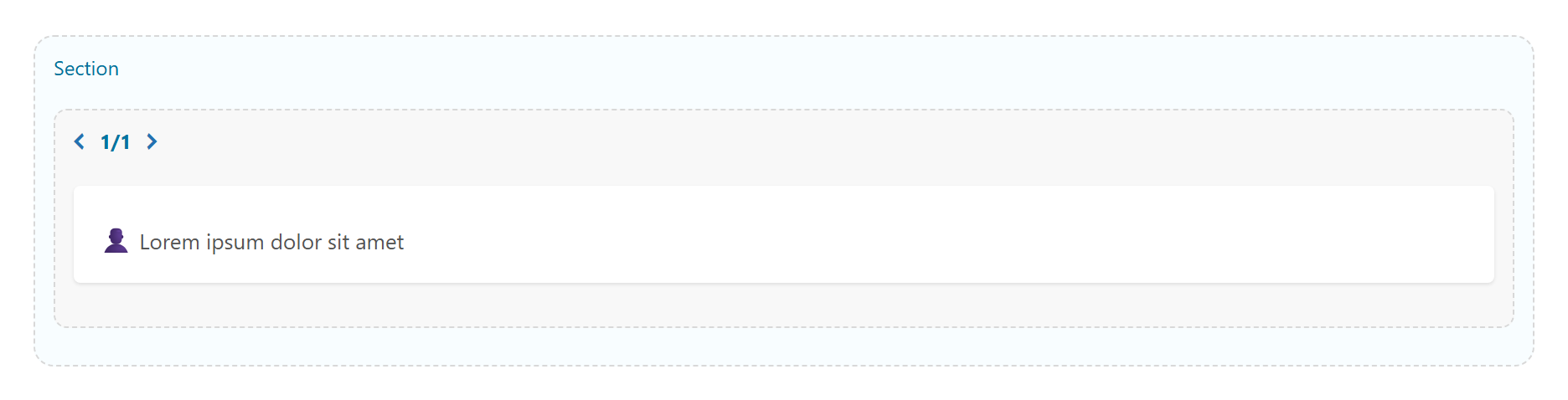
A user avatar — single, or an overlapping group with a "+N" counter. Each face is an image (server-side cropped, retina-ready) or an initials fallback, with optional status dots, shapes and a px size. Tabs: Content, Design, Style, Animations, Advanced.
Content
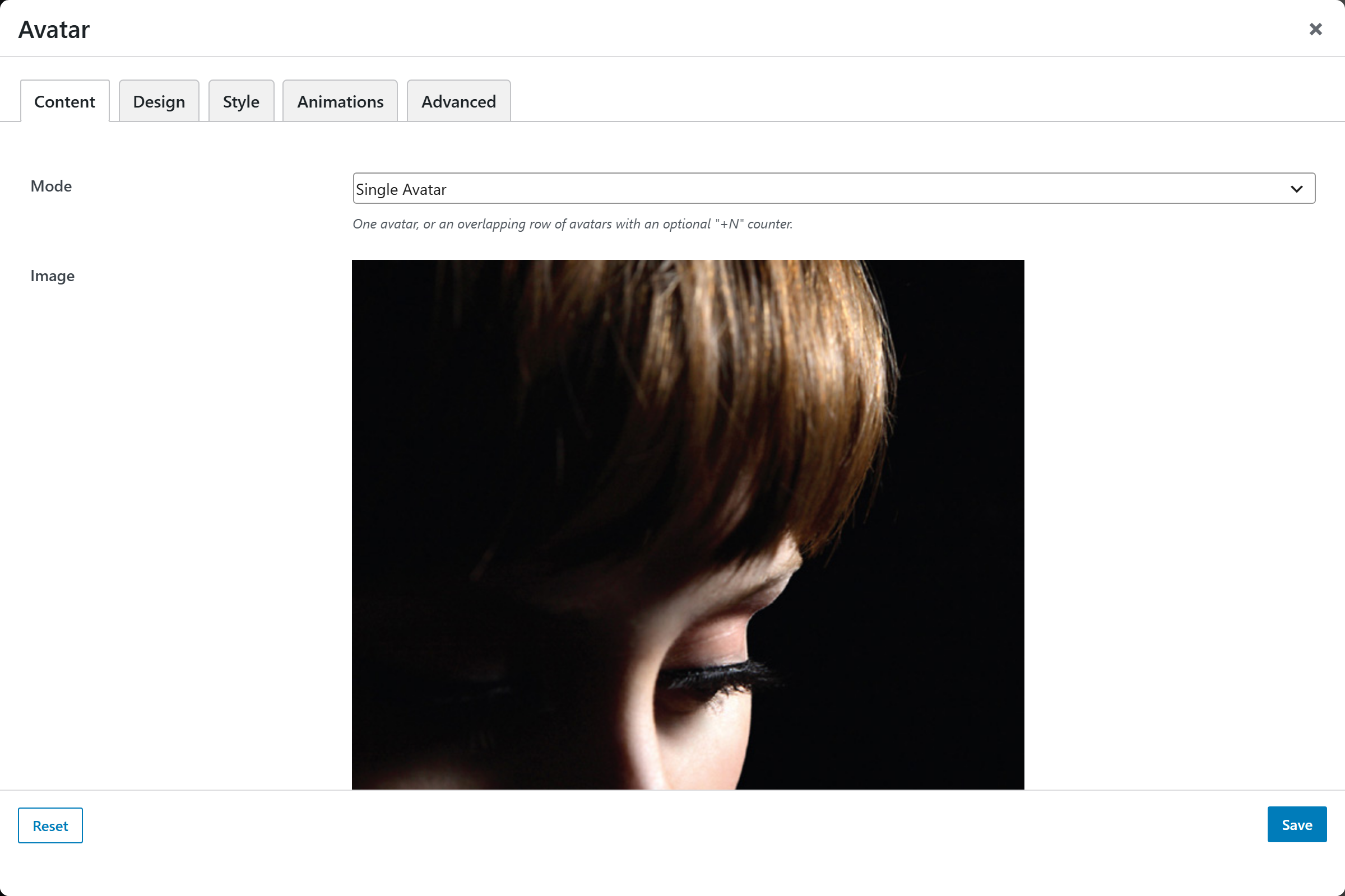
The Content tab is driven by a Mode multi-picker that reveals the fields for the chosen mode.
- Mode —
Single Avatar(default) orAvatar Group (stacked)— one avatar, or an overlapping row of avatars with an optional "+N" counter.
Single mode
- Image — upload or choose an avatar image; leave empty to fall back to initials. Library images are cropped server-side to a sharp square at the chosen size.
- Name — used for the alt text, tooltip, optional label, and to derive initials.
- Initials (override) — leave empty to auto-derive from the Name (e.g. "Jane Lee" → "JL"). Only shown when there's no image; keep it 1–2 characters.
- Subtitle / Role — optional second line, shown beside the avatar when Show Label is on.
- Link — optional URL to wrap the avatar in; blank for a non-clickable avatar.
- Open Link in New Tab — Yes (
_blank) / No (_self, default). - Status Dot — presence indicator at the corner: None (default), Online, Away, Busy / Do not disturb, Offline.
Group mode
- People — a repeatable list; each entry is one avatar in the stack. Per-person fields:
- Image — avatar image; empty shows initials.
- Name — alt text + tooltip, and the source for initials.
- Initials (override) — leave empty to auto-derive from the Name.
- Link — optional URL for this person.
- Status Dot — None / Online / Away / Busy / Offline.
- Max Visible — how many avatars to show before collapsing the rest into a "+N" counter;
0or empty shows all. Default5. - Extra Count Label — optional manual counter, e.g. "2K+" for social proof; overrides the auto "+N" of hidden avatars.
- Overlap — slider 0–80, how much each avatar overlaps the previous one as a percentage of its width. Default
35. - Stacking Order —
First on top(default) orLast on top— which avatar overlaps the others where they meet.
Design
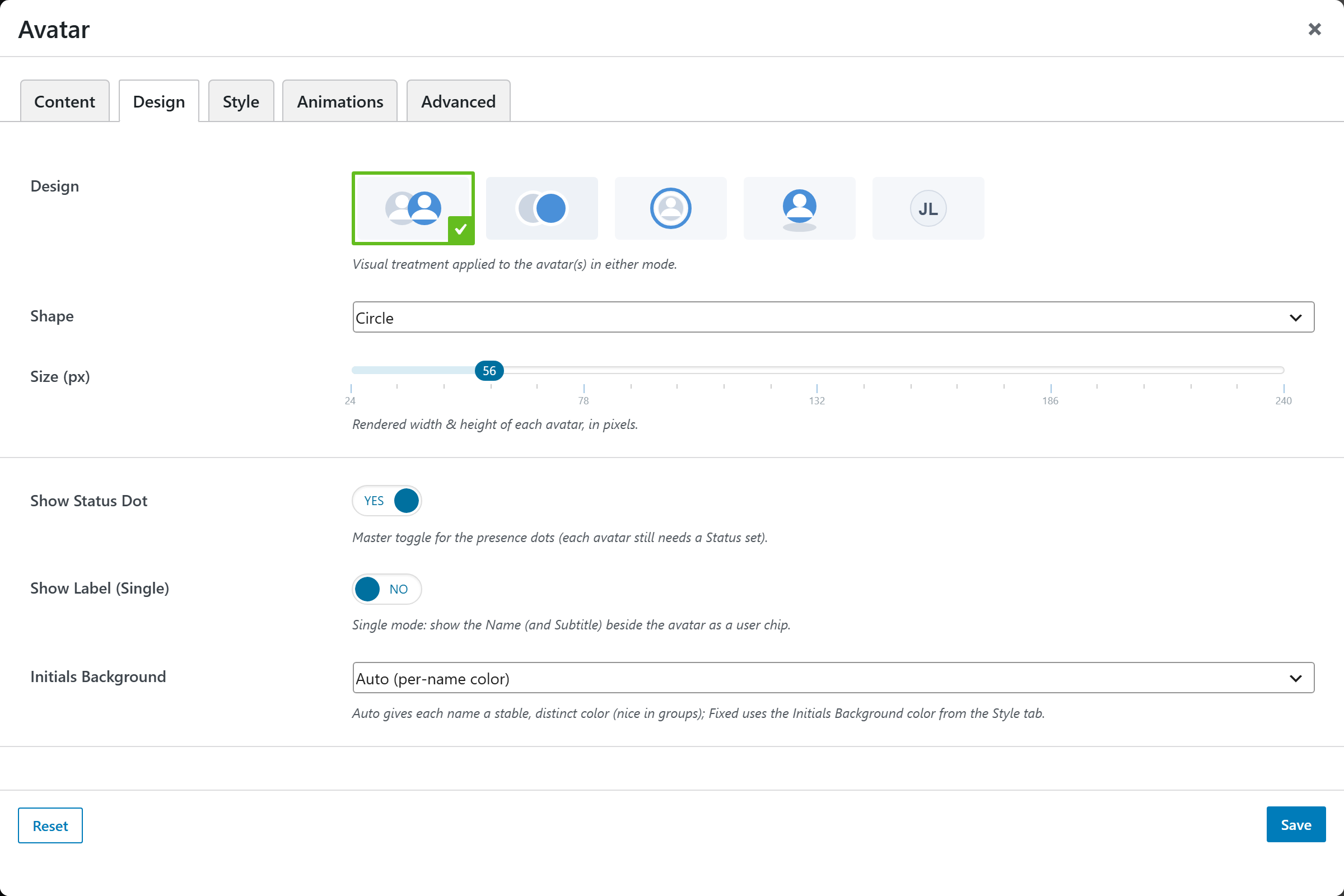
- Design — visual treatment applied in either mode: Plain (default), Bordered, Ring, Shadow, Soft. Bordered/Ring are especially useful in Group mode — the gap separates overlapping avatars cleanly.
- Shape — Circle (default), Rounded, Square.
- Size (px) — slider 24–240 (step 2), the rendered width & height of each avatar. Default
56. - Show Status Dot — Yes (default) / No — master toggle for the presence dots; each avatar still needs a Status set.
- Show Label (Single) — Yes / No (default) — in single mode, show the Name (and Subtitle) beside the avatar as a user chip.
- Initials Background —
Auto (per-name color)(default) gives each name a stable, distinct color;Fixed (from Style tab)uses the Initials Background color below.
Style
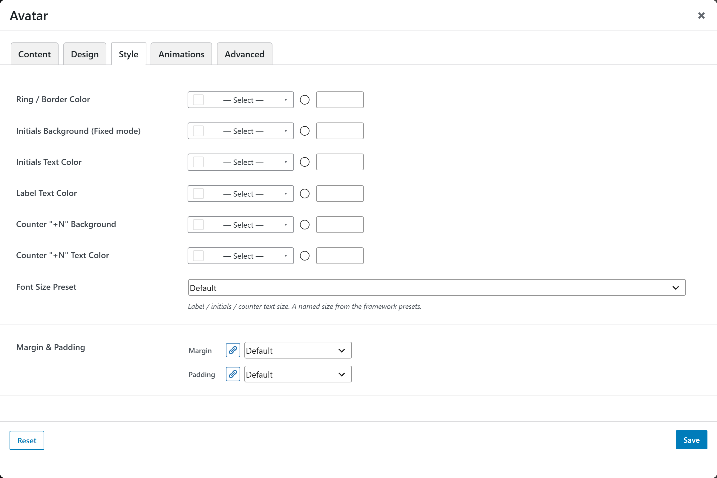
- Ring / Border Color — color of the ring/border.
- Initials Background (Fixed mode) — used when Initials Background is set to Fixed.
- Initials Text Color — color of the initials glyphs.
- Label Text Color — color of the single-mode label chip text.
- Counter "+N" Background — background of the group counter chip.
- Counter "+N" Text Color — text color of the group counter chip.
- Font Size Preset — named size for the label / initials / counter text.
- Margin & Padding — spacing around the element.
Animations
Standard entrance-animation controls (effect, duration, delay, offset).
Advanced
Custom CSS class/ID, responsive visibility toggles, custom attributes, and margin/padding.