Button
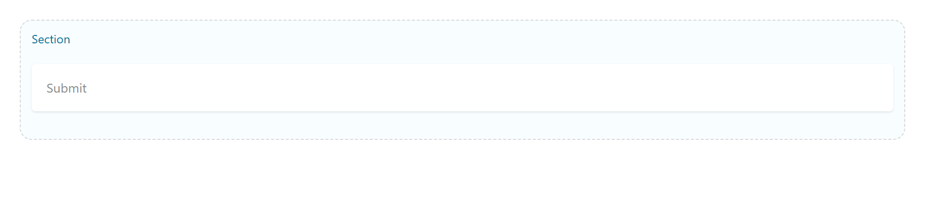
A styled, linkable button. Tabs: Content, Styling, Animations, Advanced.
Content
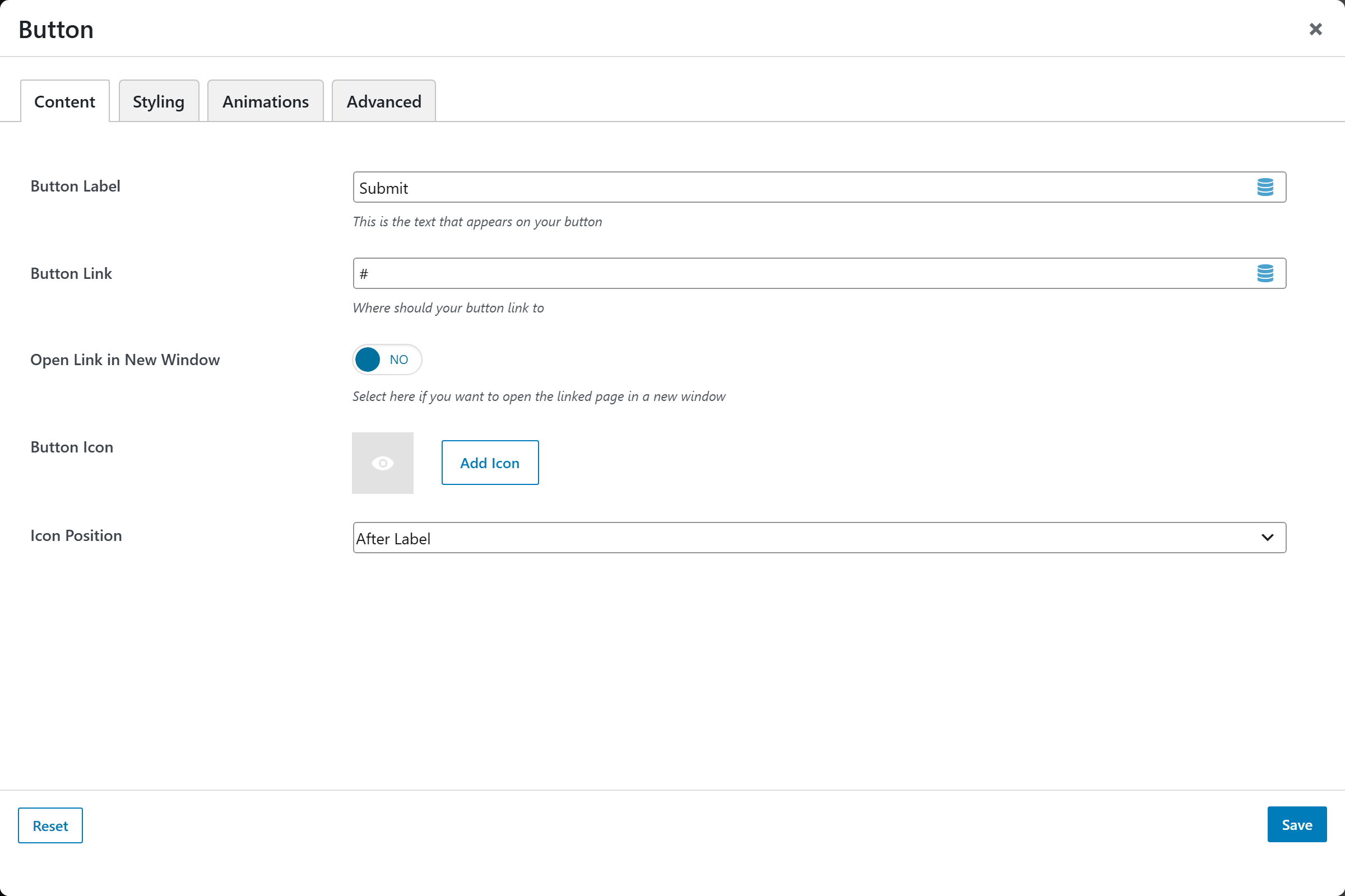
| Option | Notes |
|---|---|
| Button Label | The text shown on the button |
| Button Link | Destination URL |
| Open Link in New Window | On/Off |
| Button Icon | Optional icon |
| Icon Position | Before Label, After Label |
Styling
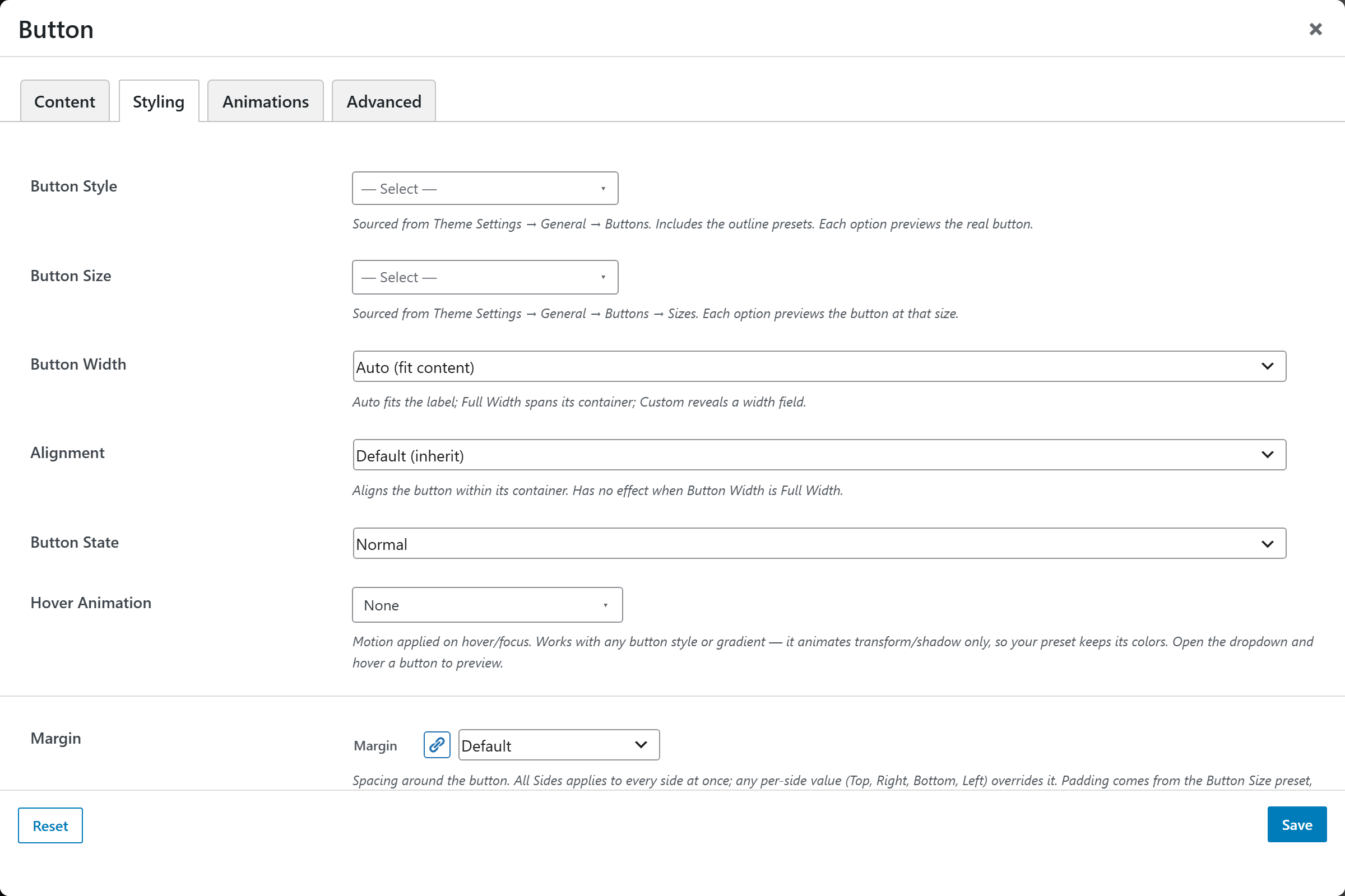
| Option | Choices |
|---|---|
| Button Style | A set of visual presets (image-picker) |
| Button Size | Size presets (image-picker) |
| Button Width | Full Width, or Custom |
| Custom Width | Used when Button Width = Custom |
| Alignment | Left, Center, Right |
| Button State | Active, Disabled |
| Hover Animation | A set of hover effects |
| Margin | Spacing |
Screenshots — styles, sizes & hover
Capture each Button Style, Button Size, and Hover Animation variant. Suggested
files: button-style-1, button-size-lg, button-hover-grow in static/img/shortcodes/.