Comparison Table
A feature comparison matrix — plans/products across the top, feature rows down the side, with checks, crosses, text values, a highlighted column and section headings. Tabs: Content, Design, Styling, Animations, Advanced.
Content
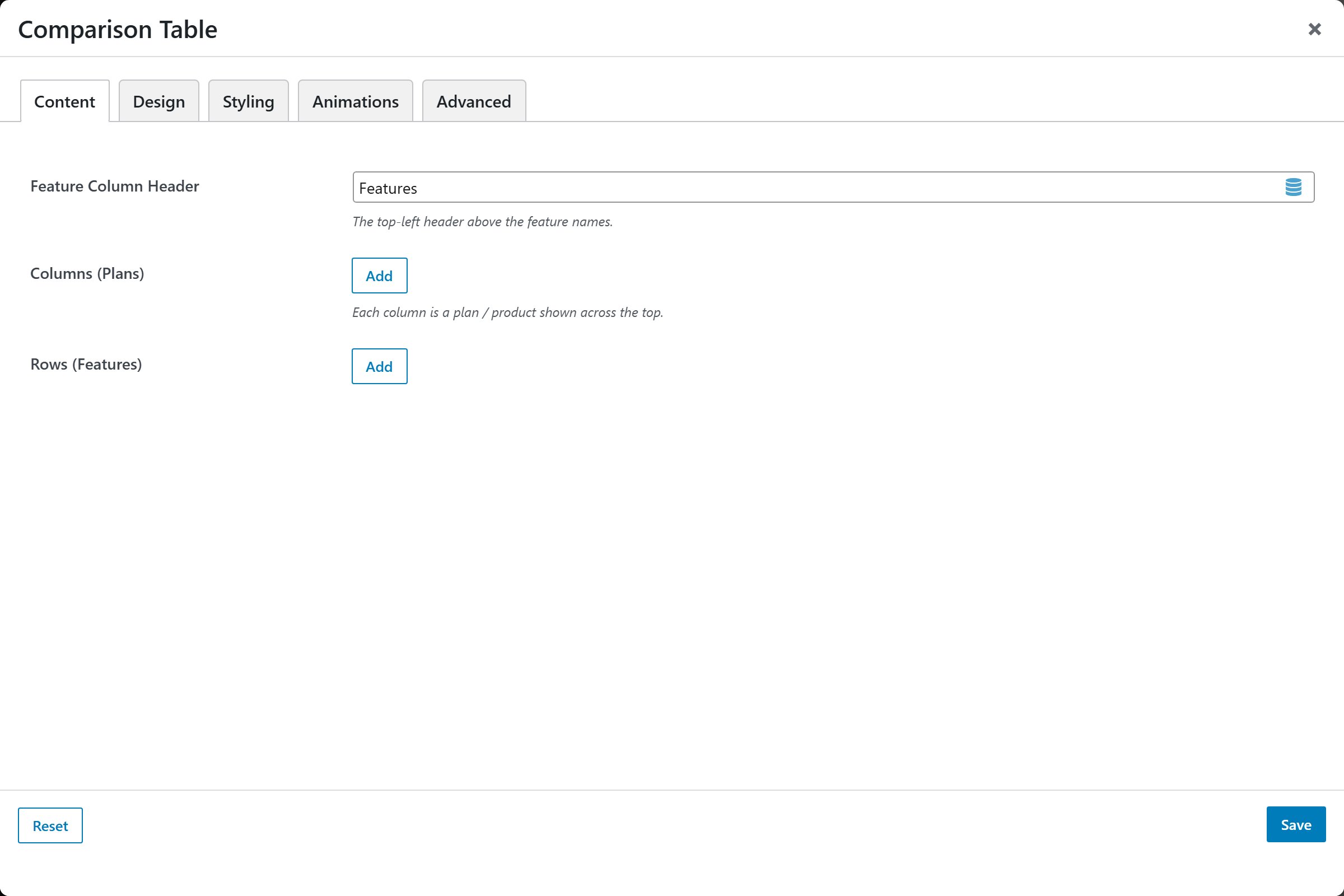
- Feature Column Header — the top-left header above the feature names. Default
Features. - Columns (Plans) — a repeatable list; each column is a plan / product shown across the top:
- Name — column name (default
Plan). - Price / Subtitle — e.g. "$29 / mo", shown under the name.
- Badge — optional ribbon, e.g. "Popular".
- Highlight this column — Yes / No (default No).
- Button Text — optional CTA label.
- Button URL — CTA link.
- Open in New Tab — Yes (
_blank) / No (_self, default).
- Name — column name (default
- Rows (Features) — a repeatable list; each row is a feature line:
- Section Heading row — Yes / No (default No) — renders the label as a full-width group heading (no cells).
- Feature Label — the feature name (default
Feature). - Hint — optional small note under the feature label.
- Cell Values — one line per column, in the same order as the columns. Use
yesfor a check,nofor a cross,-for a dash, or any text for a literal value (e.g. "Up to 5").
Design
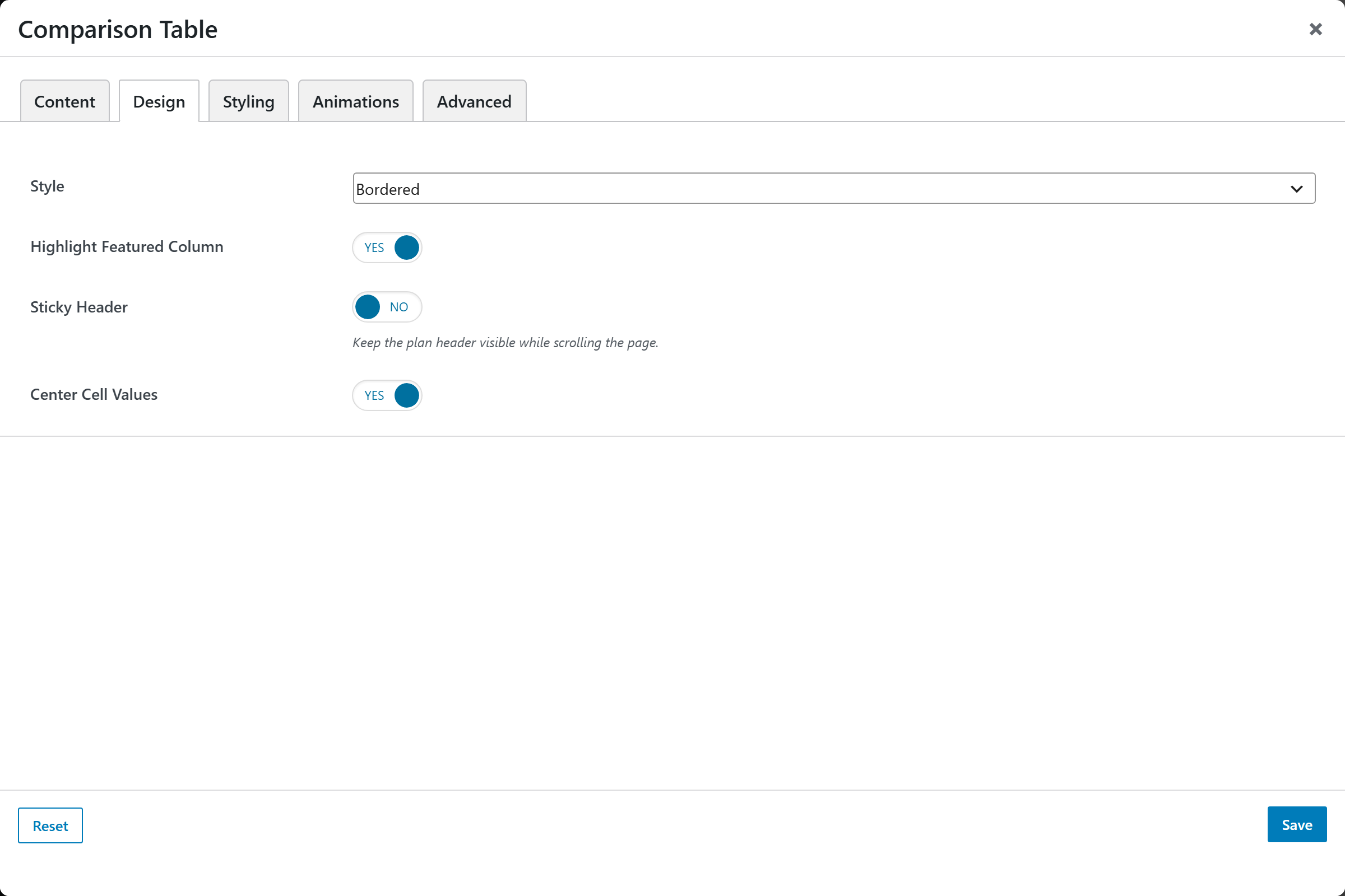
- Style —
Bordered(default),Striped rows, orMinimal. - Highlight Featured Column — Yes (default) / No.
- Sticky Header — Yes / No (default) — keep the plan header visible while scrolling the page.
- Center Cell Values — Yes (default) / No.
Styling
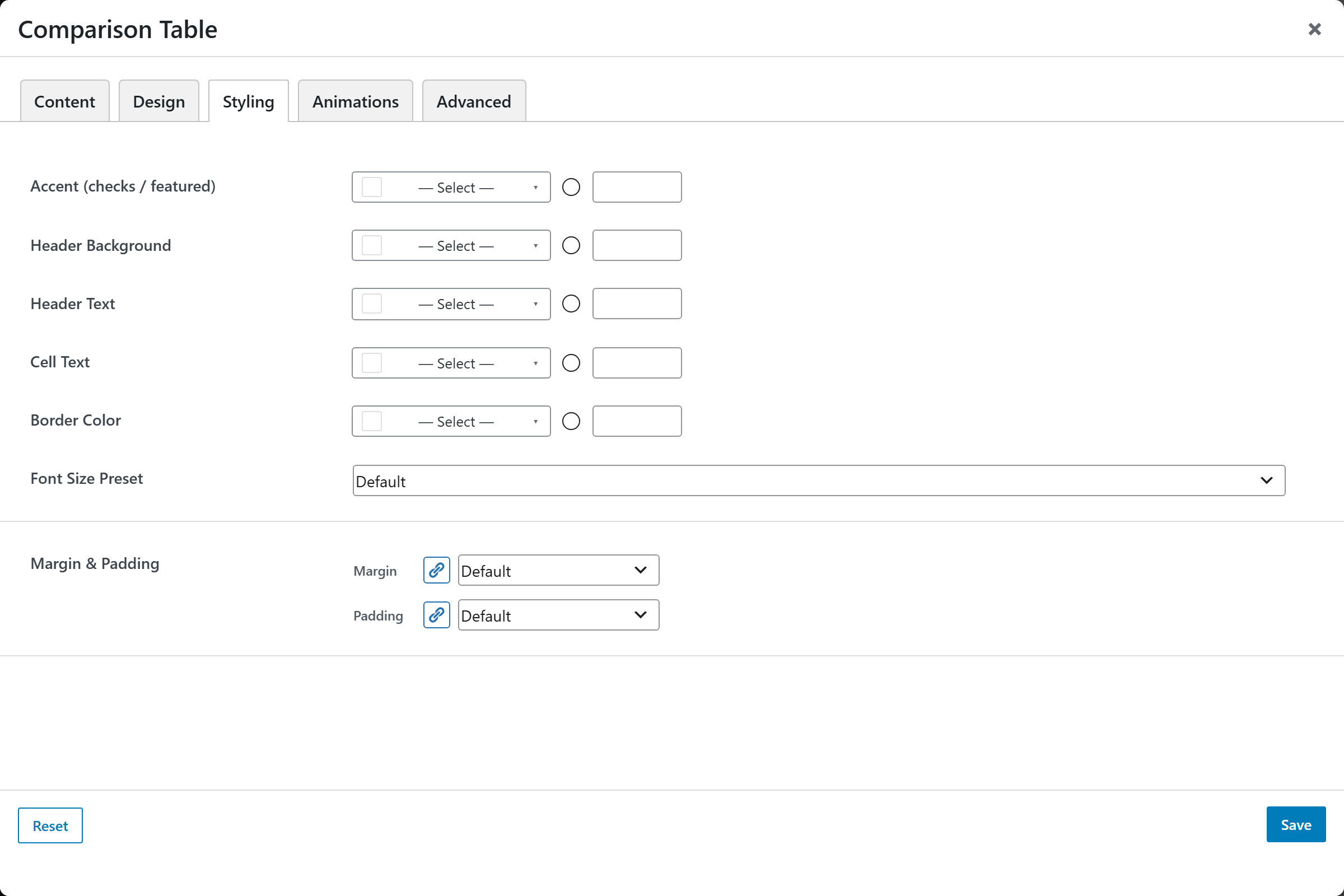
- Accent (checks / featured) — accent color for checks and the featured column.
- Header Background — background of the header row.
- Header Text — header text color.
- Cell Text — cell text color.
- Border Color — table border color.
- Font Size Preset — named base text size.
- Margin & Padding — spacing around the element.
Animations
Standard entrance-animation controls (effect, duration, delay, offset).
Advanced
Custom CSS class/ID, responsive visibility toggles, custom attributes, and margin/padding.