Feature List
An icon-led list — checklist, cross/mixed, numbered or per-item icons — with optional sub-text, a right-aligned value, and links, laid out as a vertical column grid or a horizontal strip. Tabs: Content, Design, Styling, Animations, Advanced.
Content
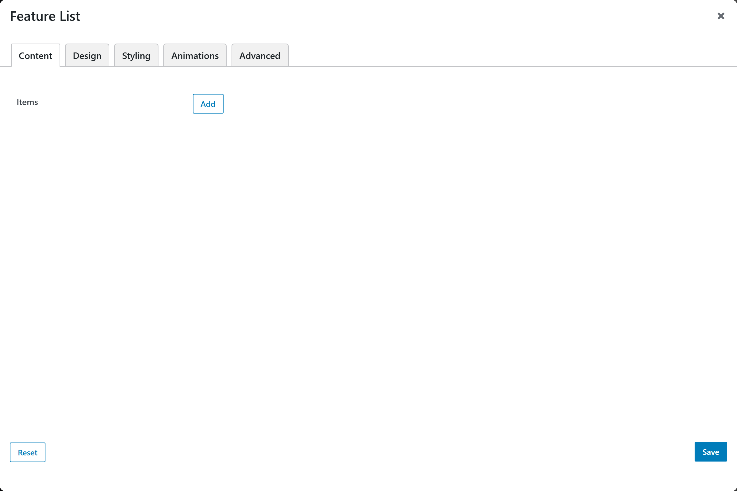
- Items — an addable, repeatable list of features. Each item opens an Add / Edit Item popup with these sub-fields:
- Text — the main line of the item (default "Feature item").
- Sub-text — an optional smaller line beneath the text.
- Value — an optional right-aligned value on the same row (e.g. "96%", "24h") — great for spec / stat rows.
- Icon — an icon (icon-v2 picker). Setting an icon always overrides the Default Marker for that item — so add an icon and it shows, whatever the marker is set to. The item row preview in the builder shows the chosen icon inline.
- Marker Color — override the marker color for this item only (e.g. a single red cross); blank inherits the list Marker Color.
- Check State —
Available (check)(default) orUnavailable (cross); used by the Checklist design. - Link URL — optional; makes the item a link.
- Open in New Tab —
Yes(_blank) orNo(_self, default).
Design
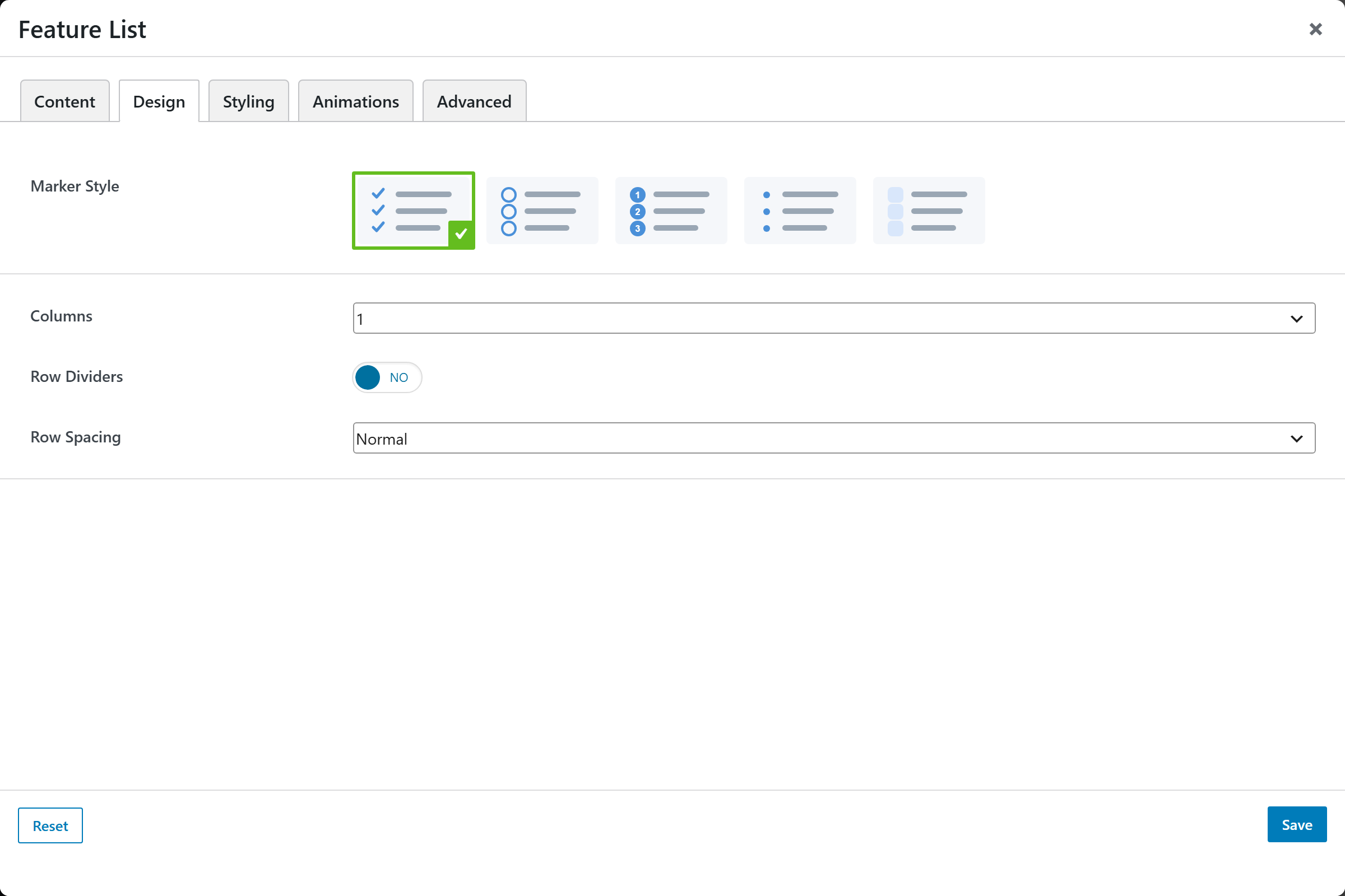
- Default Marker — image-picker for the fallback marker used by items that have no icon (a per-item icon always overrides it):
Checkmark(default),Checkmark + icon(shows both a check and the item's icon),Numbered,Bullets, orIcons only(no fallback decoration). So a list can mix — items with brand icons show their icons, plain items show the checkmark. - Orientation —
Vertical list(default, uses the Columns grid) orHorizontal strip(items flow in a wrapping inline row — a feature / trust bar). - Icon Position —
Left of text(default) orAbove text (centered)for a card-like item. - Icon Style — a chip drawn around the checklist / per-item icon markers:
Plain(default),Soft tint,Solid circle,Outline, orSquare badge. Numbered and bullet markers keep their own shape; on the Badge design the badge look wins. - Columns —
1(default),2, or3(vertical orientation only). - Row Dividers —
YesorNo(default) — show a divider line between rows. - Alternating Rows —
YesorNo(default) — zebra-stripe the rows. - Row Spacing —
Tight,Normal(default), orRoomy.
Styling
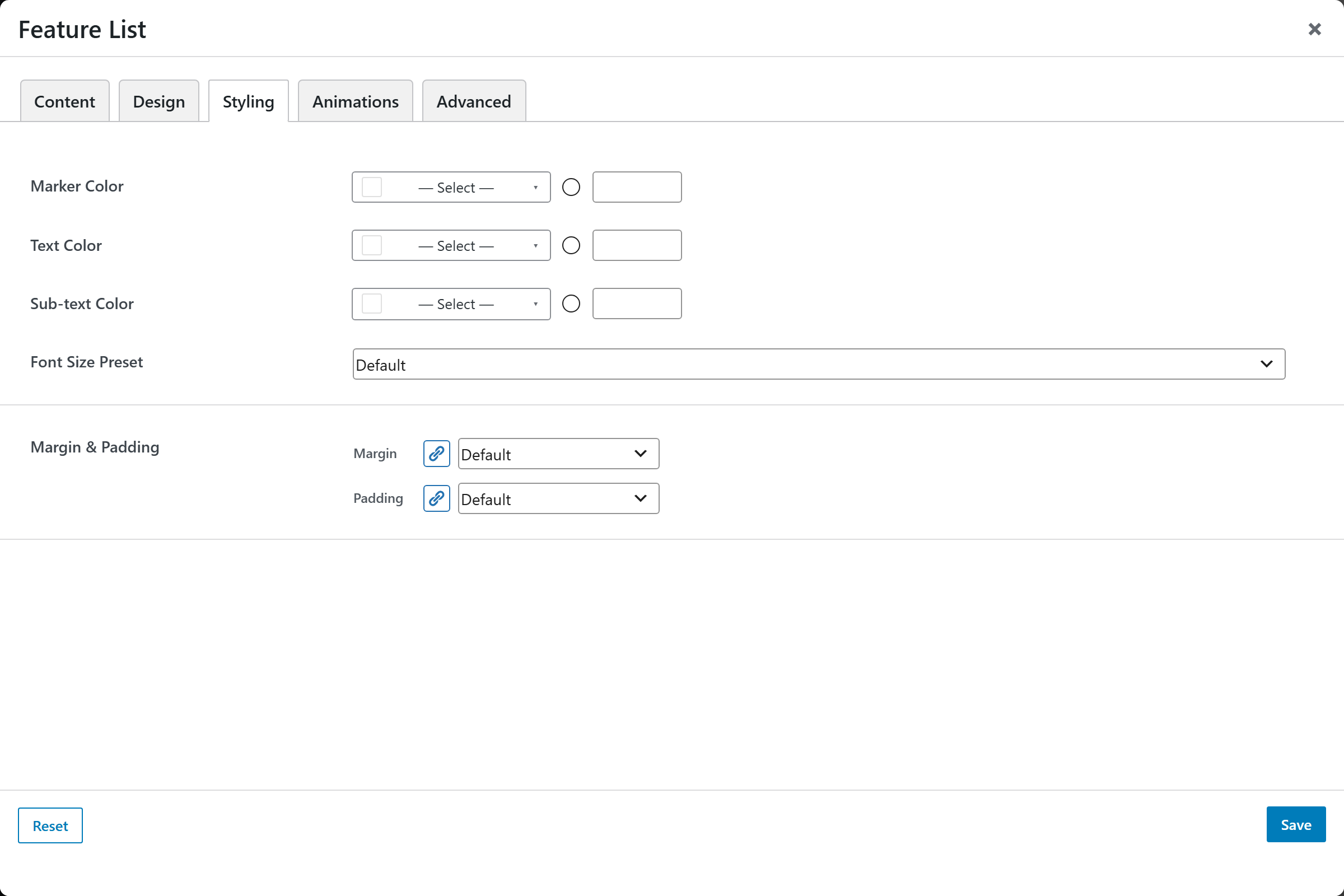
- Marker Color — color of the markers / icons.
- Text Color — color of the main item text.
- Sub-text Color — color of the optional sub-text line.
- Font Size — font-size preset for the list.
- Margin & Padding — spacing control for the block.
Animations
Standard entrance-animation controls (effect, duration, delay, offset).
Advanced
Custom CSS class/ID, responsive visibility toggles, custom attributes, and margin/padding.