Star Rating
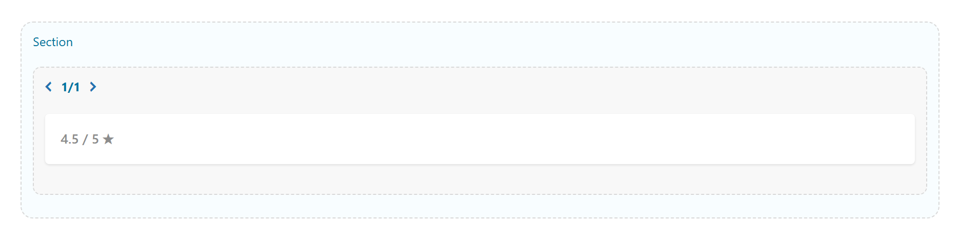
A rating display — stars, hearts, circles or a bar — with an optional label and value/count, supporting half ratings. Tabs: Content, Design, Styling, Animations, Advanced.
Content
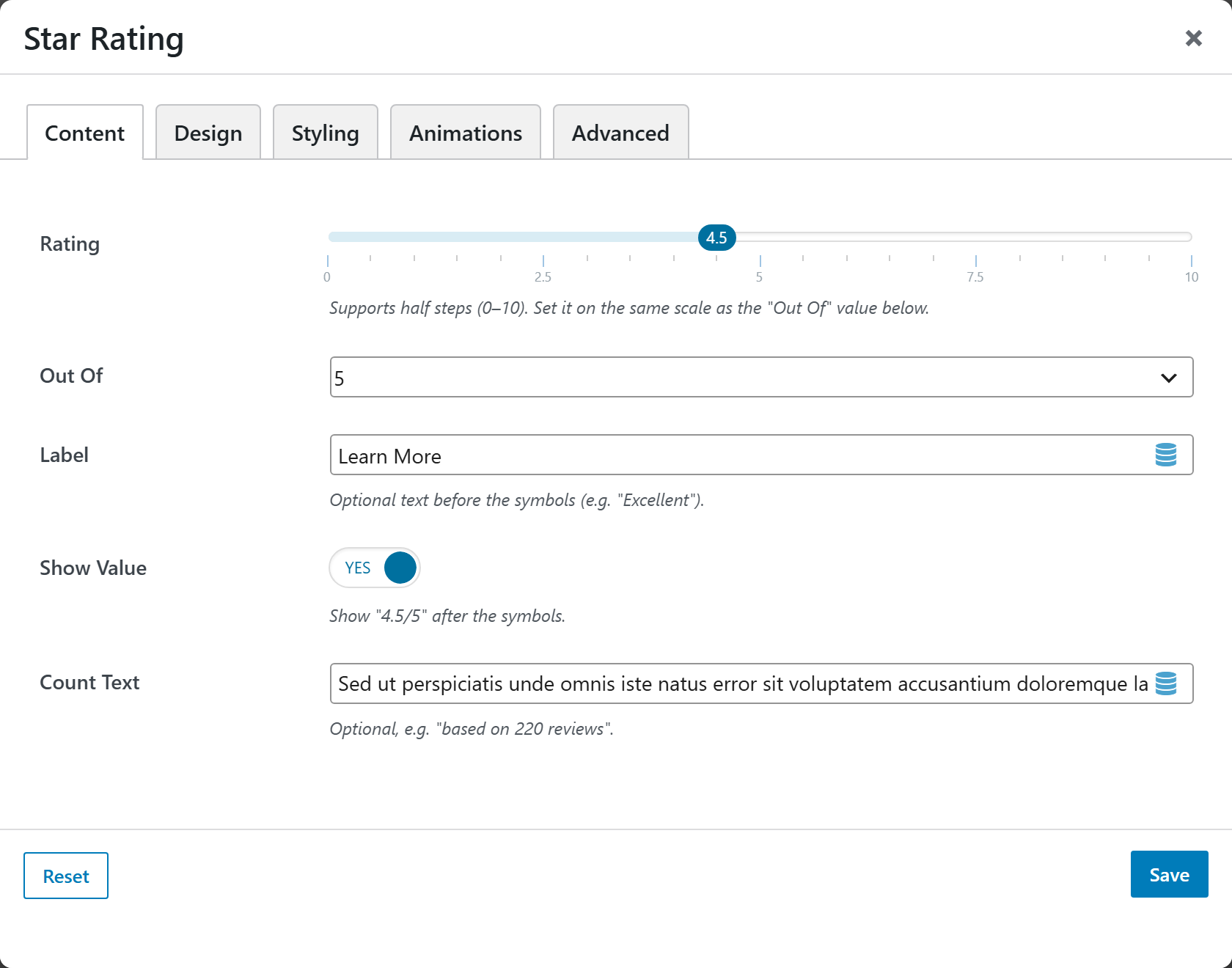
- Rating — slider from
0to10in0.5steps (default4.5); set it on the same scale as the "Out Of" value below. - Out Of —
5(default) or10. - Label — optional text before the symbols, e.g. "Excellent".
- Show Value —
Yes(default) orNo— show "4.5/5" after the symbols. - Count Text — optional text, e.g. "based on 220 reviews".
Design
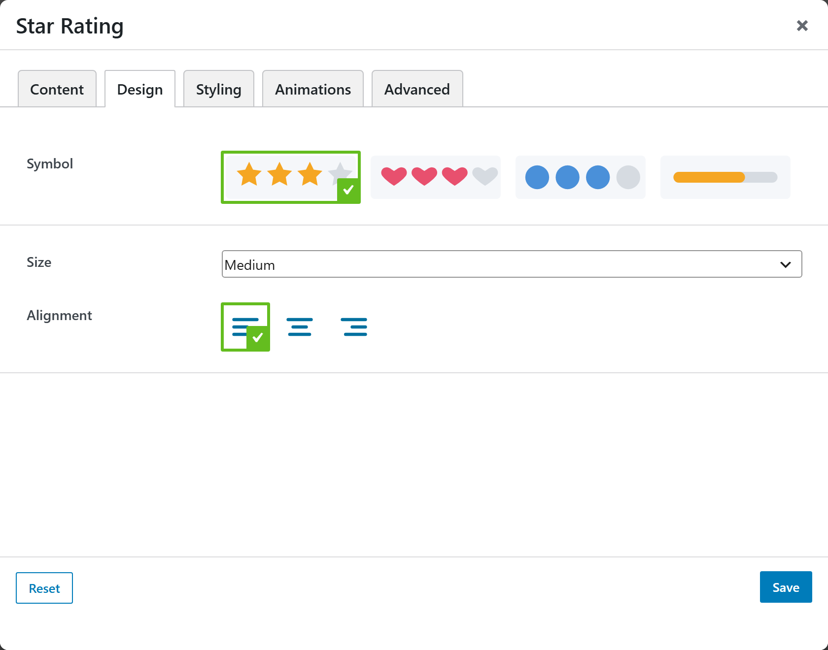
- Symbol — image-picker of symbols (star, hearts, circles, bar, etc.); default
star. - Size —
Small,Medium(default),Large, orExtra large. - Alignment —
left(default), center, or right.
Styling
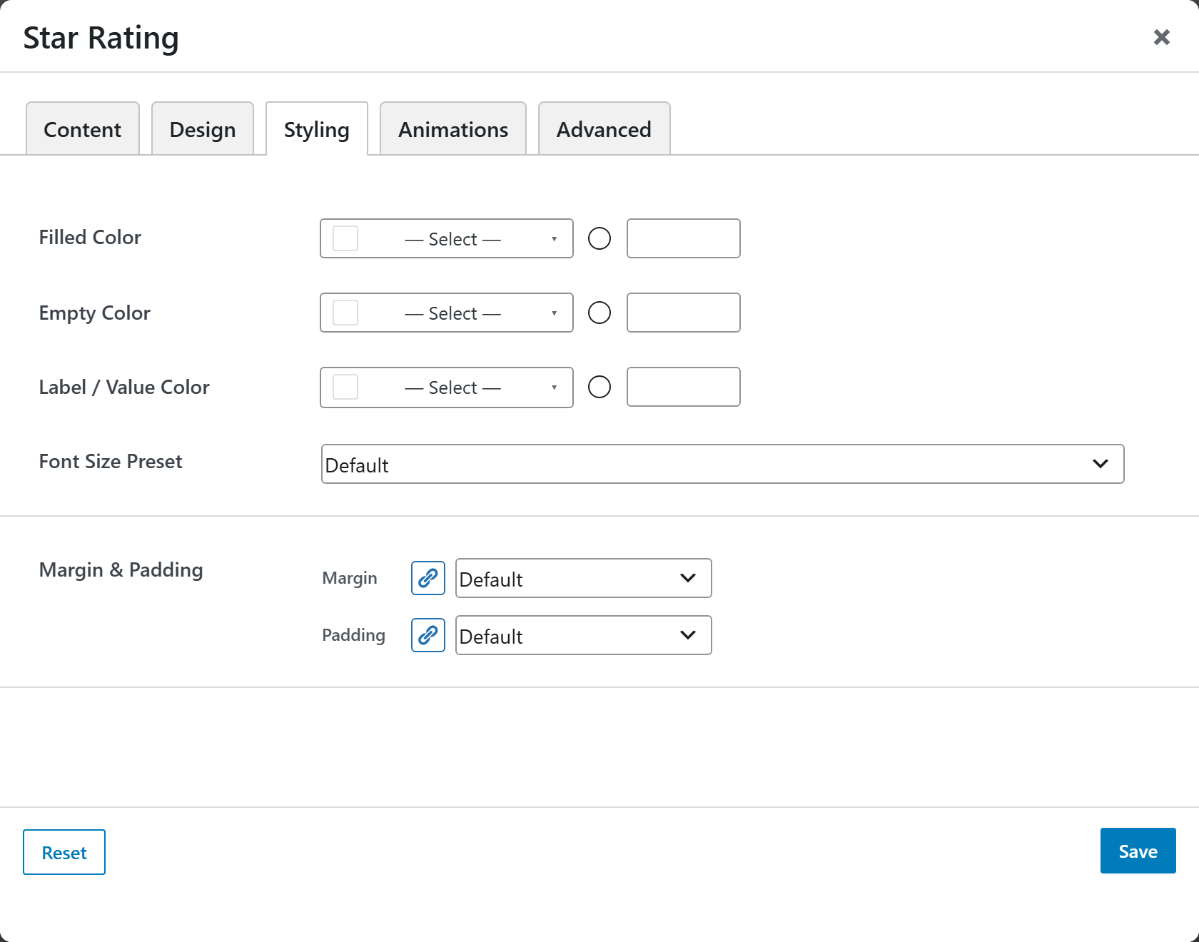
- Filled Color — color of the filled symbols.
- Empty Color — color of the empty symbols.
- Label / Value Color — color of the label and value text.
- Font Size — font-size preset for the rating.
- Margin & Padding — spacing control for the block.
Animations
Standard entrance-animation controls (effect, duration, delay, offset).
Advanced
Custom CSS class/ID, responsive visibility toggles, custom attributes, and margin/padding.