Steps / Process
A numbered steps / process flow — horizontal, vertical timeline, alternating, cards or circles — with icons or numbers and connectors. Tabs: Content, Design, Styling, Animations, Advanced.
Content
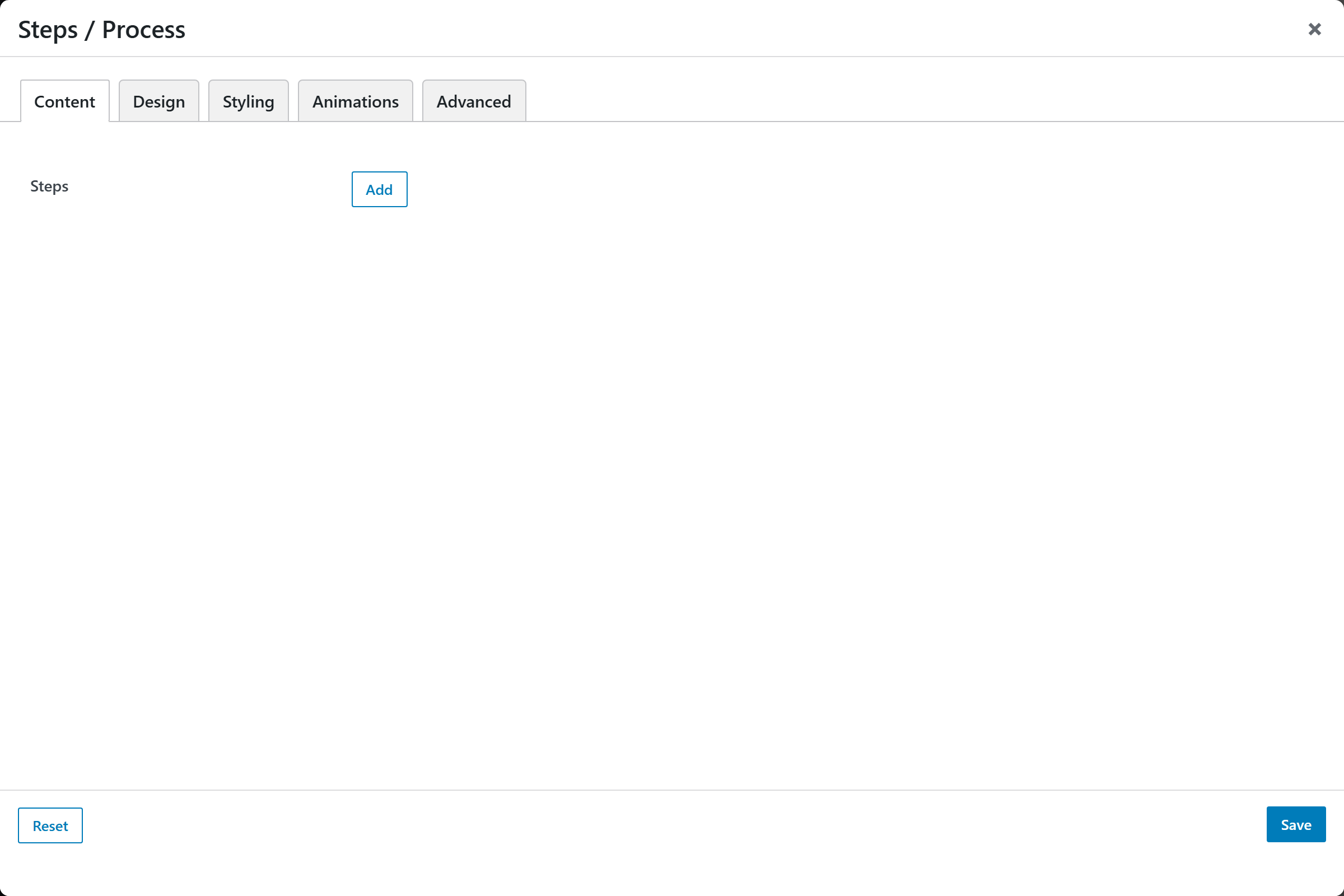
- Steps — an addable, repeatable list of steps. Each step opens an Add / Edit Step popup with these sub-fields:
- Title — the step title (default "Step title").
- Description — a textarea body; accepts HTML and shortcodes.
- Icon — an icon (icon-v2 picker) used when Marker is set to Icon.
- Number / Label override — optional; defaults to the step position (1, 2, 3…).
Design
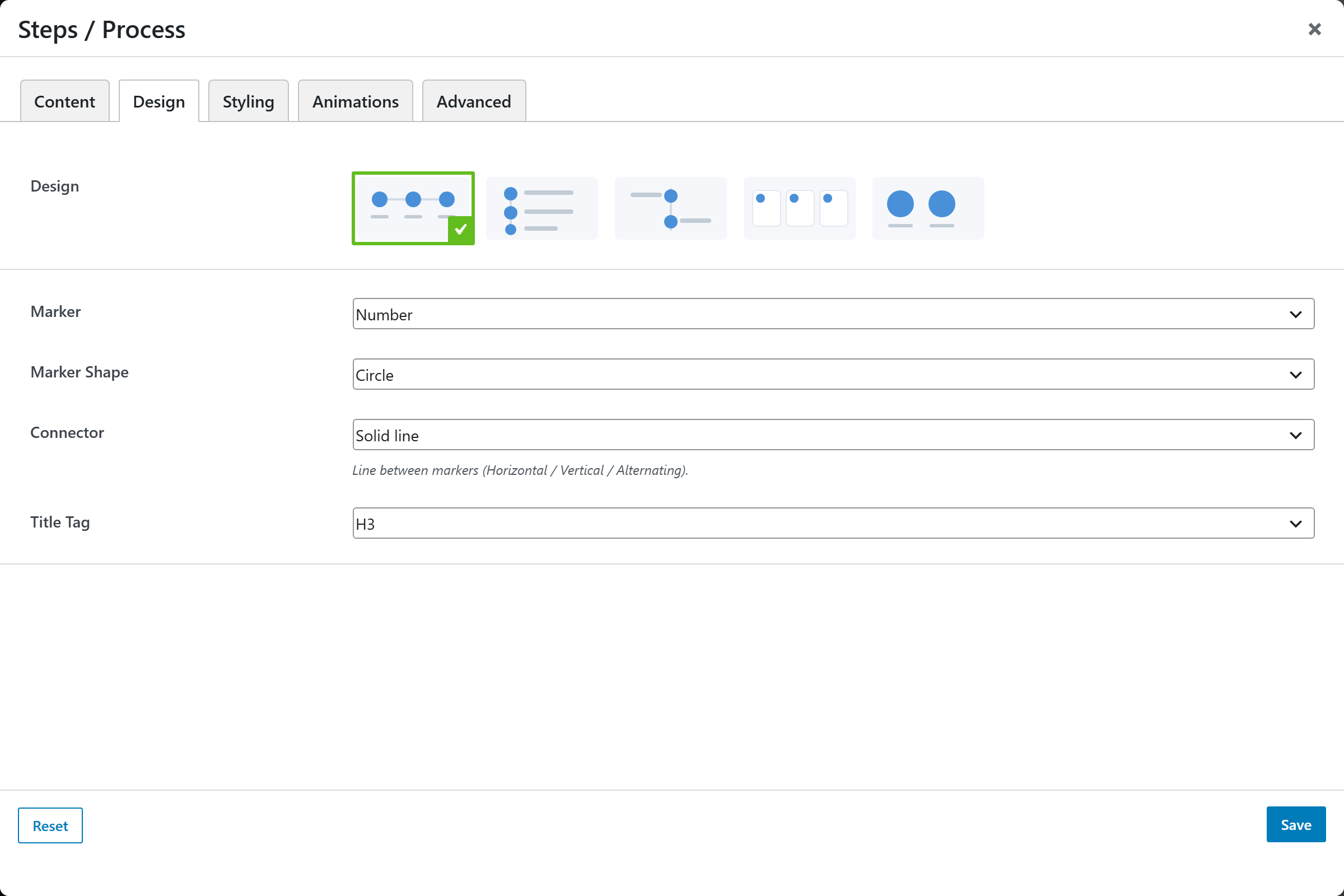
- Design — image-picker of layouts (horizontal, vertical timeline, alternating, cards, circles); default
horizontal. - Marker —
Number(default),Icon, orNone. - Marker Shape —
Circle(default),Rounded square, orSquare. - Connector —
Solid line(default),Dashed line, orNone— the line between markers (Horizontal / Vertical / Alternating). - Title Tag —
H2,H3(default),H4,H5, ordiv.
Styling
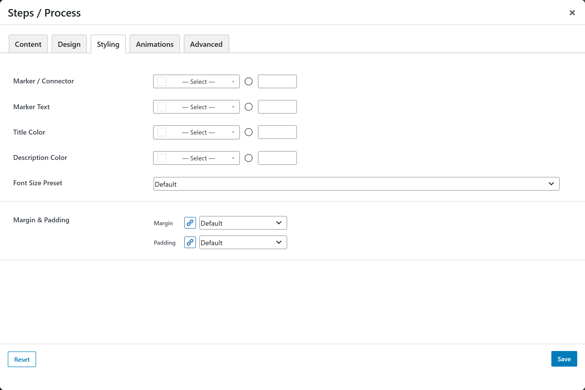
- Marker / Connector — color of the markers and connector line.
- Marker Text — color of the marker number/text.
- Title Color — color of the step title.
- Description Color — color of the description text.
- Font Size — font-size preset for the steps.
- Margin & Padding — spacing control for the block.
Animations
Standard entrance-animation controls (effect, duration, delay, offset).
Advanced
Custom CSS class/ID, responsive visibility toggles, custom attributes, and margin/padding.