Divider
A horizontal separator, optionally with text or an icon. Tabs: Content, Layout, Styling, Animations, Advanced.
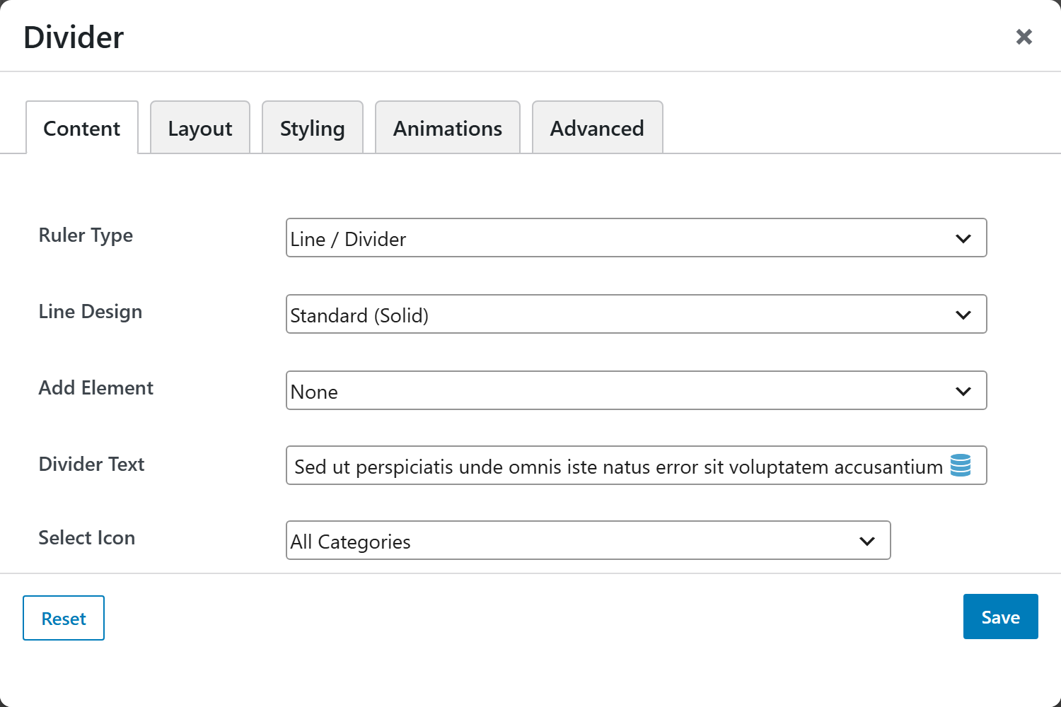
Content
| Option | Choices |
|---|---|
| Ruler Type | Line / Divider, Whitespace |
| Line Design | Standard (Solid), Gradient Fade, Ornamental / Glyph, Inner Shadow |
| Add Element | None, Text / Title, Icon |
| Divider Text | Shown when Add Element = Text |
| Select Icon | Shown when Add Element = Icon |
| Content Alignment | Center, Left, Right |
| Height (px) | Thickness / whitespace height |
Screenshots — line designs
Capture each Line Design and the text/icon variants: divider-solid,
divider-gradient, divider-ornament, divider-shadow, divider-with-text,
divider-with-icon.
Layout
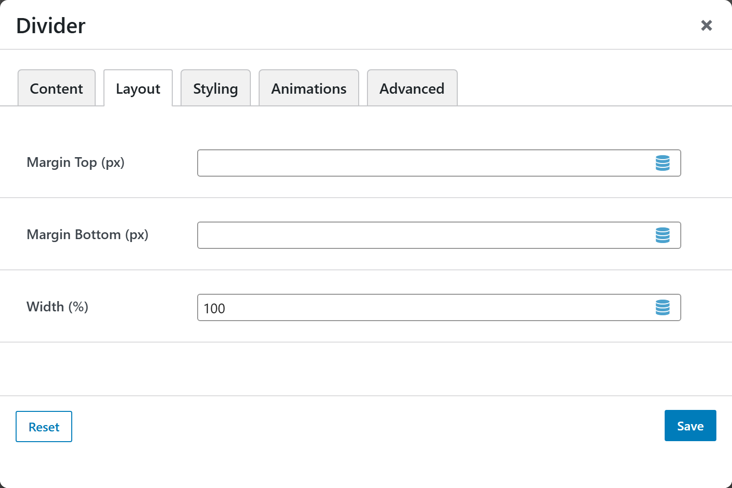
Margin Top/Bottom, Width (%), and spacing controls.
Styling
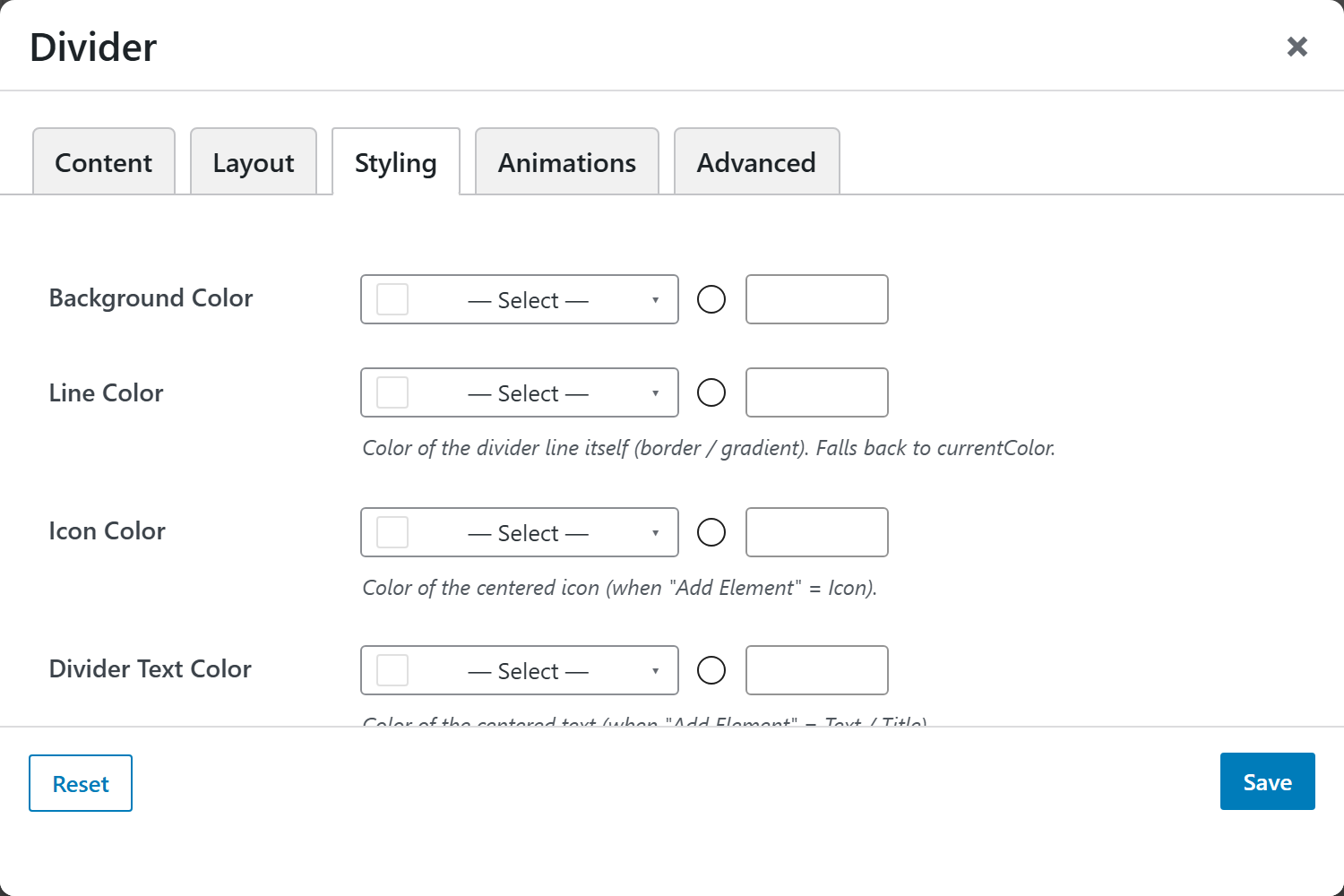
Line Color, Icon Color, Divider Text Color, Background Color, and Margin & Padding.