Highlight Text
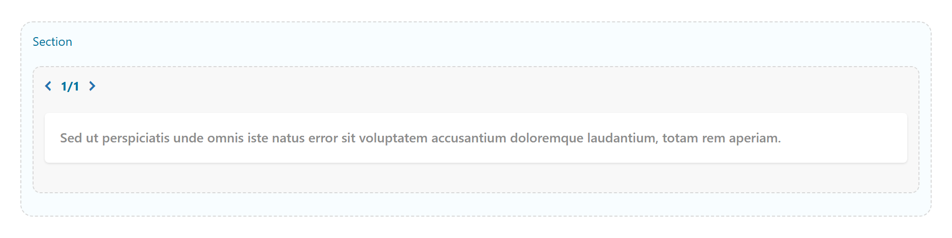
A short piece of text styled with a typographic effect — marker highlight, gradient fill, underline, outline, glow or a drop-cap. Tabs: Content, Design, Styling, Animations, Advanced.
Content
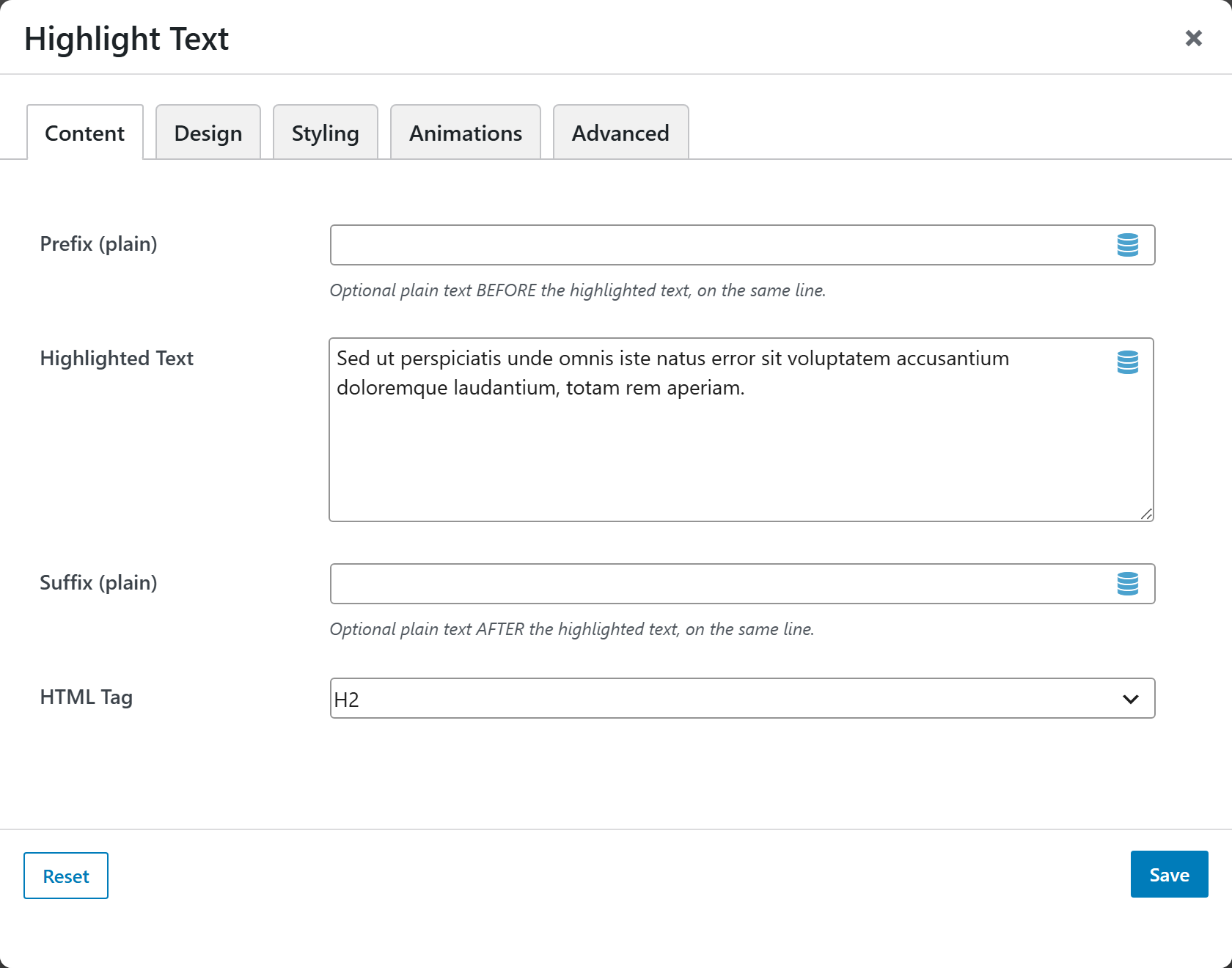
- Prefix (plain) — optional plain text before the highlighted text, on the same line. A trailing space is added automatically.
- Highlighted Text — the part that receives the effect. Basic inline HTML (bold, italic, links) is allowed. For Drop cap, enter a full paragraph.
- Suffix (plain) — optional plain text after the highlighted text, on the same line. A leading space is added automatically.
- HTML Tag — wrapping tag: H1–H6, Paragraph, Span (inline), or Div. Default H2. Use Paragraph for the Drop cap effect.
Design
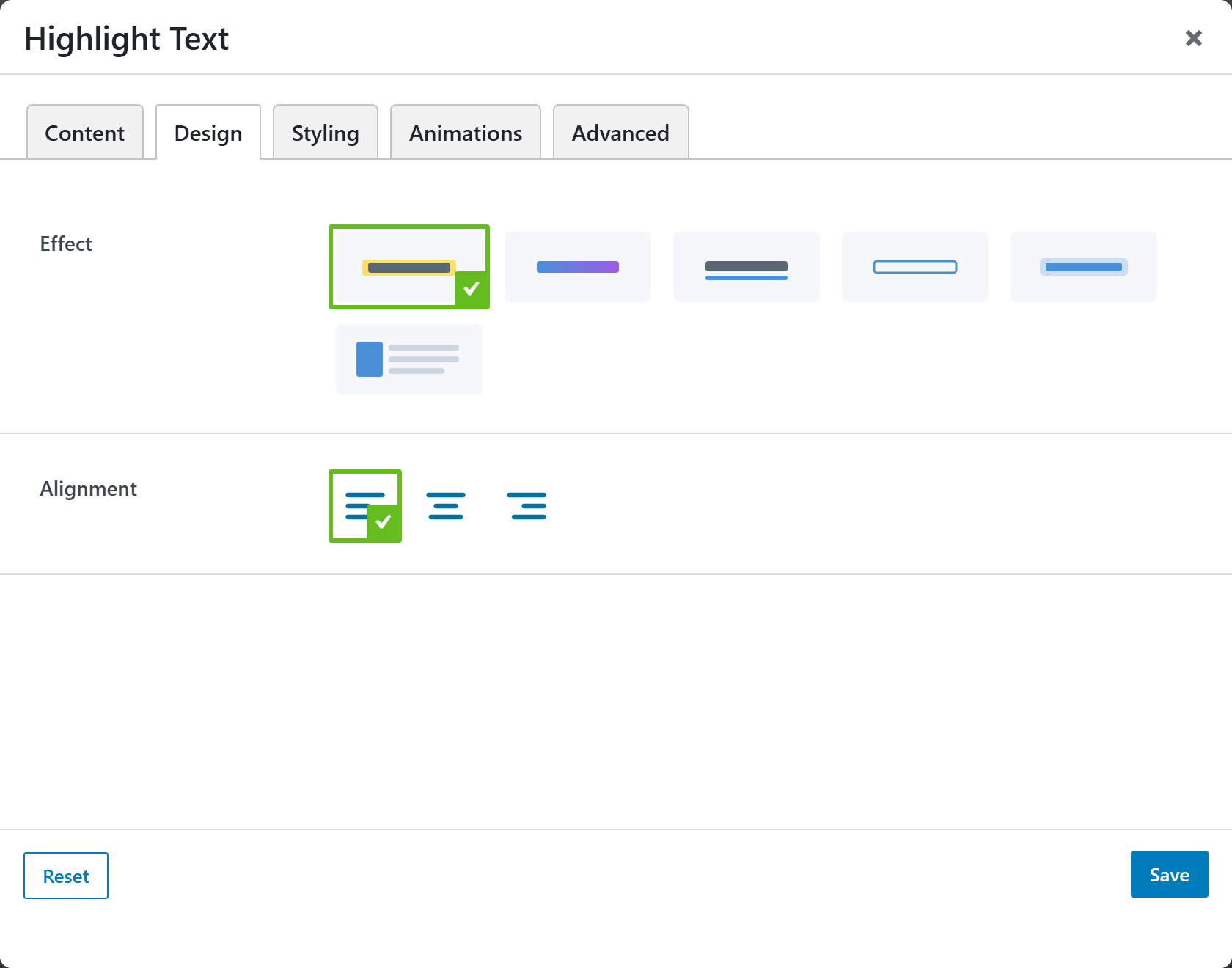
- Effect — the typographic effect:
| Effect | Look |
|---|---|
| Marker highlight | Marker-pen highlight (default) |
| Gradient fill | Gradient-filled text |
| Underline | Styled underline |
| Outline text | Outlined / hollow text |
| Glow | Glowing text |
| Drop cap | Decorative drop cap (use a full paragraph) |
- Alignment — Left (default), Center, or Right.
Styling
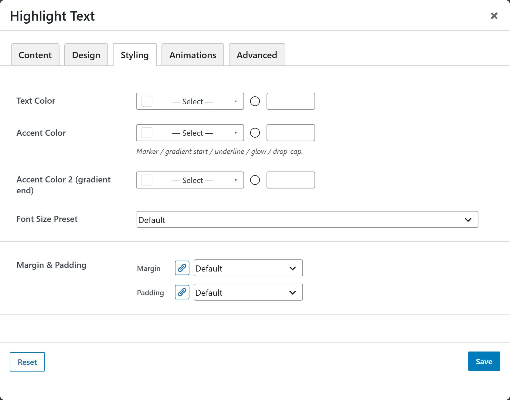
- Text Color — color of the text.
- Accent Color — marker / gradient start / underline / glow / drop-cap color.
- Accent Color 2 (gradient end) — gradient end color.
- Font Size Preset — select a preset size for the text.
- Margin & Padding — spacing around the element.
Animations
Standard entrance-animation controls (effect, duration, delay, offset).
Advanced
Custom CSS class/ID, responsive visibility toggles, custom attributes, and margin/padding.