Notification
A notification / alert box. Tabs: Content, Styling, Animations, Advanced.
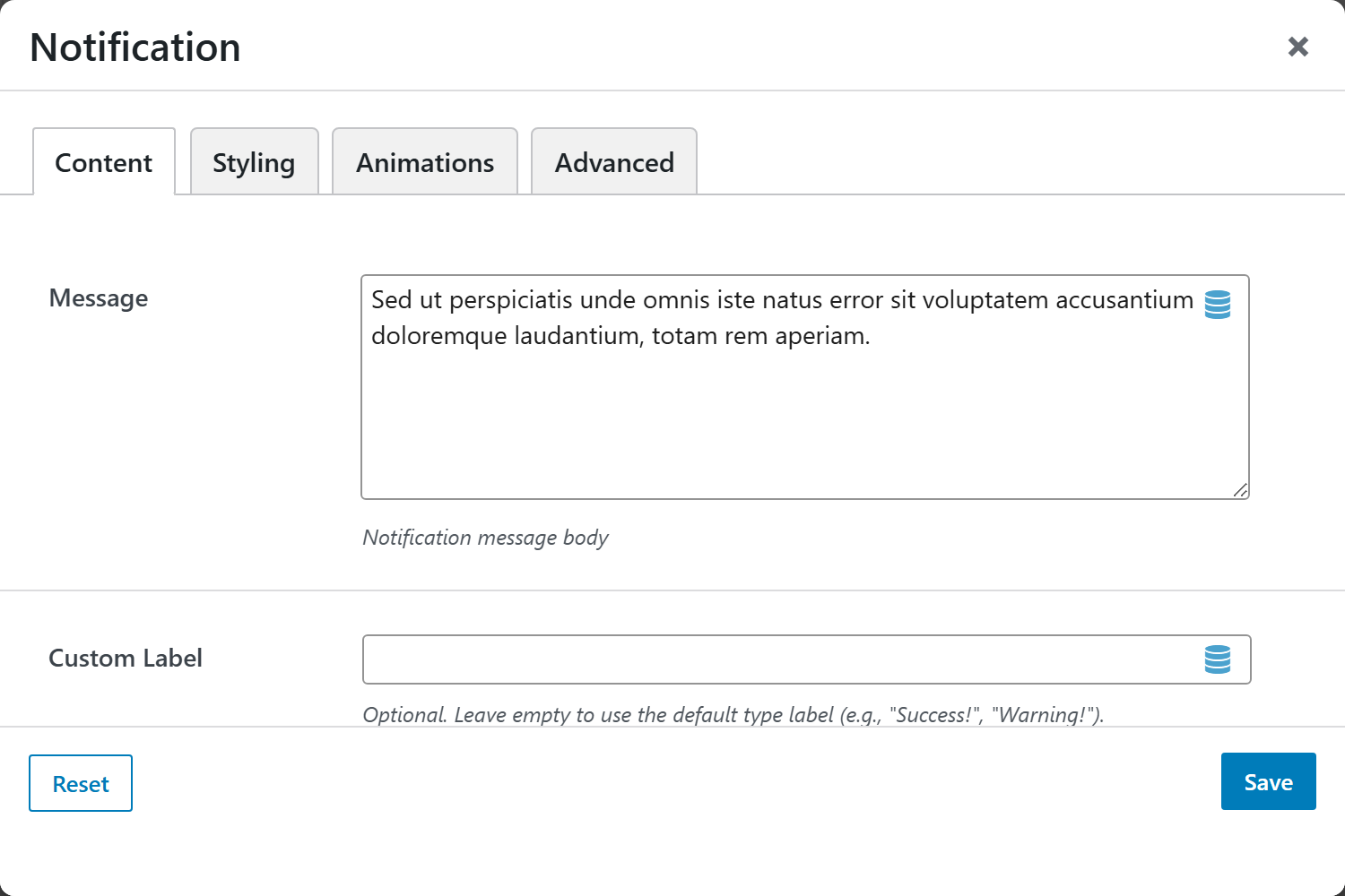
Content
| Option | Choices |
|---|---|
| Message | The alert text |
| Custom Label | Optional leading label |
| Type | Primary, Secondary, Success, Information, Warning, Danger, Light, Dark |
| Border Style | Filled (default), Outline (transparent background), Accent Left Border |
| Icon / Custom Icon (Emoji / SVG) | Leading icon |
| Layout Style | Inline (single row), Stacked (label above message) |
| Dismissible | On/Off |
| Auto-dismiss Seconds | Auto-hide after N seconds |
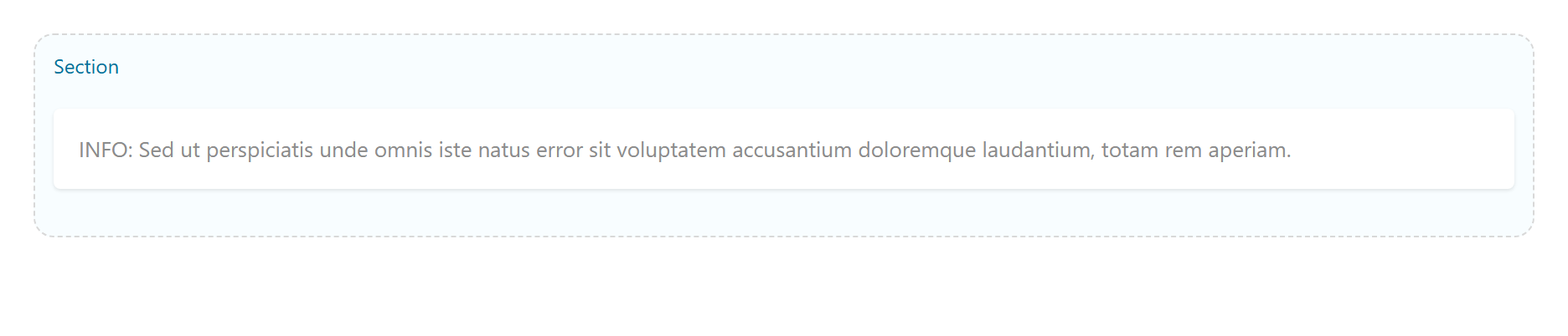
Screenshots — types, borders & layouts
Capture the 8 Types, 3 Border Styles, and 2 Layout Styles, e.g.
notification-success-filled, notification-warning-outline, notification-danger-accent,
notification-stacked.
Styling
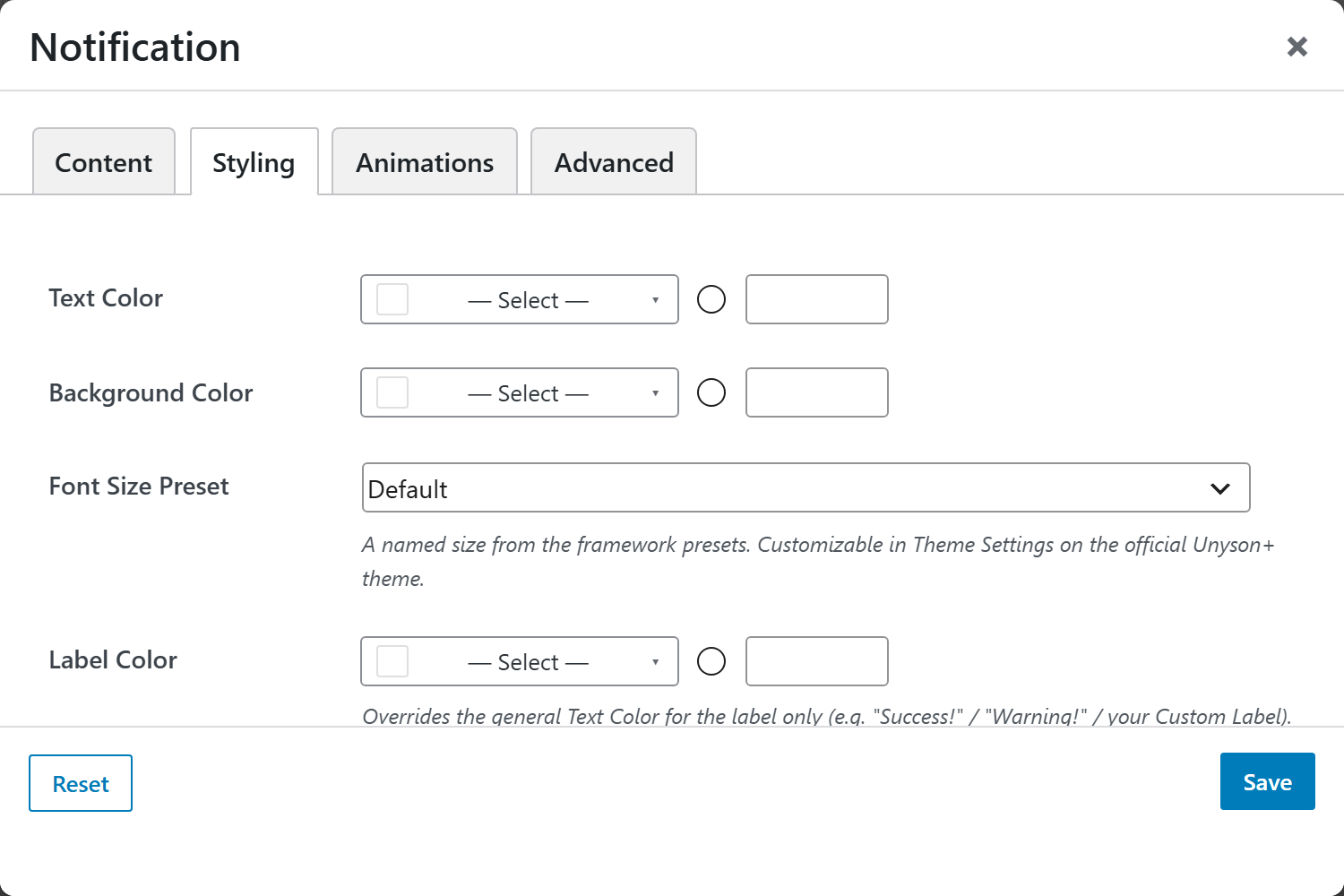
Text, Label, Message and Icon colors, Background Color, and Margin & Padding.