Tag List
A list of short items rendered as pills, chips or an inline separated list — one item per line, with optional links. Tabs: Content, Design, Styling, Animations, Advanced.
Content
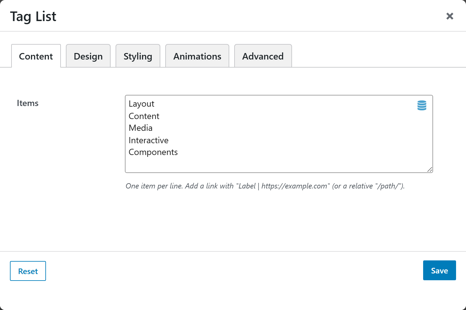
- Items — one item per line. A line without a
|is plain text;Label | URLturns that tag into a link (absolute or relative/path/). Blank lines are ignored. External links open in a new tab automatically.
Design
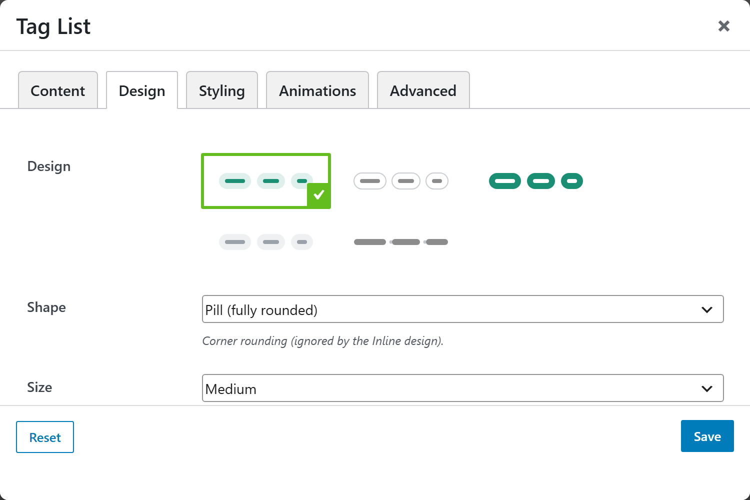
| Option | Choices |
|---|---|
| Design | Soft (tinted fill, default), Outline (bordered), Solid (filled), Subtle (light grey), Inline (no pill, dot-separated) |
| Shape | Pill (fully rounded, default), Rounded, Square — ignored by the Inline design |
| Size | Small, Medium (default), Large |
| Alignment | Left (default), Center, Right |
| Gap | Tight (default), Normal, Roomy |
| Leading Marker | None (default), Dot |
| Hover Lift | Subtle lift + accent on hover — most noticeable on linked tags. Default Off |
Styling
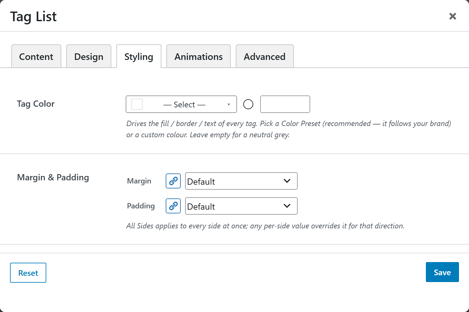
- Tag Color — drives the fill / border / text of every tag. Pick a Color Preset (recommended — it follows your brand) or a custom color. Leave empty for a neutral grey.
- Margin & Padding — spacing around the list. All Sides applies to every side; any per-side value overrides it for that direction.
Animations
Standard entrance-animation controls (effect, duration, delay, offset).
Advanced
Custom CSS class/ID, responsive visibility toggles, custom attributes, and margin/padding.