Accordion
Collapsible accordion panels. Tabs: Content, Layout, Behaviour, Styling, Animations, Advanced.
Content
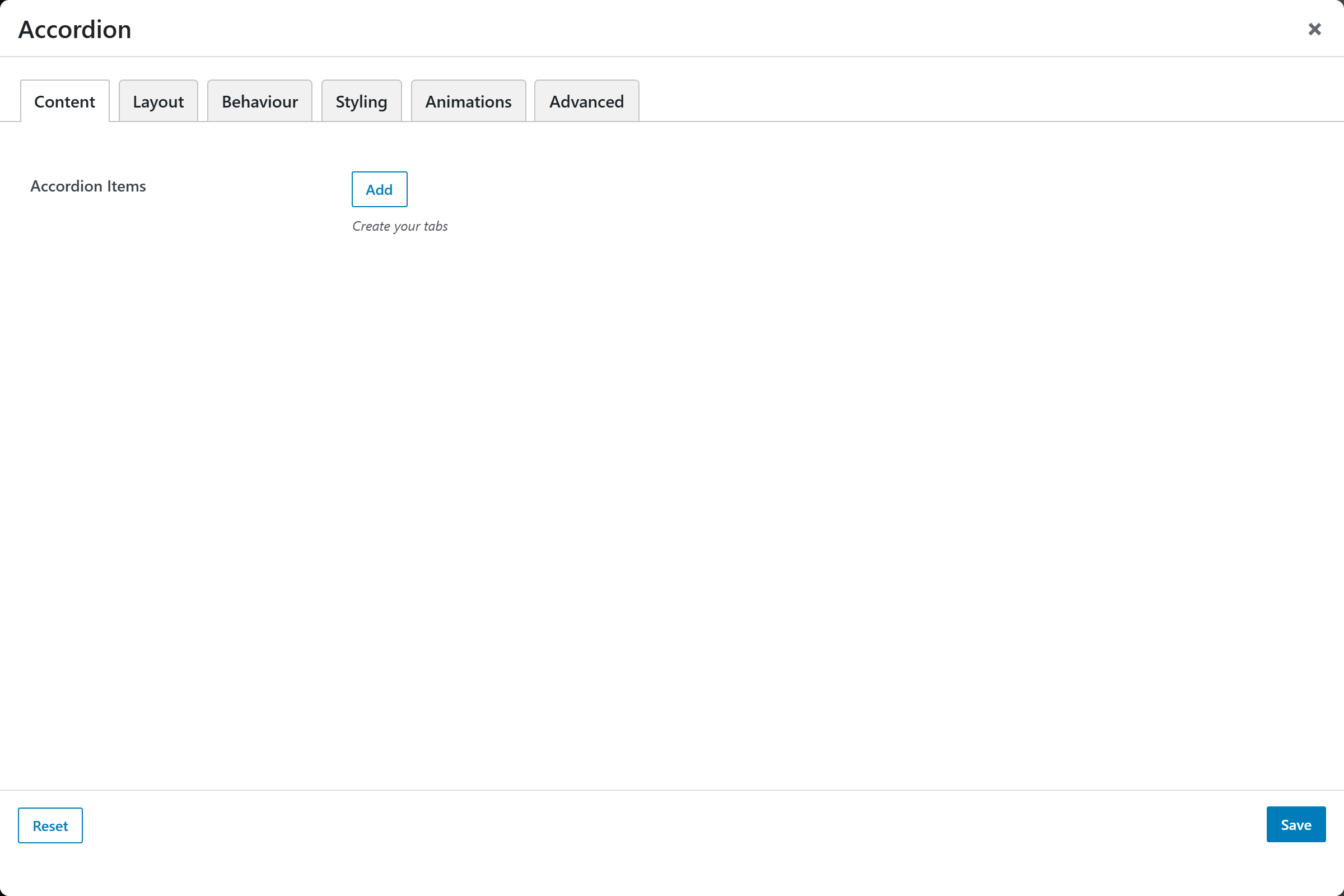
- Accordion Items — a repeatable list; each item has a Title, Content (rich text), and an Open by Default switch.
Layout
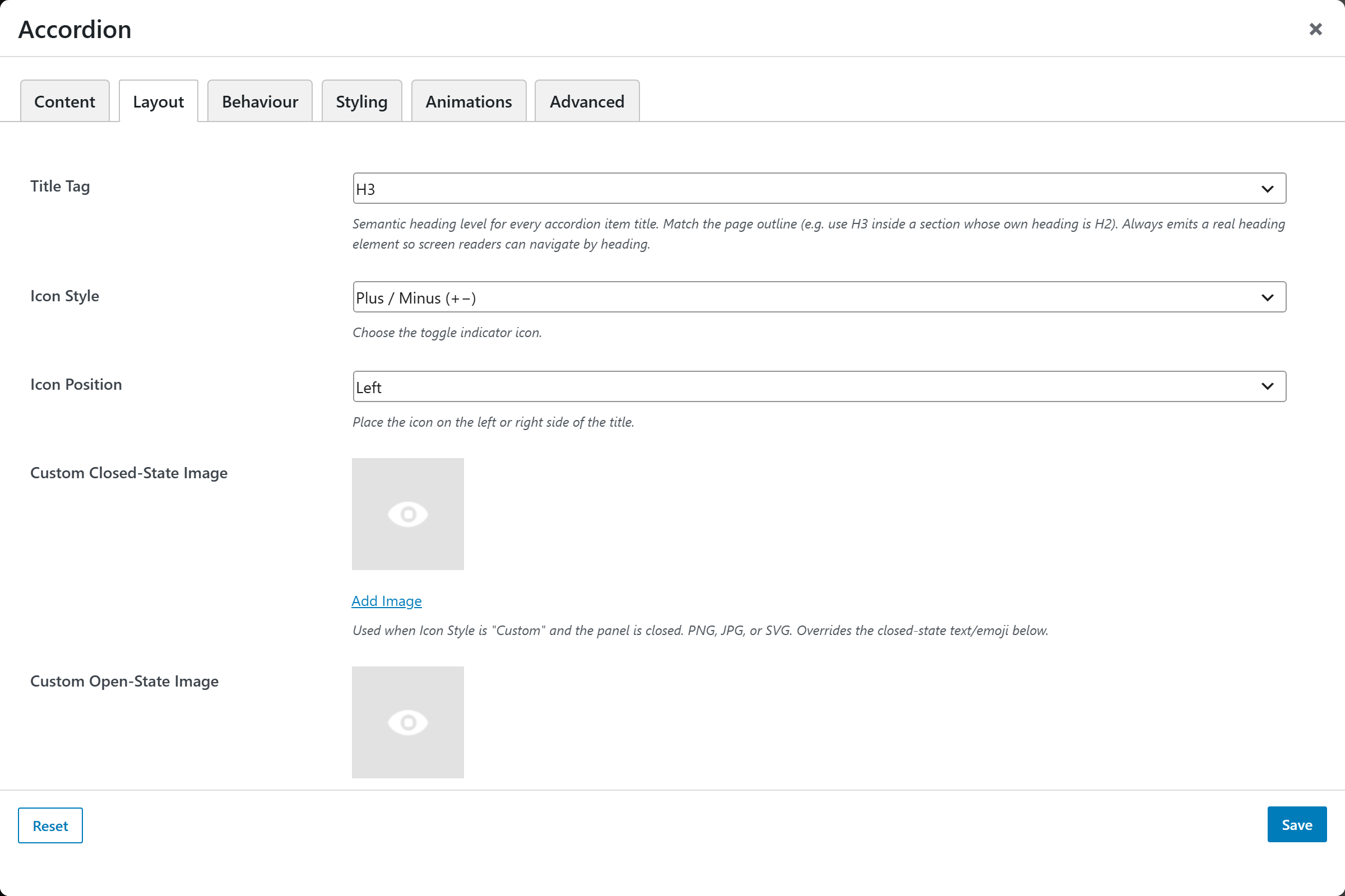
| Option | Choices |
|---|---|
| Title Tag | H2–H6 / Span / Paragraph |
| Icon Style | Plus / Minus (+−), Plus / X (+×), Chevron (›), Arrow (▶), No Icon, Custom (image or text/emoji) |
| Icon Position | Left, Right |
| Custom Closed/Open-State Image | Upload (used when Icon Style = Custom) |
| Custom Closed/Open-State Text | Text/emoji (used when Icon Style = Custom) |
| Item Numbering | None · 1, 2, 3 · 01, 02, 03 · a, b, c · A, B, C · i, ii, iii · I, II, III · Q1, Q2, Q3 · Custom… |
| Custom Template / Start Number | For custom numbering |
| Item Spacing | Gap between items |
| Title Alignment | Left (default), Center, Right |
Screenshots — icon styles & numbering
These two options have several visible variants worth a screenshot each. Suggested files:
accordion-icon-plus-minus, accordion-icon-chevron, accordion-icon-arrow,
accordion-numbering-decimal, accordion-numbering-roman in static/img/shortcodes/.
Behaviour
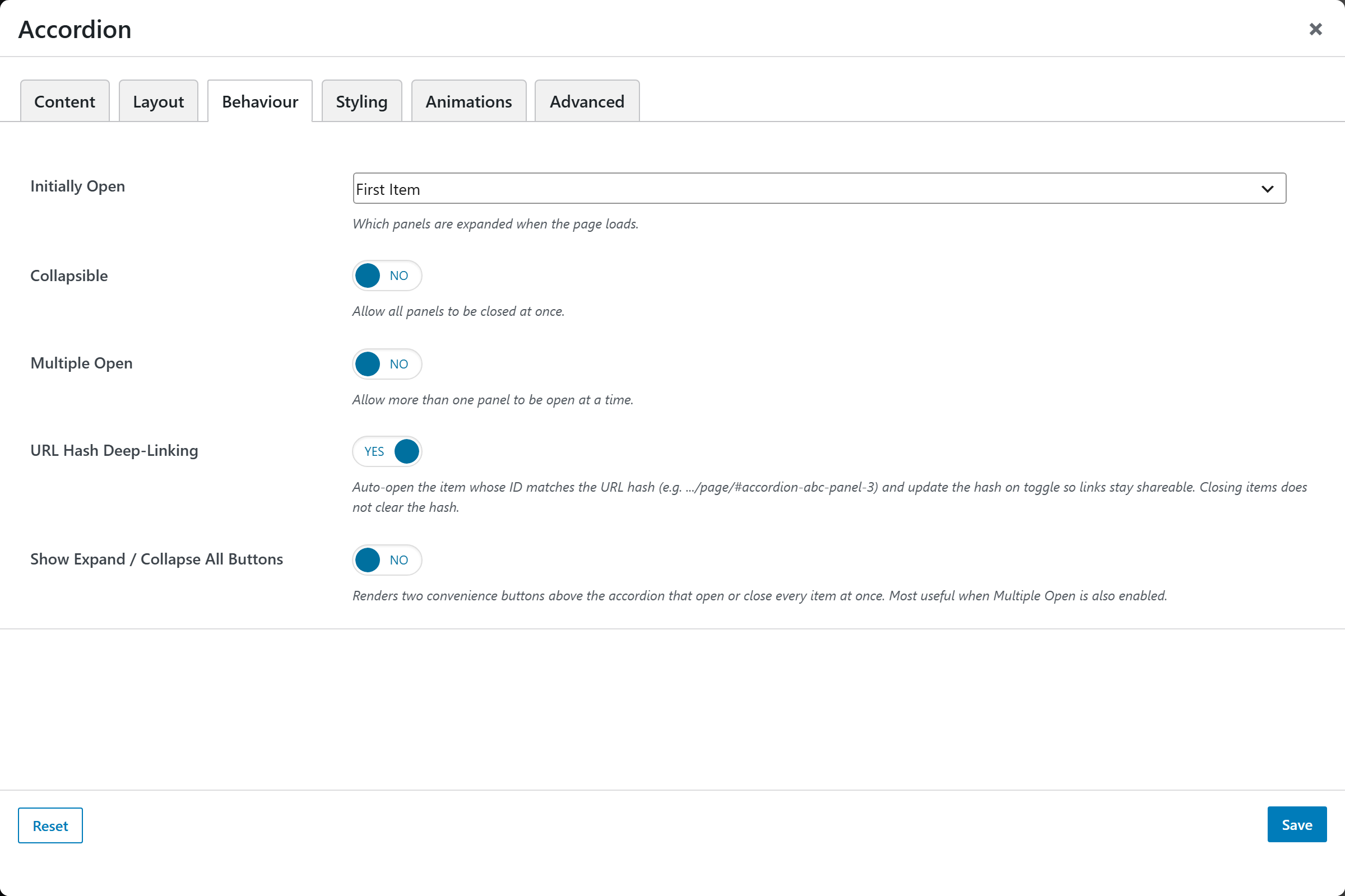
| Option | Choices |
|---|---|
| Initially Open | First Item, None (All Closed), All Open |
| Collapsible | On/Off |
| Multiple Open | On/Off |
| URL Hash Deep-Linking | On/Off |
| Show Expand / Collapse All Buttons | On/Off |
Styling
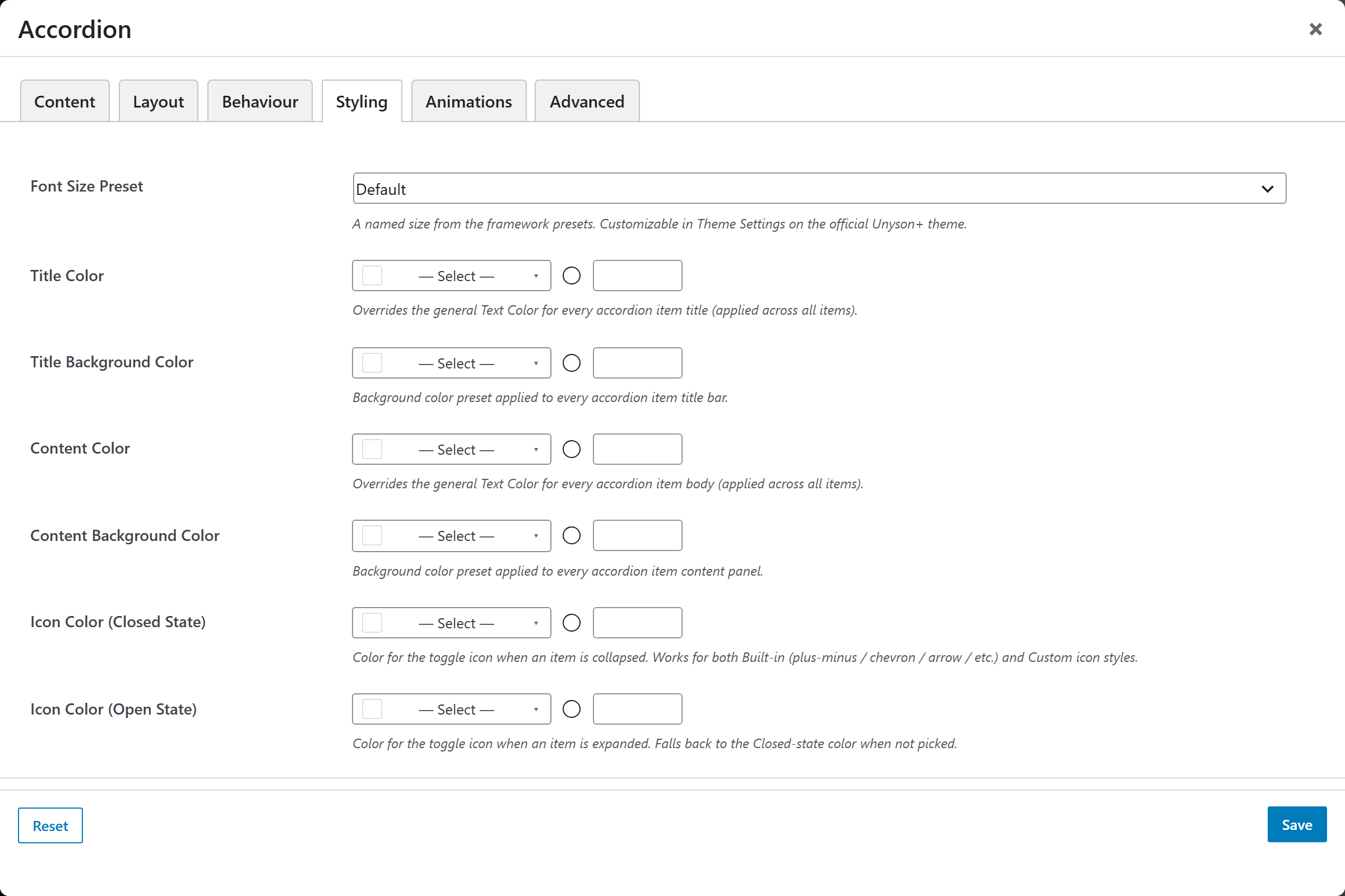
Per-state Title, Content and Icon colors (closed/open), Background Color, and Margin & Padding.