Carousel
A flexible, touch-friendly carousel/slider. Each slide can carry an image, heading, text and button. Supports multiple slides per view, autoplay, loop, arrows and dots (built on Splide). Tabs: Slides, Layout, Behavior, Style, Animations, Advanced.
Slides
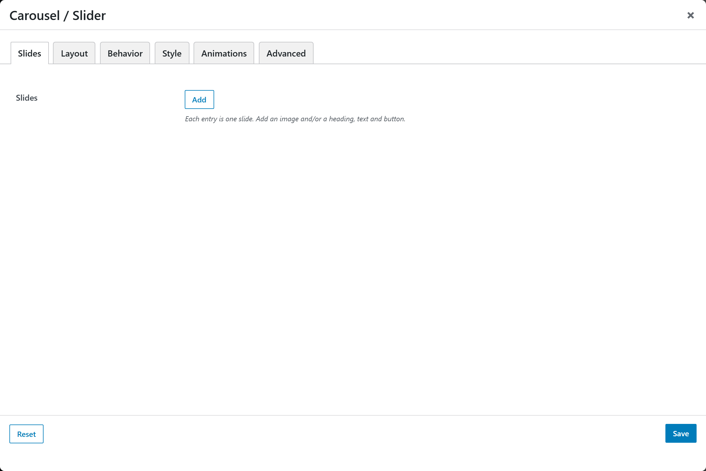
- Slides — a repeatable list; each slide has an Image, Heading, Text and a Button (label + link).
Layout
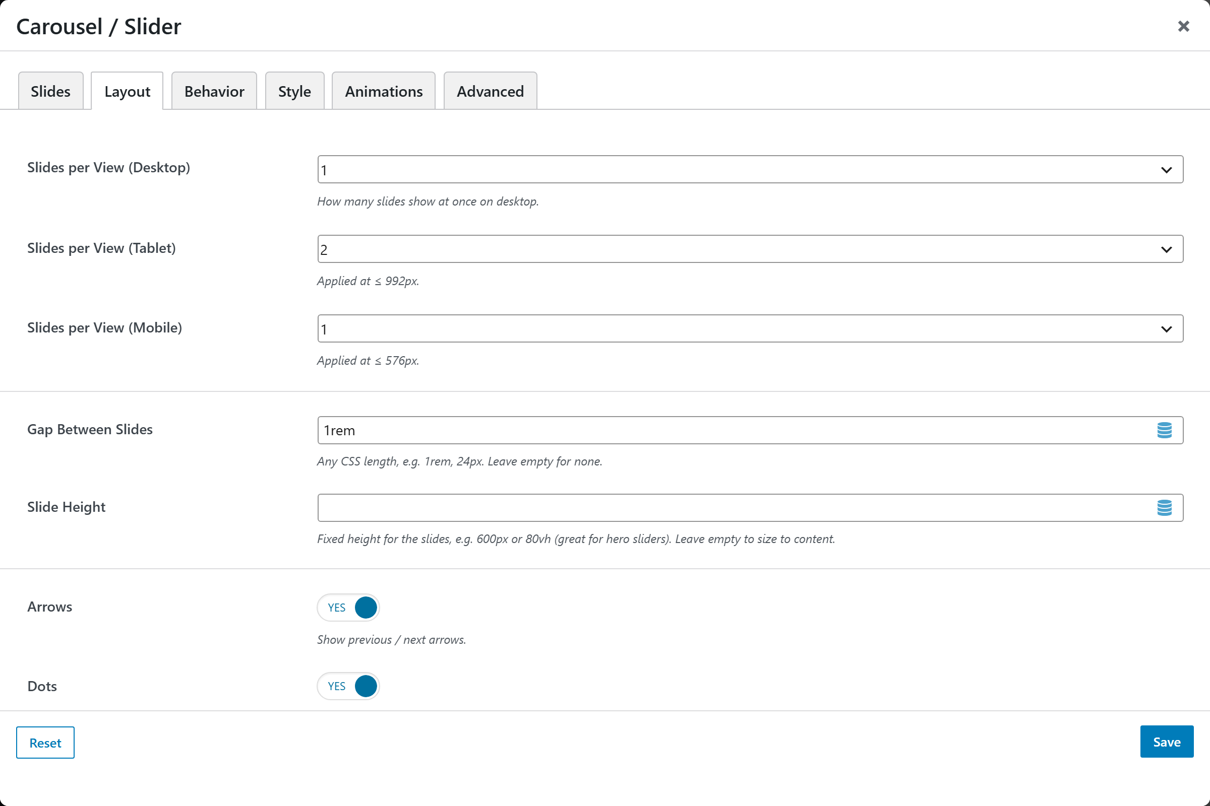
| Option | Choices |
|---|---|
| Per Page (Desktop) | 1–6 slides per view |
| Per Page (Tablet) | 1–6 slides per view (≤992px) |
| Per Page (Mobile) | 1–6 slides per view (≤576px) |
| Gap Between Slides | CSS length (e.g. 1rem) |
| Slide Height | Fixed height (e.g. 600px, 80vh) or empty to fit content |
| Arrows | On/Off |
| Dots | On/Off |
Behavior
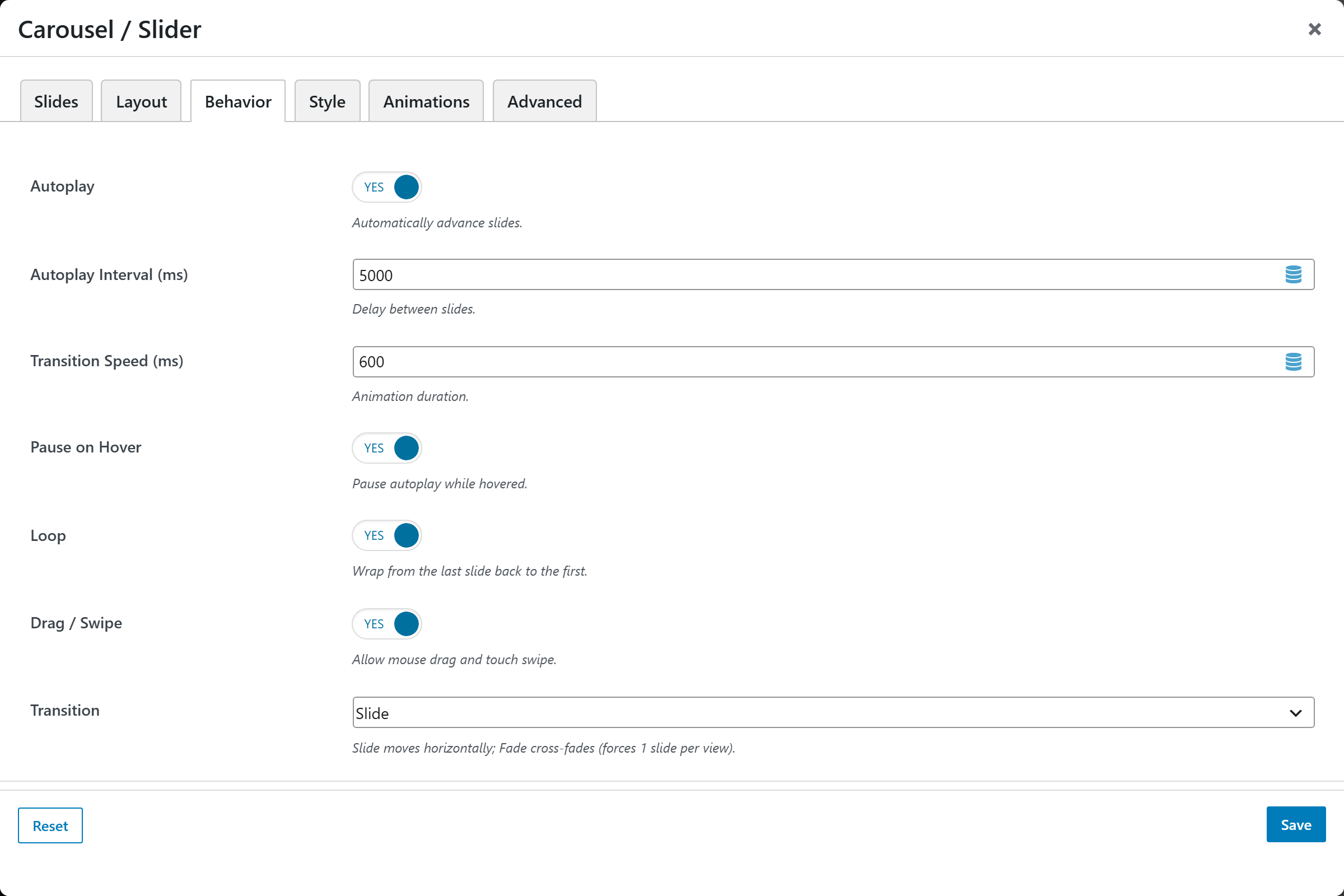
| Option | Choices |
|---|---|
| Autoplay | On/Off |
| Autoplay Interval (ms) | Default 5000 |
| Transition Speed (ms) | Default 600 |
| Pause on Hover | On/Off |
| Loop | On/Off |
| Drag / Swipe | On/Off |
| Transition | Slide, Fade |
Style
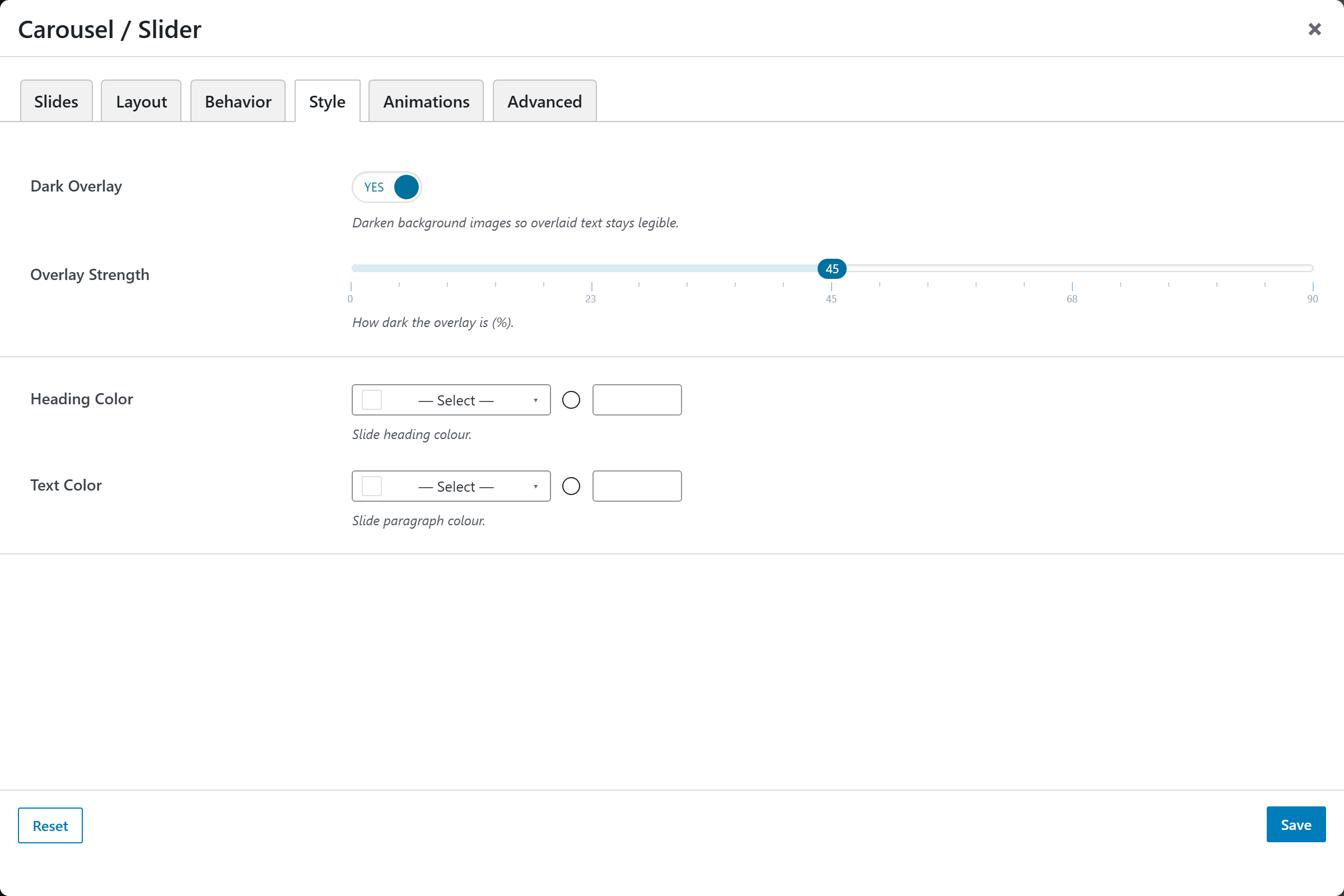
Dark Overlay (On/Off) and Overlay Strength (0–90%) for legibility over images, plus Heading Color and Text Color.