Flip Box
A two-sided card that flips on hover or click — icon/title on the front, text + button on the back — with four flip directions and several designs. Tabs: Content, Design, Styling, Animations, Advanced.
Content
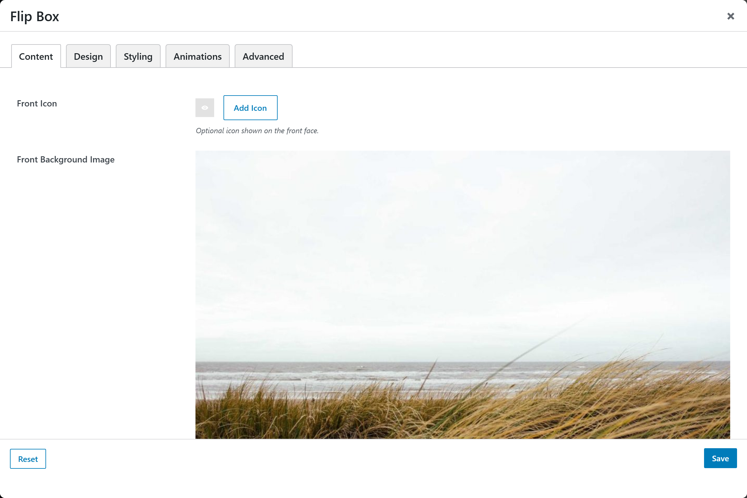
| Option | Notes |
|---|---|
| Front Icon | Optional icon |
| Front Background Image | Optional image behind the front face |
| Front Title | Default Hover Me |
| Front Text | Front description |
| Back Title | Default More Info |
| Back Text | Back description |
| Button Label / URL | Optional call-to-action on the back |
| Open in New Tab | On/Off |
Design
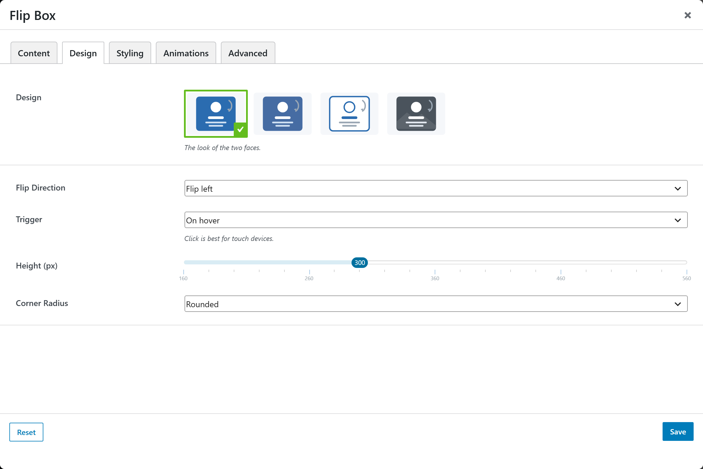
| Option | Choices |
|---|---|
| Design | Solid · Outline · Gradient · Image-front · … |
| Flip Direction | Flip left · right · up · down |
| Trigger | On hover · On click/tap |
| Height | 160–560px |
| Corner Radius | Square · Rounded · Large |
Styling
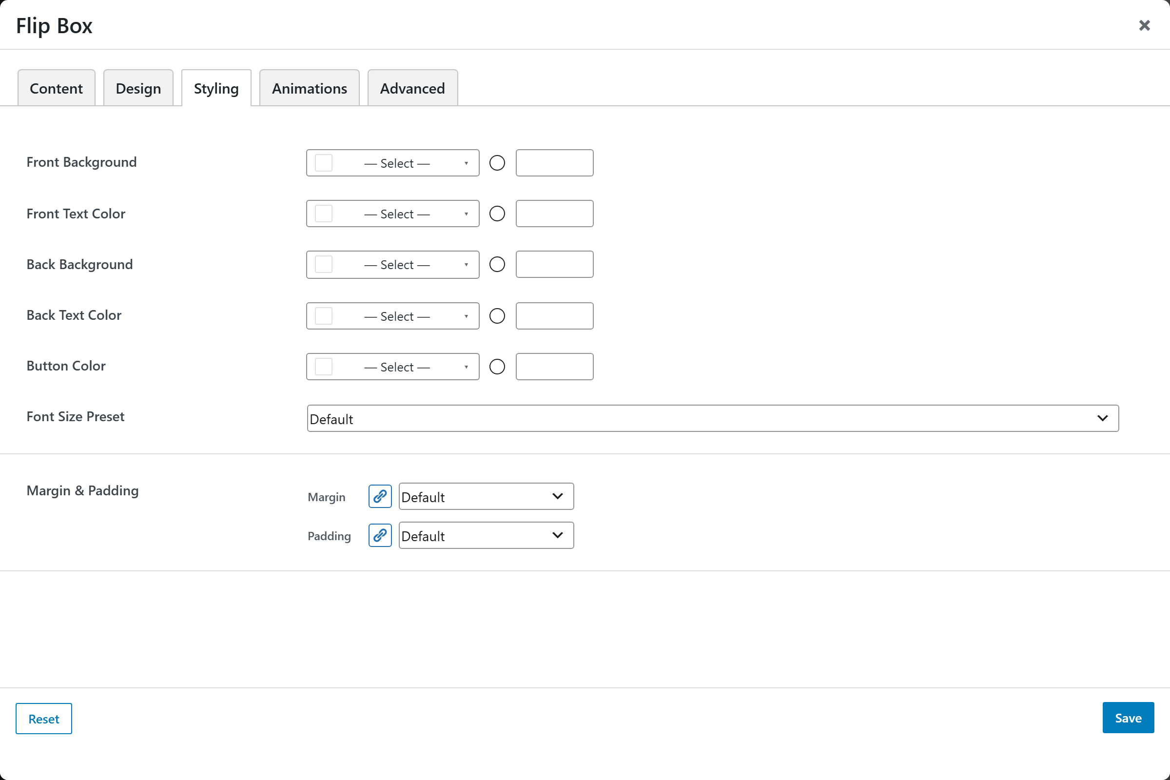
Per-face Front / Back Background and Text Color, Button Color, a Font Size Preset, and Margin & Padding.