Progress Bars
Animated skill / progress indicators (label + percentage) that fill to their value when scrolled into view. Tabs: Bars, Style, Animations, Advanced.
Bars
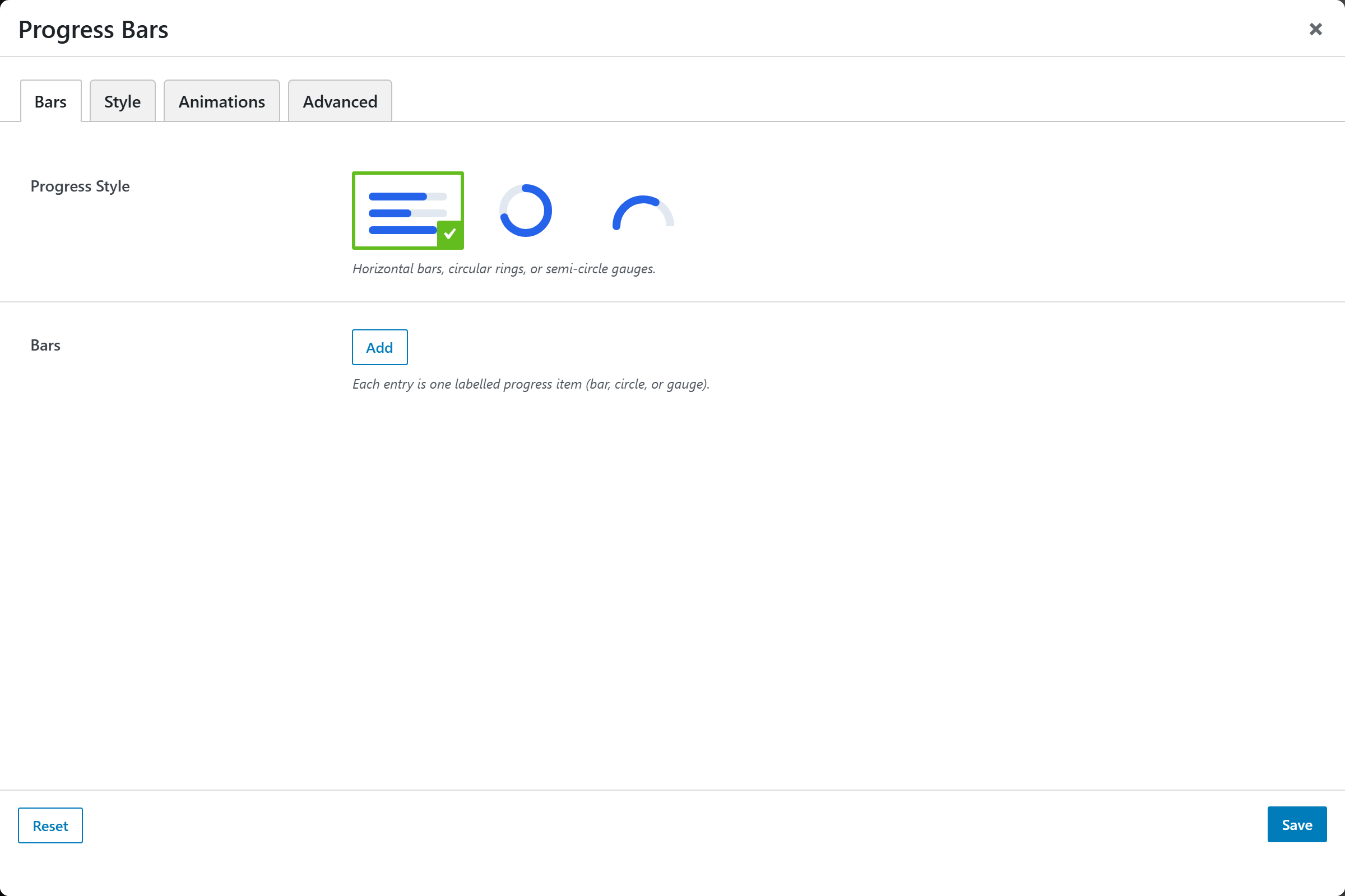
| Option | Choices |
|---|---|
| Progress Style | Horizontal Bar · Circle · Gauge (semi-circle) |
| Bars | A repeatable list; each bar has a Label, Percent (0–100), Icon and Color |
The Circle and Gauge styles add Diameter / Width, Thickness and Per Row (1–6) options.
Style
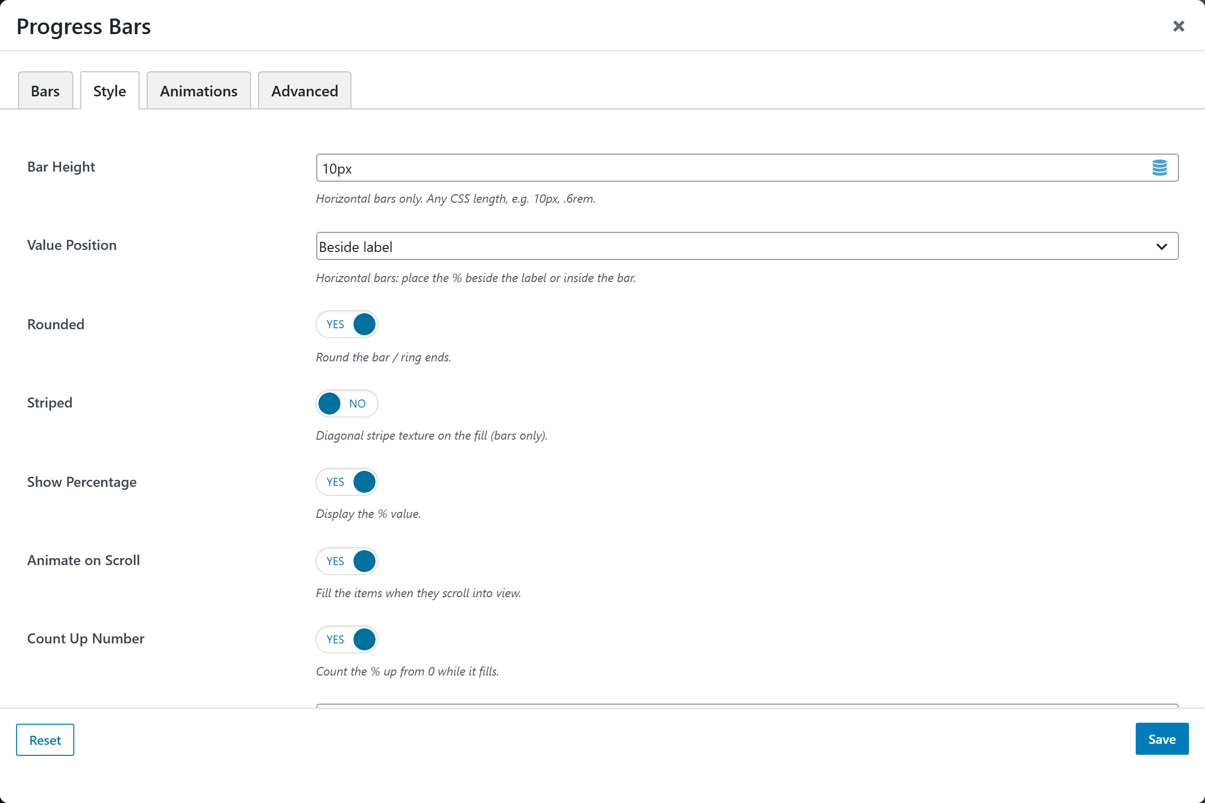
| Option | Choices |
|---|---|
| Bar Height | e.g. 10px, .6rem (bars only) |
| Value Position | Beside label · Inside the bar (bars only) |
| Rounded | On/Off |
| Striped | On/Off (bars only) |
| Show Percentage | On/Off |
| Animate on Scroll | On/Off |
| Count Up Number | On/Off |
| Spacing | Gap between items |
Plus Fill Color, an optional Gradient Color (second color), Track Color (unfilled track) and Label Color.