Scroll to Top & Progress
A back-to-top button and/or a reading-progress bar tied to page scroll — place it once per page. Configure it across the General, Styling, and Advanced tabs.
General
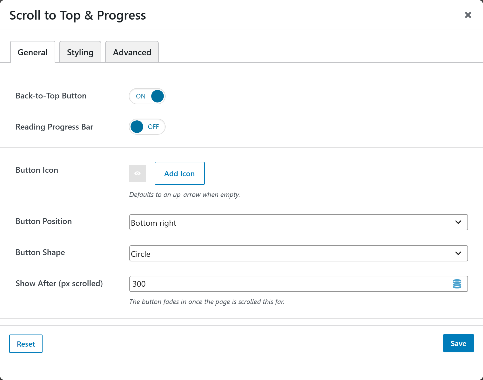
- Back-to-Top Button — switch to show the floating scroll-to-top button. Choices: On / Off (default On).
- Reading Progress Bar — switch to show a scroll-progress bar. Choices: On / Off (default Off).
- Button Icon — icon shown on the button; defaults to an up-arrow when empty.
- Button Position — where the button sits. Choices: Bottom right / Bottom left (default Bottom right).
- Button Shape — Circle / Rounded / Square (default Circle).
- Show After (px scrolled) — the button fades in once the page is scrolled this far. Defaults to 300.
- Progress Bar Position — Top of viewport / Bottom of viewport (default Top).
- Progress Bar Height (px) — thickness of the progress bar. Defaults to 4.
Styling
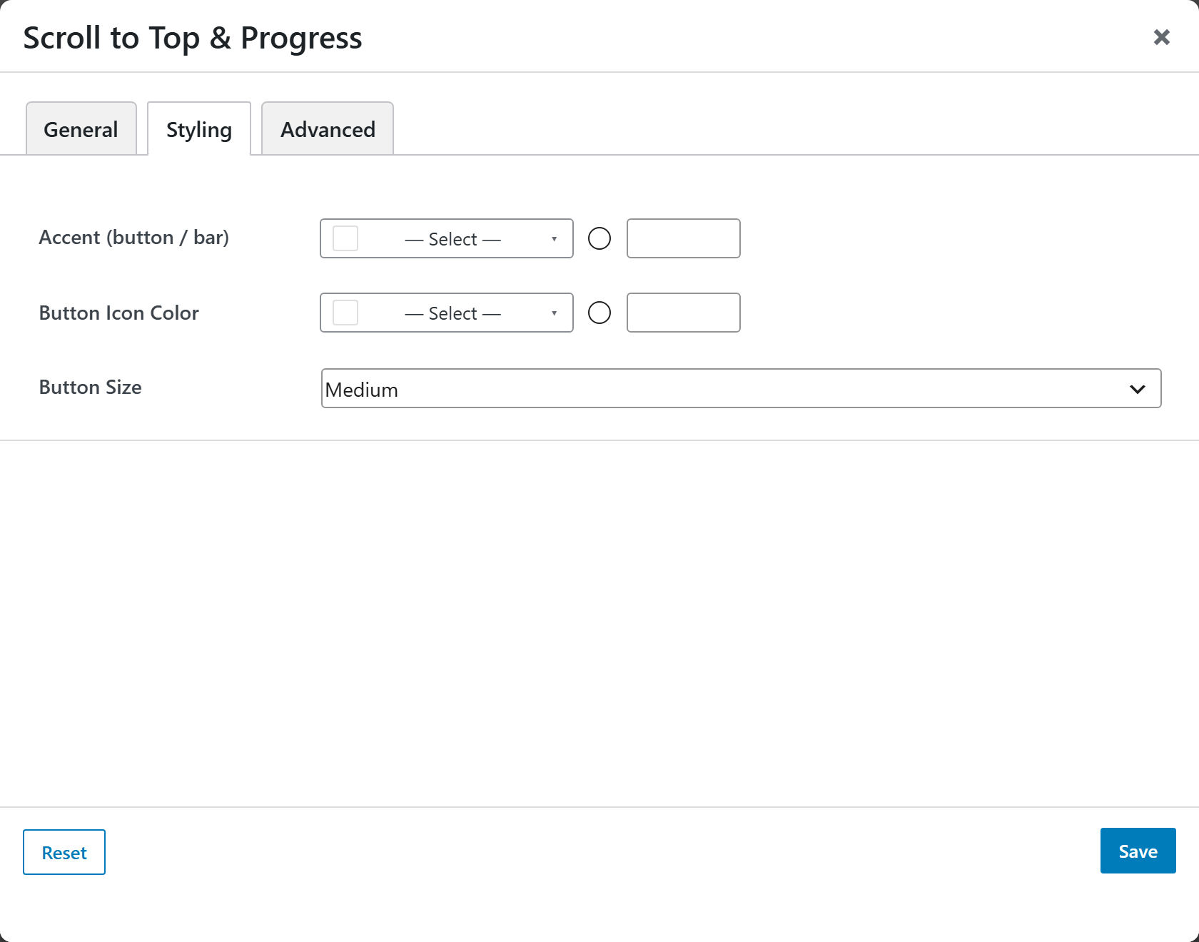
- Accent (button / bar) — background color of the button and progress bar.
- Button Icon Color — color of the button's icon.
- Button Size — Small / Medium / Large (default Medium).
Advanced
Custom CSS class/ID, responsive visibility toggles, custom attributes, and margin/padding.