Tabs
Tabbed content panels — or, in the Media panel layout, a list-of-tabs beside a switching image (a feature/product showcase). Tabs: Content, Styling, Animations, Advanced.
Click/hover showcase vs. scroll-pinned
Set Layout → Media panel for a list on one side and an image that switches on click or hover (with optional Auto-rotate) on the other — each tab has its own image. For the scroll-pinned cinematic version (the image pins while steps scroll, Apple/Stripe style), use the Animation Engine → Scrollytelling module on a Section instead.
Content
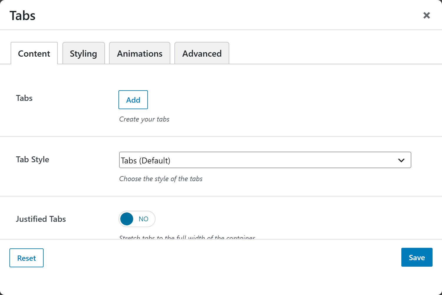
- Tabs — a repeatable list; each tab has a Title, Content (rich text), an Image (used by the Media layout — its Content becomes the caption), an optional Badge, and an Active Tab switch.
Layout & style
| Option | Choices |
|---|---|
| Tab Style | Tabs (default), Pills, Underline, Segmented Toggle |
| Justified Tabs | On/Off (stretch tabs to full width) |
| Tab Alignment | Start (default), Center, End |
| Tabs Orientation | Horizontal, Vertical (Content layout) |
| Layout | Content panels (default) · Media panel (list + image) |
| Image Side | Image Right (default) · Image Left (Media layout) |
| Activate On | Click (default) · Hover |
| Auto-rotate | On/Off, with an interval (seconds) — pauses on hover/focus |
| Fade Animation | On/Off |
Screenshots — tab styles & orientation
Capture each style and orientation: tabs-default, tabs-pills, tabs-underline,
tabs-vertical.
Styling
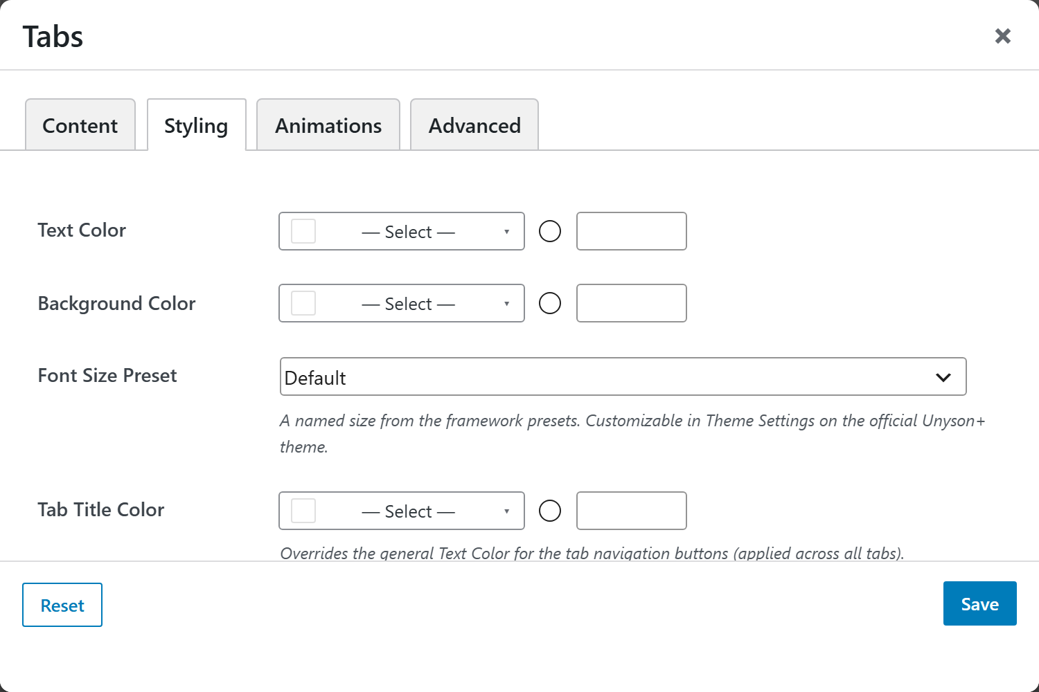
Tab Title Color, Tab Content Color, Text Color, Background Color, and Margin & Padding.