Tooltip
A trigger (text, icon or button) that reveals a tooltip on hover, focus or click — four positions and themes. Tabs: Content, Design, Styling, Animations, Advanced.
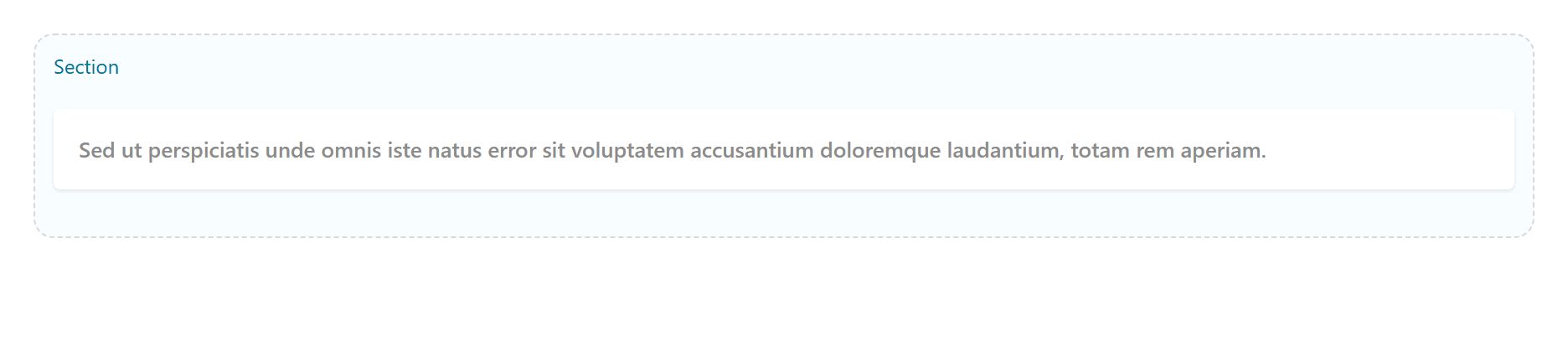
Content
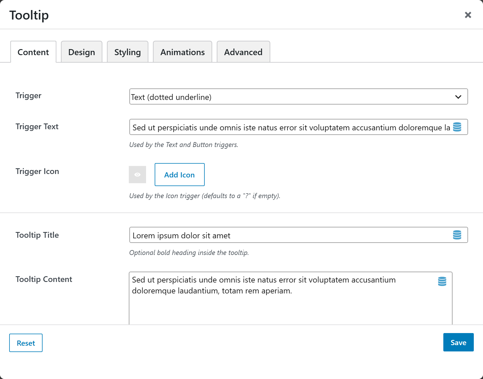
| Option | Choices |
|---|---|
| Trigger | Text (dotted underline) · Button · Icon |
| Trigger Text | Default hover me |
| Trigger Icon | Defaults to ? if empty |
| Tooltip Title | Optional |
| Tooltip Content | Basic HTML allowed |
Design
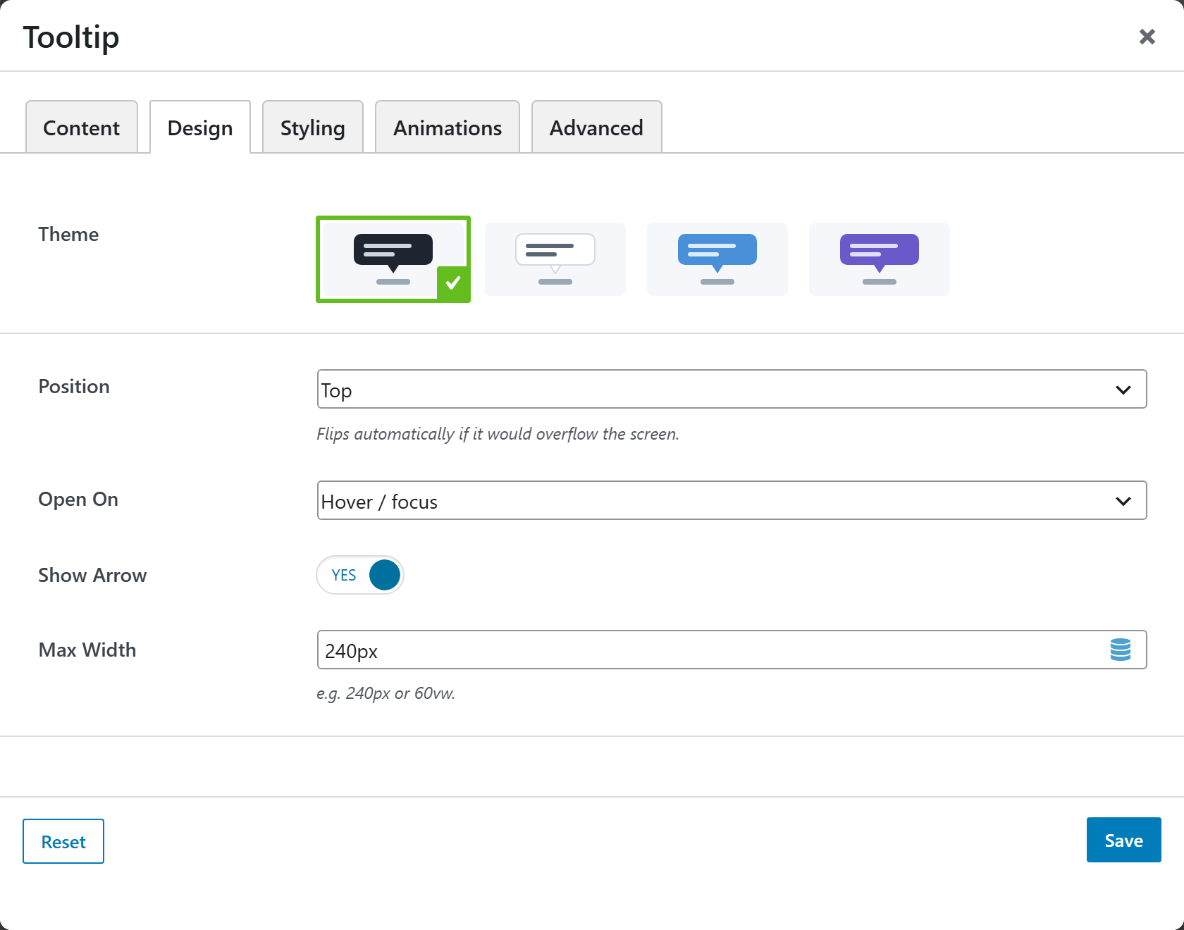
| Option | Choices |
|---|---|
| Theme | Dark · Light · Success · Error · Warning · Info |
| Position | Top · Right · Bottom · Left (auto-flips on overflow) |
| Open On | Hover / focus · Click / tap |
| Show Arrow | On/Off |
| Max Width | Default 240px |
Styling
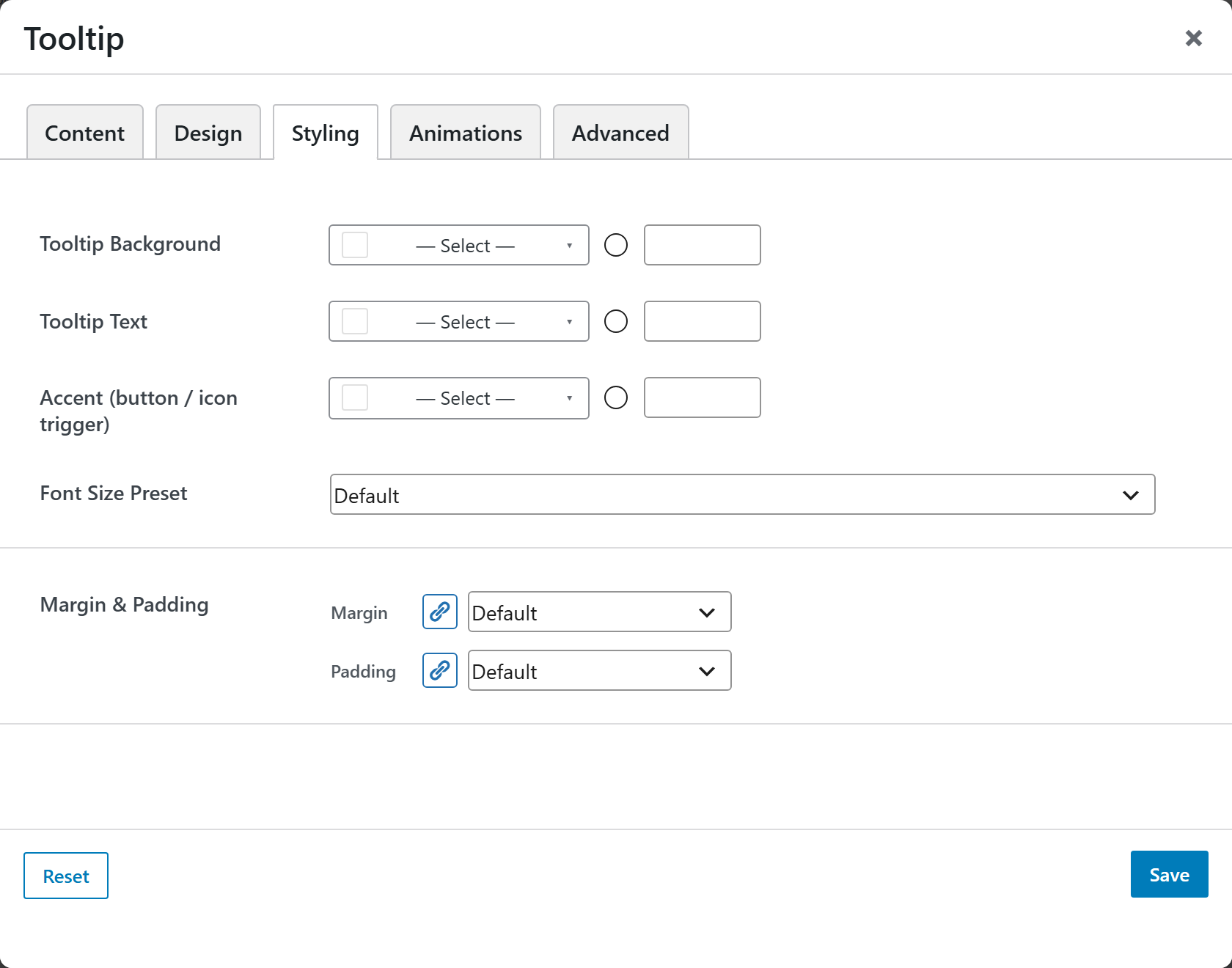
Tooltip Background, Tooltip Text, Accent (button/icon trigger), a Font Size Preset, and Margin & Padding.