Before / After
An interactive two-image element with two Types: a classic Comparison slider (drag, hover or click to reveal, in many handle styles) and a cursor-following Spotlight reveal. Either type can also fill its Section as a background, with the Section's own content sitting on top — ideal for a hero whose backdrop wipes or reveals under the cursor. Its options are organized across the Content, Design, Styling, Animations, and Advanced tabs.
Content
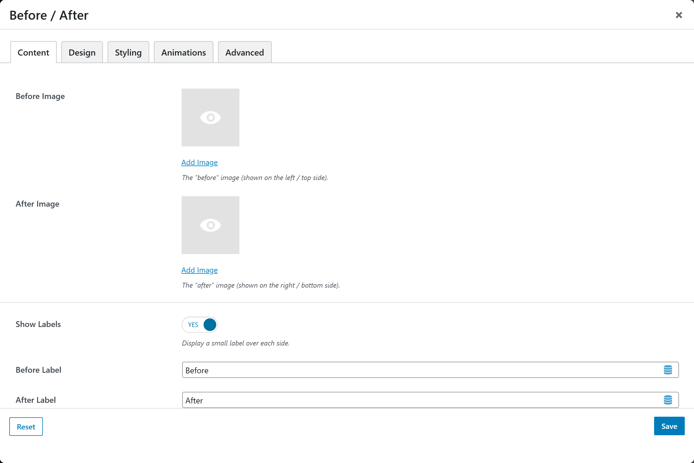
You supply two images that are stacked and revealed against each other:
- Before Image — the base image. In Comparison it is the "before" side (left / top); in Spotlight it is what shows normally (the After image is revealed under the cursor). For the cleanest result, use two images with the same dimensions and framing.
- After Image — the revealed image. In Comparison it is the "after" side (right / bottom); in Spotlight it is revealed inside the circular spotlight under the pointer. Use the same size as the Before image so the two line up pixel-for-pixel.
Design
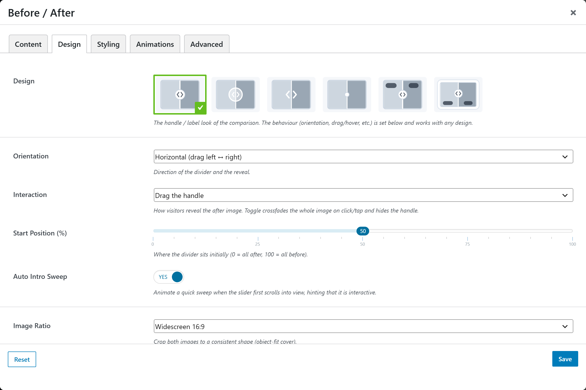
At the top of the Design tab, the Type picker chooses how the two images behave. The options below it change to match the selected type, followed by the shared image-framing and background options.
Type
- Comparison slider (default) — a divider sweeps between the two images, driven by dragging a handle, following the cursor, or a click-to-crossfade.
- Spotlight reveal — a soft circle follows the pointer, revealing the After image beneath the Before image (the "Lithos" effect).
Comparison options
- Design — image-picker of the handle / label look (default
classic). Choices:Classic(round knob + chevrons),Circle knob,Arrows(no ring),Minimal line,Invisible(no line and no handle — a clean, chrome-less wipe that pairs beautifully with the Follow the cursor interaction, especially as a background),Labeled badges,Framed card. All designs share the same slider engine, so the behavior below works with any design. - Orientation — the divider direction;
Horizontal (drag left ↔ right)(default) orVertical (drag up ↕ down). - Interaction — how visitors reveal the after image;
Drag the handle(default),Follow the cursor (hover),Click to toggle (crossfade). Toggle crossfades the whole image on click/tap and hides the handle. - Start Position (%) — slider (0–100, default
50) for where the divider sits initially (0 = all after, 100 = all before). - Auto Intro Sweep — switch (
yes/no; defaultyes) to animate a quick sweep when the slider first scrolls into view. Ignored for Click-to-toggle. - Handle Size — the drag handle / knob size;
Small,Medium(default),Large. - Show Labels — switch (
yes/no; defaultyes) to display a small label over each side. The Labeled and Framed designs always show labels regardless of this switch. - Before Label / After Label — text for each side's label (defaults
Before/After).
Spotlight options
- Spotlight Radius (px) — slider (60–700, default
240) for the size of the circular reveal that follows the cursor. - Edge Softness (%) — slider (0–95, default
55) for how feathered the spotlight edge is.0= a hard circle; higher = a soft, gradual fade. - Smooth Follow — switch (default
yes); the spotlight eases toward the cursor for a fluid, slightly trailing feel. Off = it tracks the pointer exactly. - Idle Reveal — switch (default
yes); before the visitor moves the pointer (and on touch, where there is no hover), the spotlight rests in the center so the effect is discoverable.
Shared framing & background
- Use as Section Background — switch (
yes/no; defaultno). Fills the parent Section and sits behind its content — the Section's own elements are automatically lifted on top. Works with either Type; pairs best with the Spotlight type or the Comparison Follow the cursor interaction (try the Invisible design for a chrome-less hero whose backdrop reveals under the cursor). When on, the Max Width / Image Ratio / Corner Radius below are ignored — the element stretches to cover its Section, so give the Section a min-height to fill. - Image Ratio — crop both images to a consistent shape via
object-fit: cover;Original (uncropped),Square 1:1,Landscape 4:3,Landscape 3:2,Widescreen 16:9(default),Portrait 3:4,Portrait 2:3. Ignored in background mode. - Max Width — optional text to constrain the width (e.g.
800pxor80%). Blank = full width. Ignored in background mode. - Corner Radius —
Square,Rounded(default),Large. Ignored in background mode.
Styling
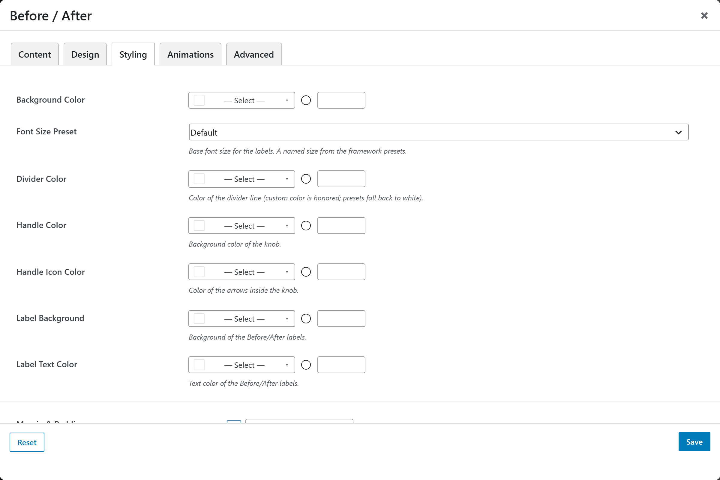
- Background Color — compact color picker for the wrapper background.
- Font Size — base font size for the labels (a named size from the framework presets).
- Divider Color — color of the divider line (Comparison only; custom color is honored, presets fall back to white).
- Handle Color — background color of the knob (Comparison only).
- Handle Icon Color — color of the arrows inside the knob (Comparison only).
- Label Background — background of the Before/After labels (Comparison only).
- Label Text Color — text color of the Before/After labels (Comparison only).
- Margin & Padding — spacing control. All Sides applies to every side at once; any per-side value overrides it for that direction.
Animations
Standard entrance-animation controls (effect, duration, delay, offset).
Advanced
Custom CSS class/ID, responsive visibility toggles, custom attributes, and margin/padding.