Gallery
A flexible image gallery with seven layout designs, a built-in lightbox and captions. Tabs: Content, Design, Style, Animations, Advanced.
Content
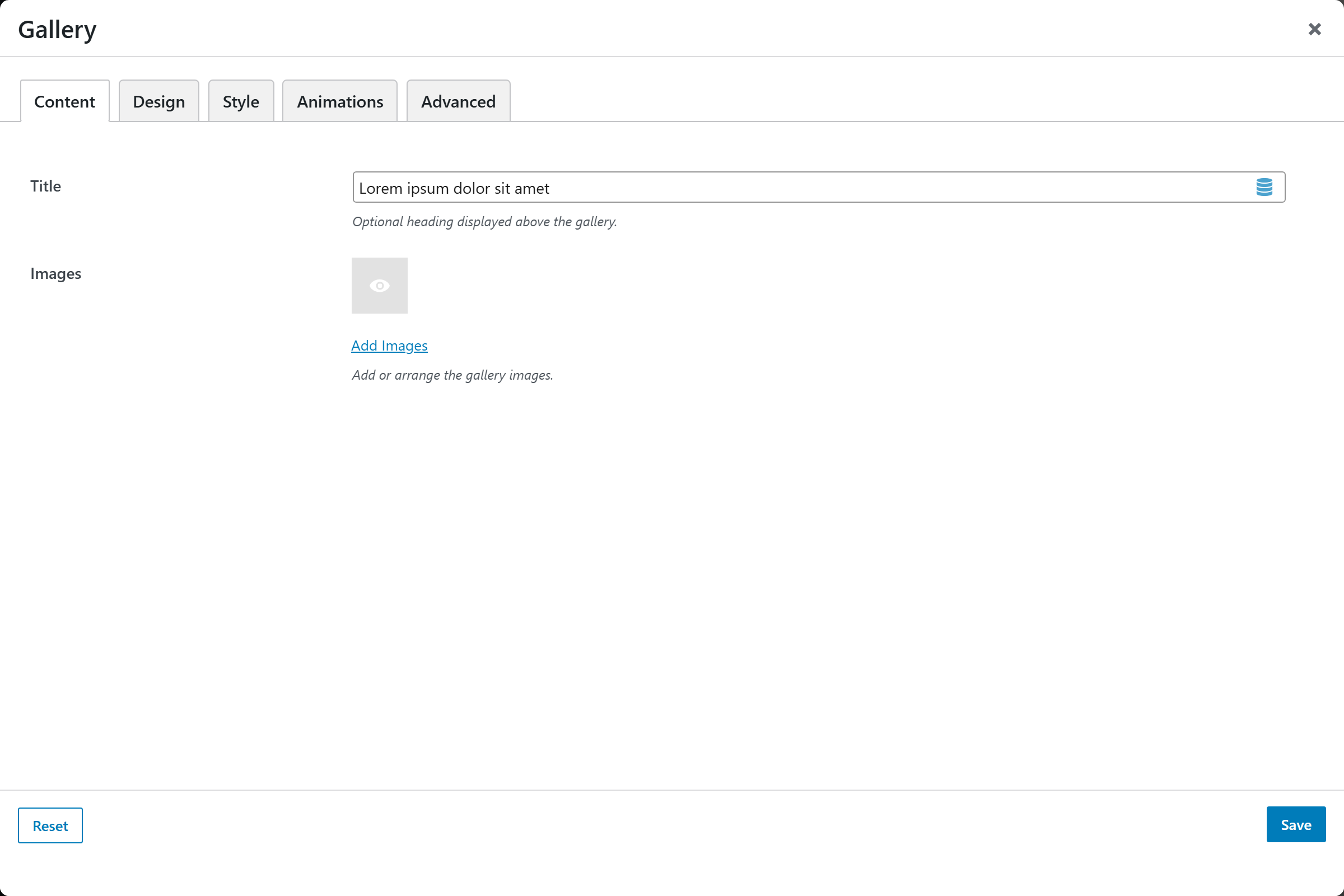
- Title — optional heading above the gallery.
- Images — the gallery images (multi-upload).
Design
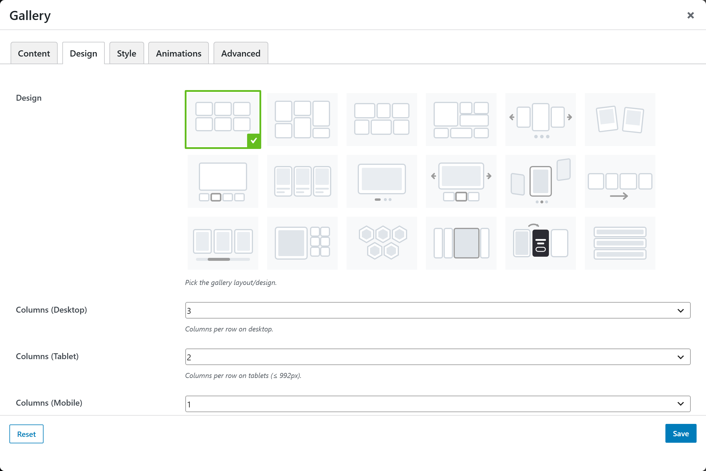
| Option | Choices |
|---|---|
| Design | Grid · Masonry · Justified · Metro · Carousel · Polaroid · Showcase |
Each design reveals its own options:
- Grid / Masonry / Polaroid — Columns (Desktop / Tablet / Mobile, 1–6), Gap (0–60px), Image Ratio (Square 1:1, Landscape 4:3, Photo 3:2, Wide 16:9, Portrait 3:4, Original).
- Justified — Target Row Height (120–420px), Gap.
- Metro — Columns (Desktop), Gap.
- Carousel — Slides per View, Image Ratio, Gap, Autoplay (+ Interval, Loop, Pause on Hover), Show Arrows, Show Dots.
- Showcase — Image Ratio, Thumbnail Position (Below · Left · Right), Gap.
Style
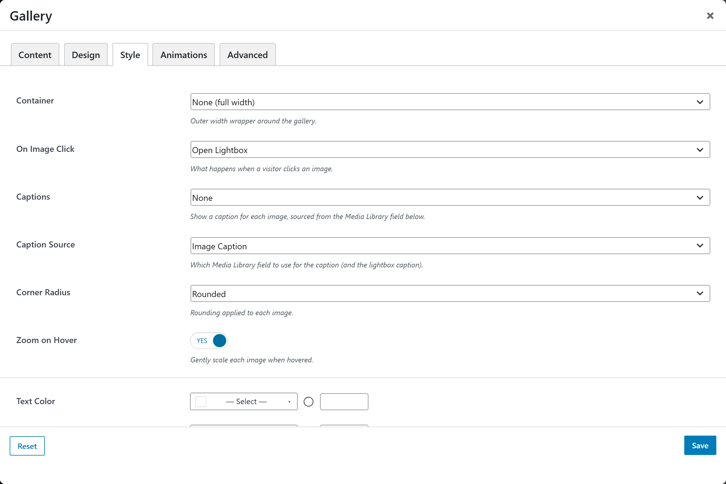
| Option | Choices |
|---|---|
| Container | None (full width) · Container · Fluid |
| On Image Click | Open Lightbox · Open Full Image · Go to Attachment Page · Do Nothing |
| Captions | None · Overlay on Hover · Below the Image |
| Caption Source | Image Caption · Image Title · Alt Text · Description |
| Image Style | Any Image Style preset — crop, corners, mask, filter, scrim (Theme Settings → Components → Image Styles) |
| Zoom on Hover | On/Off |
Plus Text / Background / Title / Caption Color, a Font Size Preset, and Margin & Padding.