Image Box
An image paired with a heading, text and link, rendered in one of five layout families (Stacked, Side, Overlay, Card, Frame) — each with its own variations — plus a universal image size control and reusable Image Style presets. Its options are organized across the Content, Design, Effects & Link, Styling, Animations, and Advanced tabs.
Content
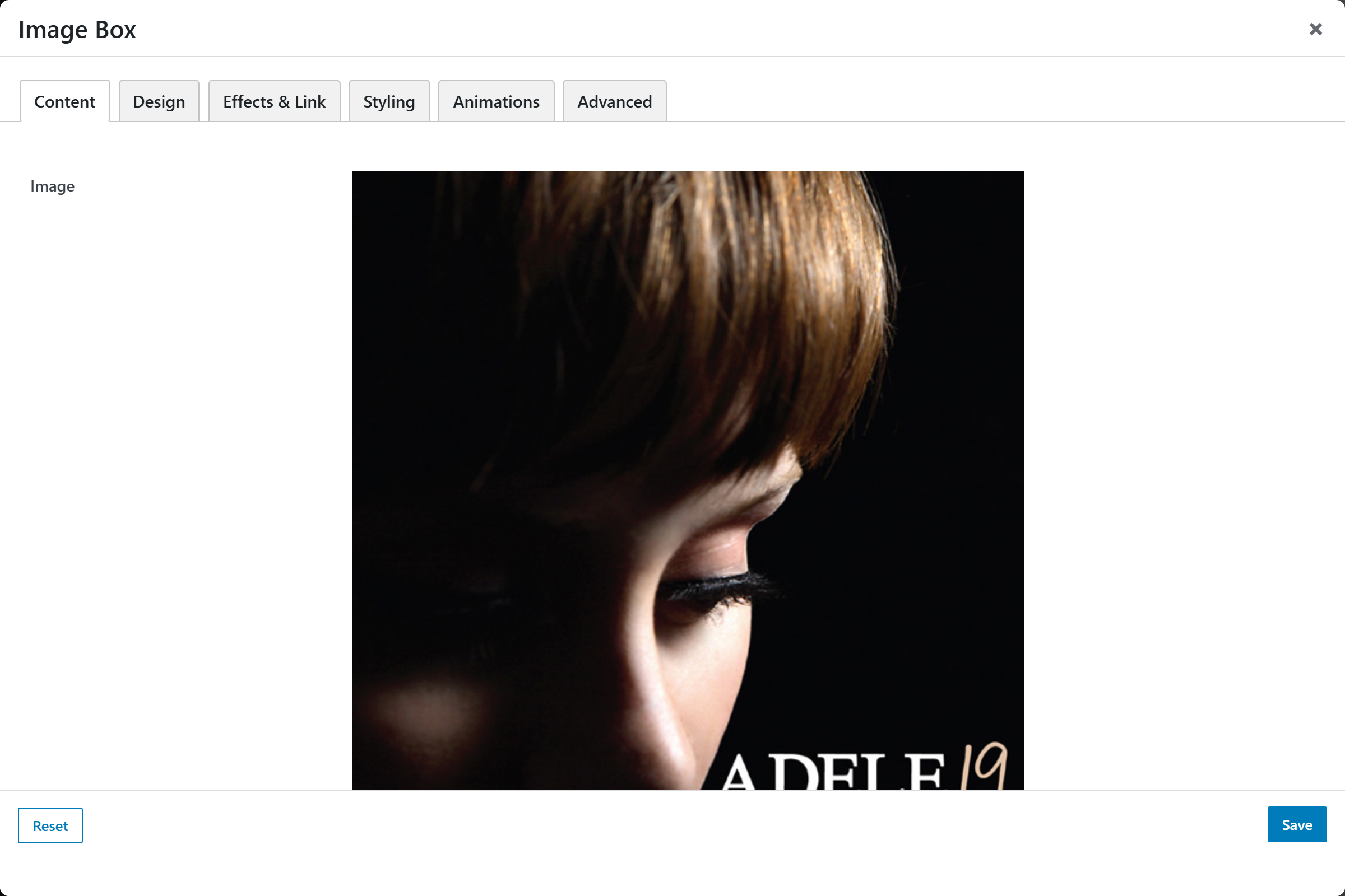
- Image — upload a new image or choose one from the media library. Pick a source larger than the display size so it stays sharp.
- Alt Text Override — optional text. Leave blank to use the alt text saved on the image in the media library; leave empty for a purely decorative image.
- Eyebrow / Subtitle — small line shown above the title (e.g. a category like "Web Development"). Blank to hide.
- Title — the main heading. Leave blank to render an image-only box.
- Title HTML Tag — semantic tag for the title; choices
H2,H3(default),H4,H5,H6,Span (decorative, not a heading),Paragraph. - Text — optional textarea description shown below the title. On hover-overlay designs this is revealed over the image.
- Icon — optional icon (icon-v2 picker). Shown over the image on the Overlay family, or above the title on the Stacked family. Recolor it via Icon Color in Styling.
- Custom Icon (Emoji / SVG) — optional text. If filled, overrides the Icon picker; accepts an emoji or inline SVG markup (whose colors are fixed, so Icon Color won't affect them).
- Button / Link Style — select for the call-to-action under the text; choices
None(default),Button,Text link,Arrow link. - Button Label — text shown on the button / link (default
Read More). Ignored when Button / Link Style is None.
Design
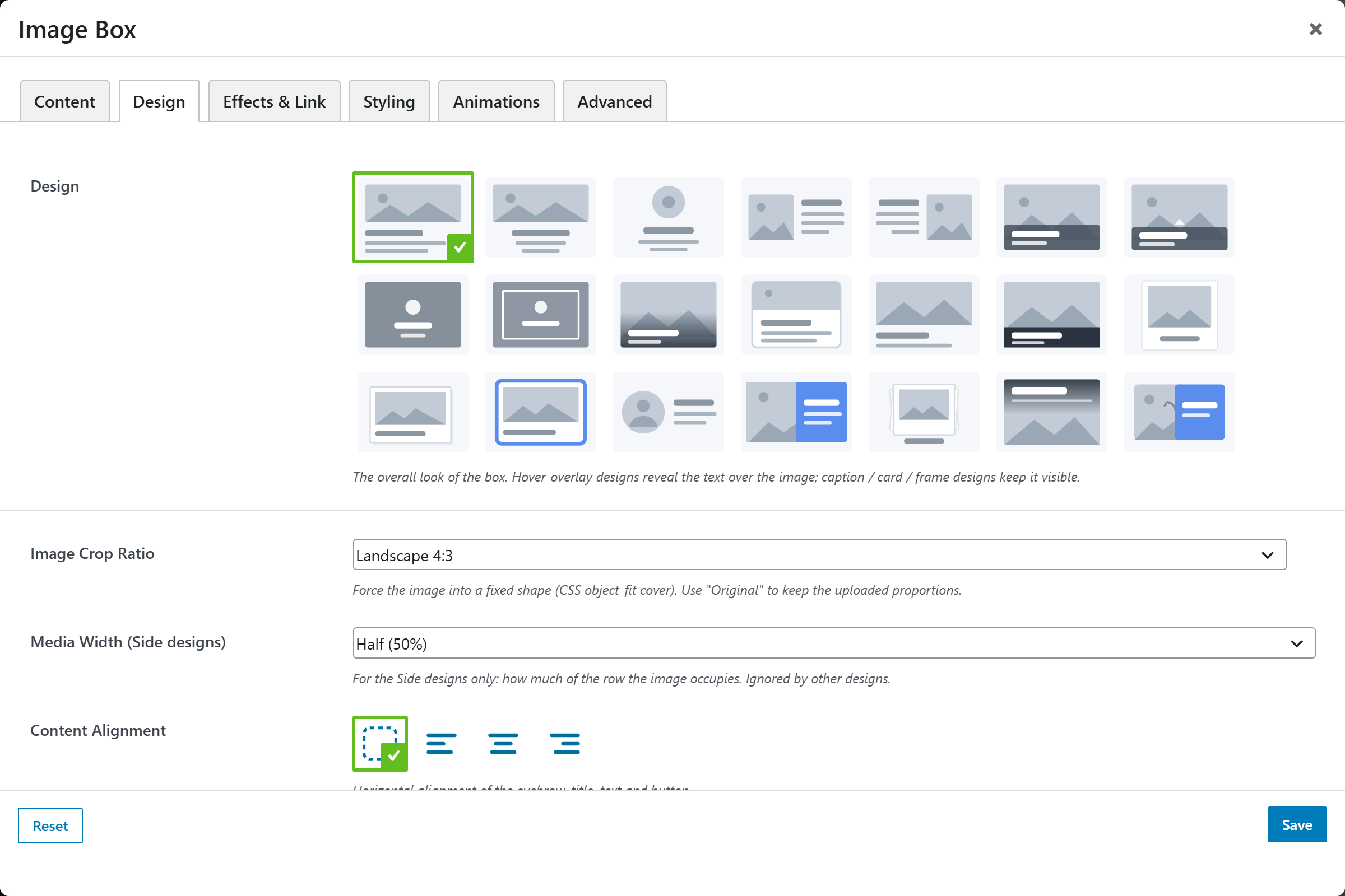
- Design — a compact popover picker of five layout families (default
Stacked). Selecting a family reveals only that family's variations in the panel:- Stacked — image, heading and text in a column. Reveals Stacking Order:
Image, Title, Text(default),Title, Image, Text,Title, Text, Image,Text, Image, Title. - Side — image beside the content. Reveals Image Side (
Left/Right), Colour Panel (fills the content half with the Accent colour as an equal-height split), and Media Width (33%,40%,50%(default),60%). - Overlay — content sits on the image. Reveals Reveal (
Gradient scrim (always visible)(default),Editorial cover (title at top),Overlapping panel (magazine),Solid caption bar,Fade in on hover,Slide up on hover,Centered on hover,Frame draw on hover), plus Overlay Colour and Overlay Opacity. - Card — reveals Card Style (
Bordered card/Clean caption strip). - Frame — reveals Frame Style (
Polaroid/Postcard/Bordered badge/Photo stack).
- Stacked — image, heading and text in a column. Reveals Stacking Order:
- Image Crop Ratio — select that forces the image into a fixed shape via
object-fit: cover; choicesOriginal (uncropped),Square 1:1,Landscape 4:3(default),Landscape 3:2,Widescreen 16:9,Portrait 3:4,Portrait 2:3. - Image Size — compact select for how large the image renders on the image-top families (Stacked, Card, Frame); choices
Full(default),Large (75%),Medium (55%),Small (35%),X-Small (140px). Small / X-Small centre the image — handy for a logo or avatar with a shape Mask. The Side family uses Media Width instead. - Content Alignment — alignment control (with Inherit) for the horizontal alignment of the eyebrow, title, text and button. Leave on Inherit to use each design's default.
Effects & Link
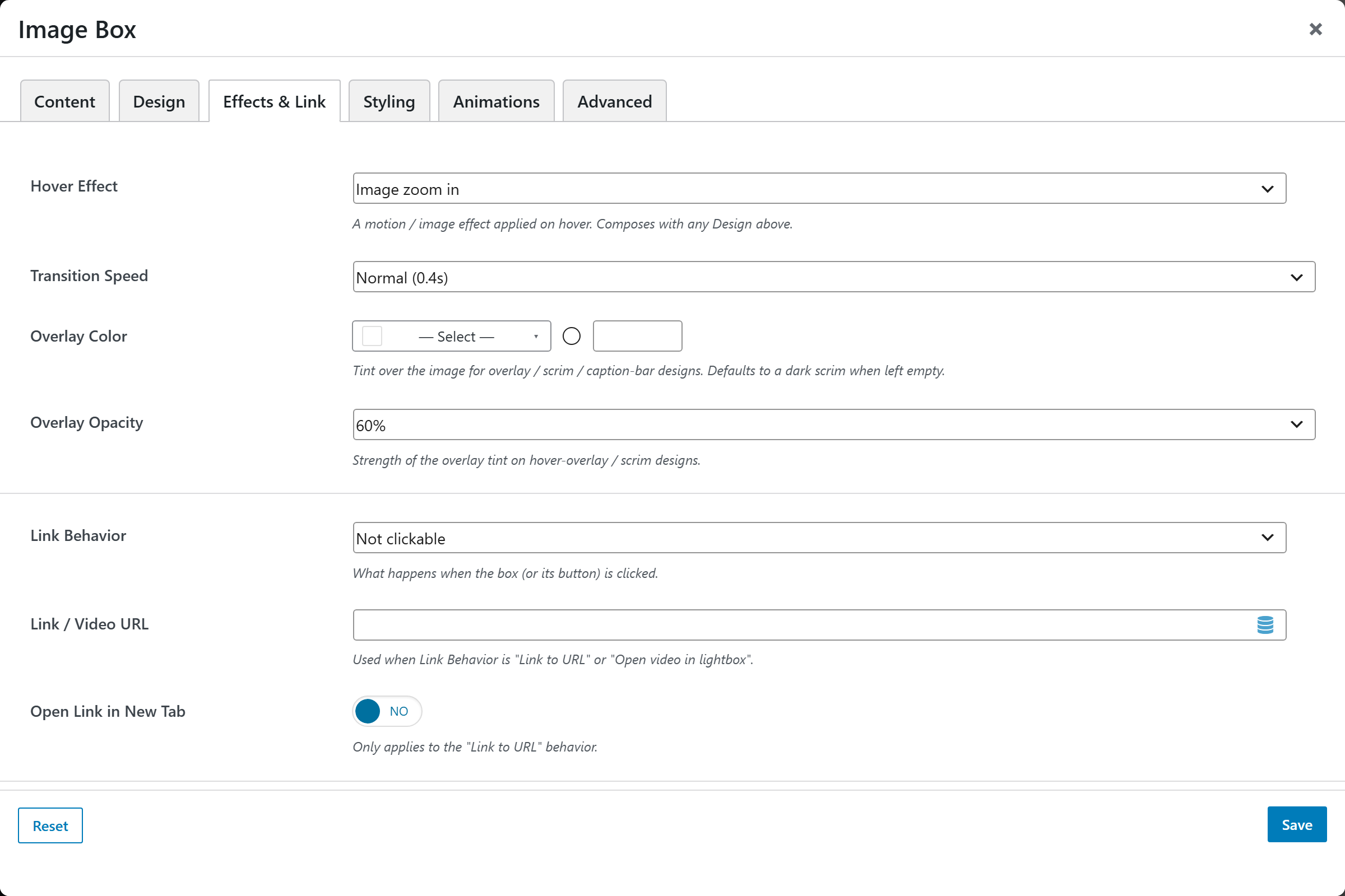
- Hover Effect — select for a motion / image effect on hover (composes with the Design); choices
None,Image zoom in(default),Image zoom out,Grayscale → Color,Image blur,Shine sweep,Lift card,3D tilt. - Transition Speed — select; choices
Fast (0.2s),Normal (0.4s)(default),Slow (0.7s). - Link Behavior — select for what happens on click; choices
Not clickable(default),Link to URL,Open image in lightbox,Open video in lightbox. - Link / Video URL — full URL used when Link Behavior is "Link to URL" or "Open video in lightbox" (a YouTube / Vimeo page URL or a direct
.mp4). Ignored for the lightbox-image and not-clickable behaviors. - Open Link in New Tab — switch (
_blank/_self; default_self). Only applies to the "Link to URL" behavior.
Styling
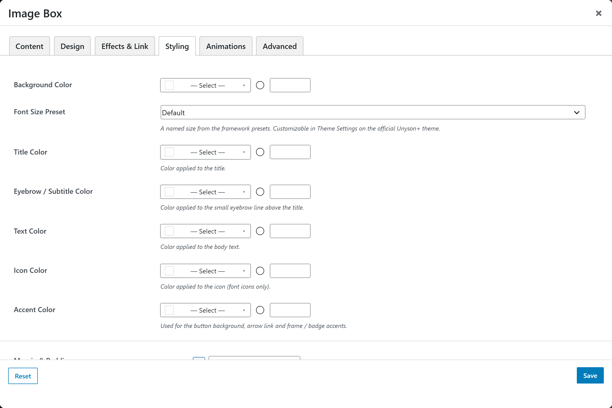
- Image Style — a live-preview picker of the reusable Image Style presets (crop ratio, corner radius, shape mask, filter, scrim), managed in Theme Settings → Components → Image Styles. This replaces the old per-element Image Mask option — the full shape library (circle, hexagon, heart, blobs, custom SVG / clip-path, …) now lives on the preset, so a mask defined once applies consistently across every element. Legacy saved masks keep rendering unchanged.
- Background Color — compact color picker for the box background.
- Font Size — a named size from the framework presets (customizable in Theme Settings on the official Unyson+ theme).
- Title Color — color applied to the title.
- Eyebrow / Subtitle Color — color applied to the small eyebrow line above the title.
- Text Color — color applied to the body text.
- Icon Color — color applied to the icon (font icons only).
- Accent Color — color used for the button background, arrow link and frame / badge accents.
- Margin & Padding — spacing control. All Sides applies to every side at once; any per-side value overrides it for that direction.
Animations
Standard entrance-animation controls (effect, duration, delay, offset).
Advanced
Custom CSS class/ID, responsive visibility toggles, custom attributes, and margin/padding.