Image Hotspots
An image with interactive pins, where each pin reveals a tooltip card with a title, text and link. Its options are organized across the Content, Design, Styling, Animations, and Advanced tabs.
Content
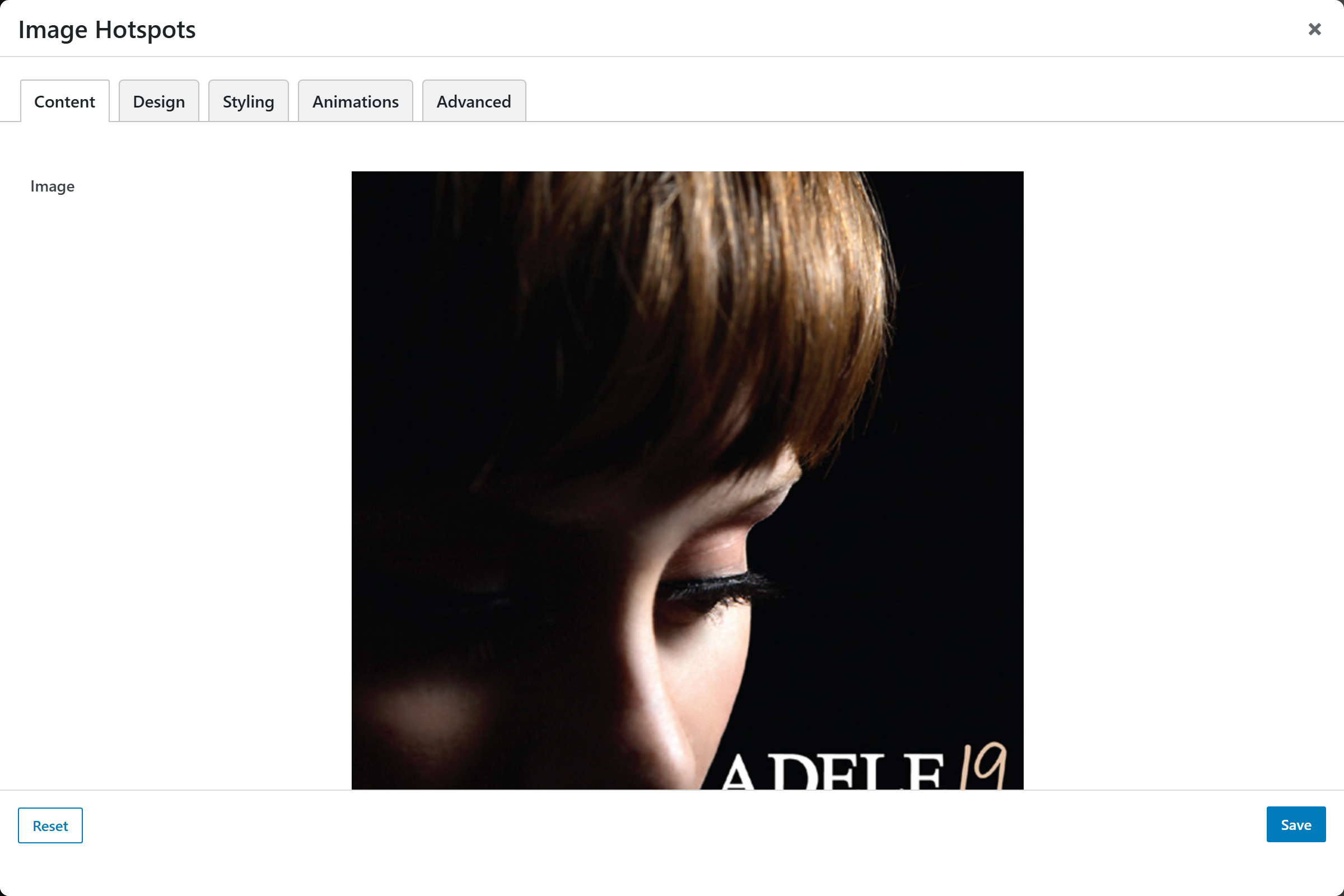
- Image — upload for the base image the pins are placed on.
- Hotspots — an addable-popup list of pins. Add as many as you need; each one opens an "Add / Edit Hotspot" popup with these sub-fields:
- Horizontal Position (%) — slider (0–100, default
50) for the pin's X position over the image. - Vertical Position (%) — slider (0–100, default
50) for the pin's Y position. - Pin Icon — icon-v2 picker used by the "Icon" pin design (defaults to
+). - Title — text for the tooltip card heading.
- Text — textarea for the tooltip body.
- Link Label — text for the optional link shown in the tooltip.
- Link URL — text for the link destination.
- Open in New Tab — switch (
_blank/_self; default_self).
- Horizontal Position (%) — slider (0–100, default
Design
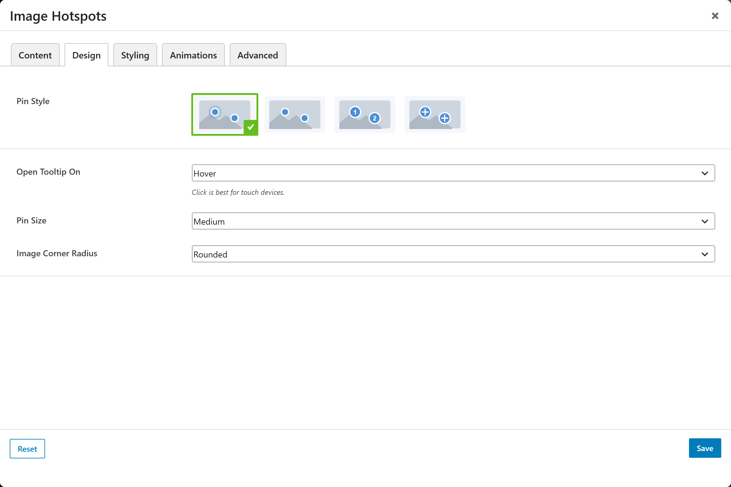
- Pin Style — image-picker of the pin appearance (default
pulse). Choices come from the design registry. - Open Tooltip On — select for the trigger; choices
Hover(default),Click / tap. Click is best for touch devices. - Pin Size — select; choices
Small,Medium(default),Large. - Image Corner Radius — select; choices
Square,Rounded(default),Large.
Styling
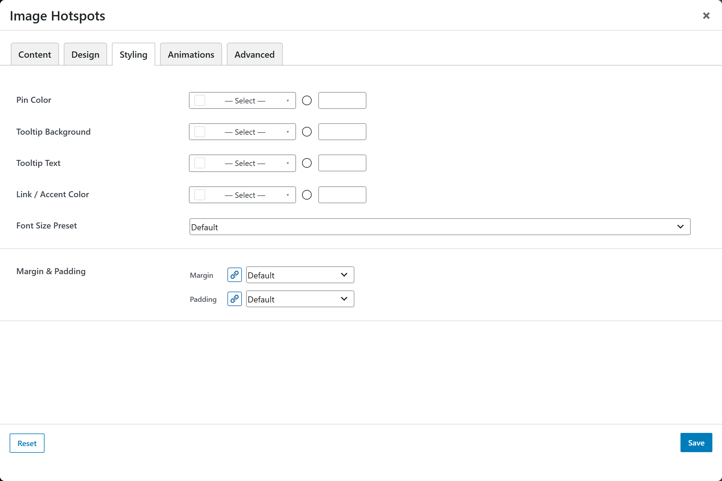
- Pin Color — compact color picker for the pins.
- Tooltip Background — compact color picker for the tooltip card background.
- Tooltip Text — color of the tooltip text.
- Link / Accent Color — color of the tooltip link / accent.
- Font Size — a named size from the framework presets.
- Margin & Padding — spacing control. All Sides applies to every side at once; any per-side value overrides it for that direction.
Animations
Standard entrance-animation controls (effect, duration, delay, offset).
Advanced
Custom CSS class/ID, responsive visibility toggles, custom attributes, and margin/padding.