Logo Grid
A grid, boxed grid, carousel or marquee of client / partner logos, with an optional grayscale-to-color hover. Its options are organized across the Content, Design, Styling, Animations and Advanced tabs.
Content
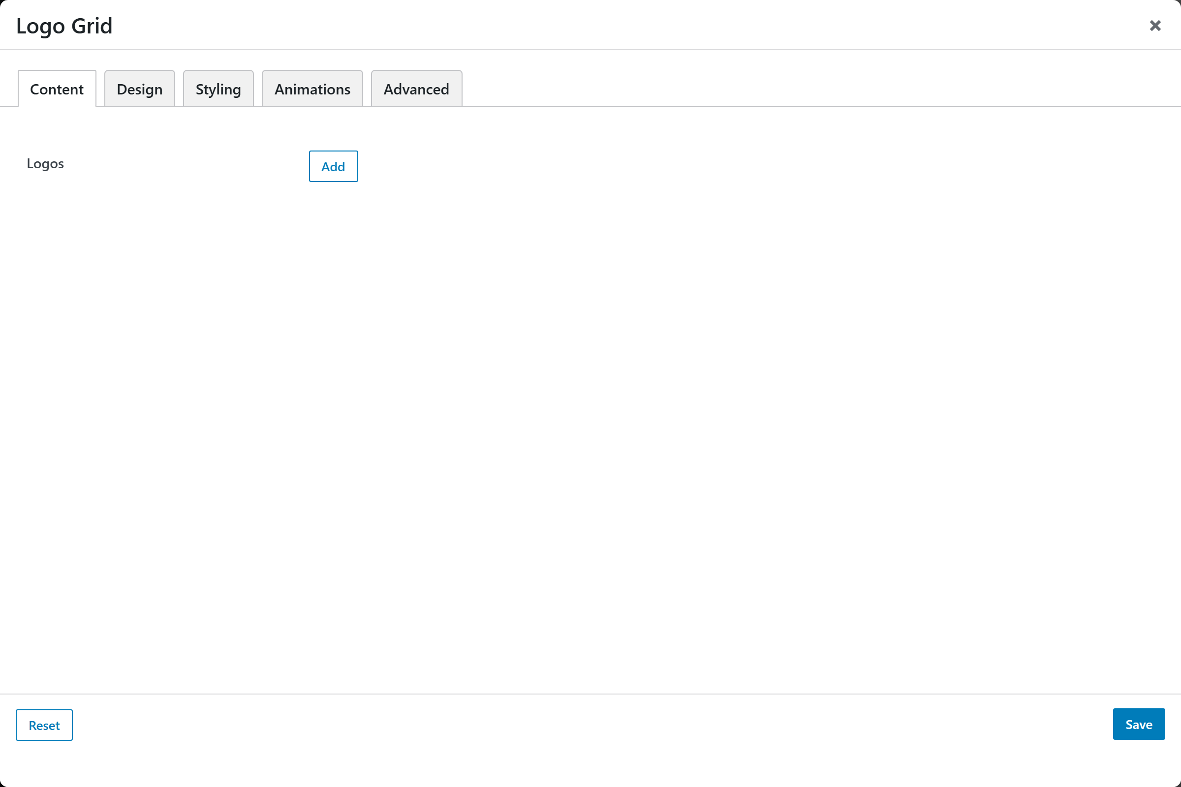
- Logos — a repeatable list of logos. Each entry opens an "Add / Edit Logo" popup with:
- Logo Image — the logo to display.
- Name (alt text) — alt text for the image.
- Link URL — optional URL the logo links to.
- Open in New Tab — open the link in a new tab (
_blank, default Yes) or the same tab (_self).
Design
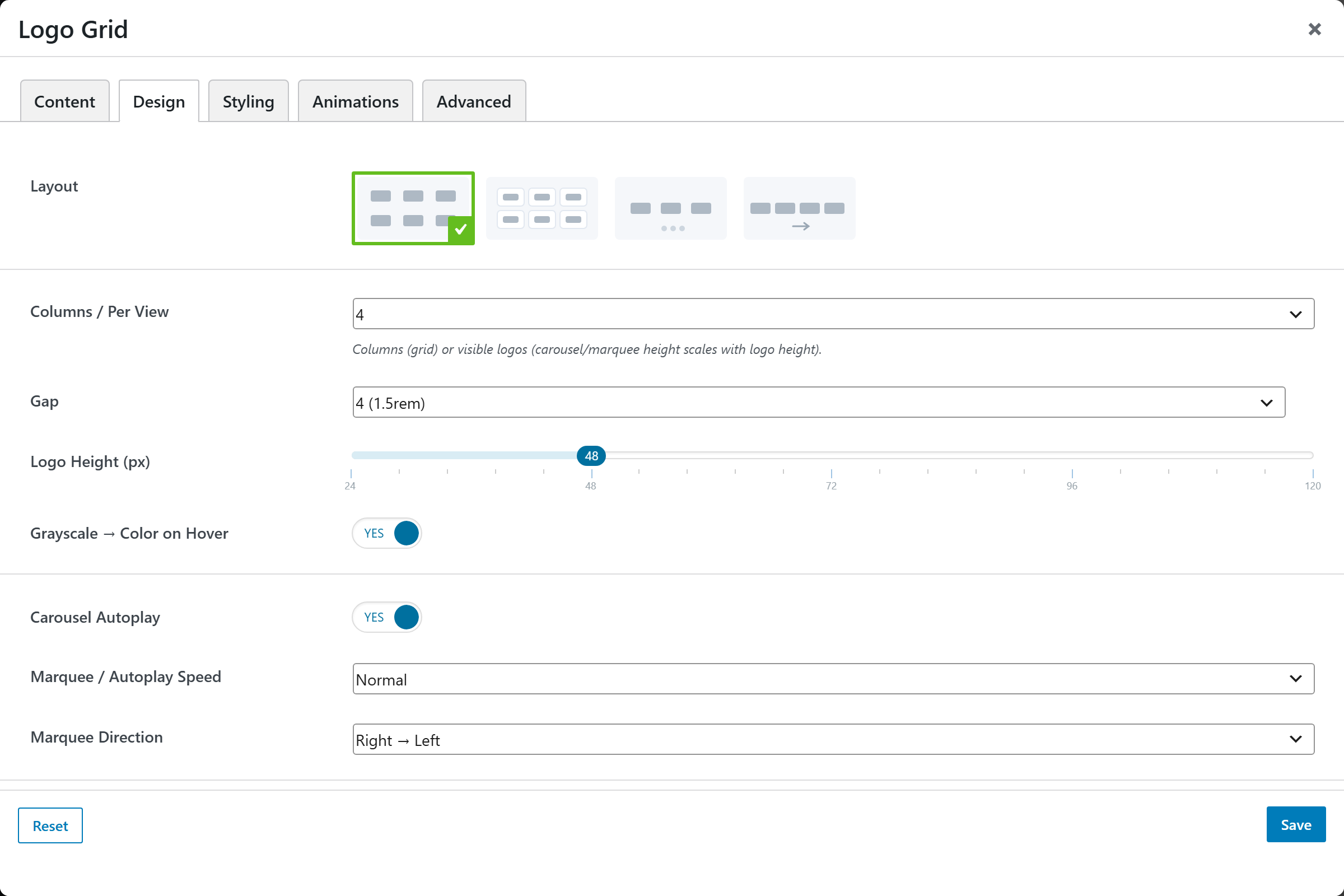
- Layout — an image-picker of layouts (grid, boxed grid, carousel, marquee); defaults to Grid.
- Columns / Per View — columns in a grid, or visible logos in a carousel/marquee: 2, 3, 4 (default), 5, or 6.
- Gap — spacing between logos; defaults to
4. - Logo Height (px) — slider from 24 to 120 px (step 2); defaults to 48.
- Grayscale → Color on Hover — show logos in grayscale, revealing color on hover. Defaults to Yes.
- Carousel Autoplay — auto-advance the carousel. Defaults to Yes.
- Marquee / Autoplay Speed — Slow, Normal (default), or Fast.
- Marquee Direction — Right → Left (default) or Left → Right.
Styling
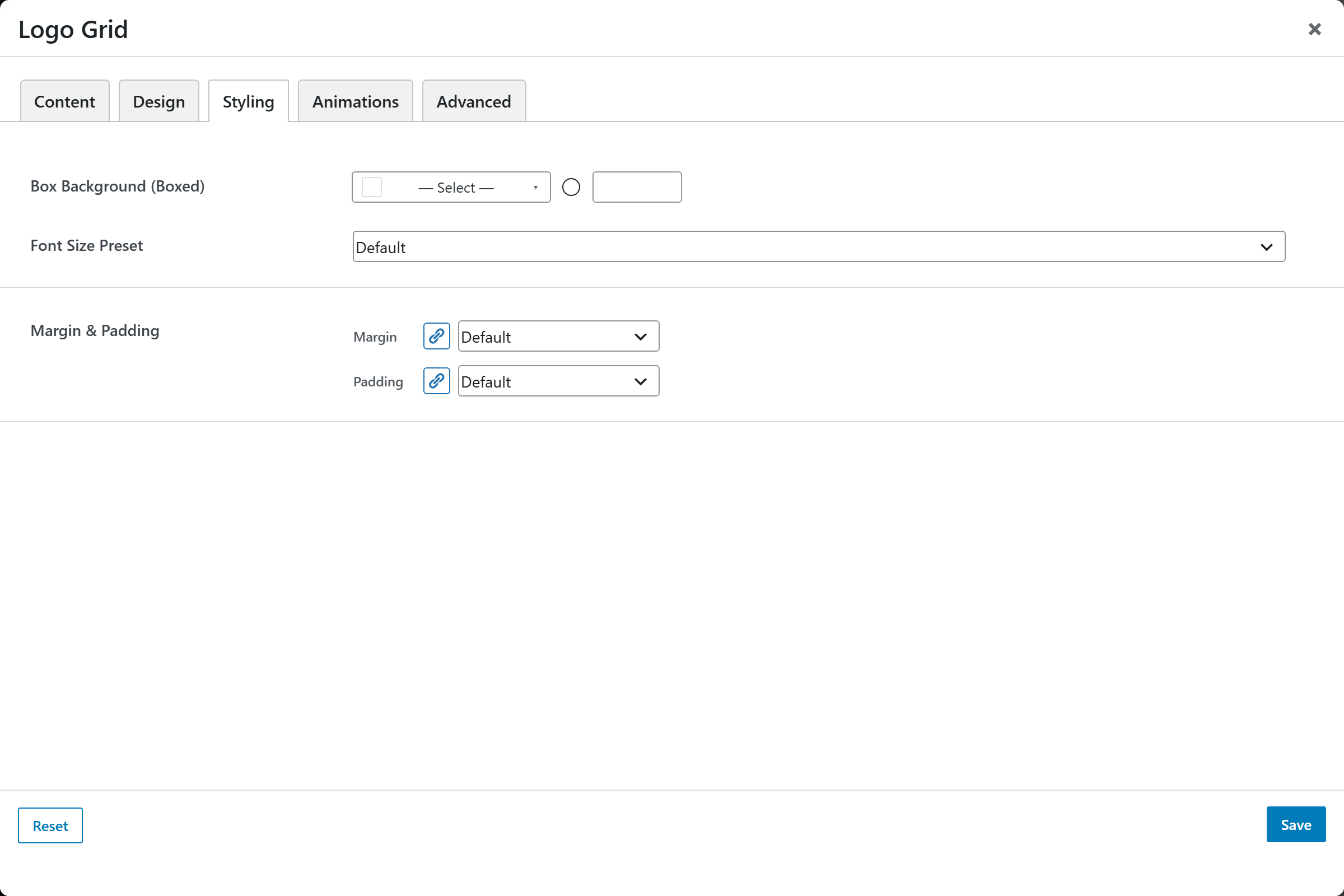
- Box Background (Boxed) — background color of each box in the boxed layout.
- Font Size — text size preset.
- Margin & Padding — spacing around the element.
Animations
Standard entrance-animation controls (effect, duration, delay, offset).
Advanced
Custom CSS class/ID, responsive visibility toggles, custom attributes, and margin/padding.