Image
A standalone image with optional click-through link and explicit width/height sizing. Its options are organized across the Content, Styling, Animations, and Advanced tabs.
Content
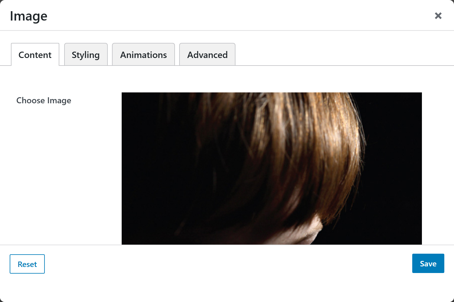
- Choose Image — upload a new image or pick one from the media library. Source of truth is a WordPress attachment, so the alt text comes from the media library (never from the URL). Pick a source larger than the display size below so it stays sharp.
- Width — a unit-input (number + unit; choices
px,%,vw,rem,em; default300px). Applied as inline CSS so any unit previews correctly. When both Width and Height are inpx, the source image is cropped to that exact size server-side viafw_resize, and the px value also becomes the HTMLwidthattribute (reduces layout shift). Non-px units only scale the display. Leave Height empty to keep the aspect ratio. - Height — a unit-input (choices
px,%,vh,rem,em; default200px). Same crop/scale rules as Width. Leave the number blank to let the height follow the width. - Image Link — optional full URL (e.g.
https://example.com/page) that wraps the image in an anchor. Blank renders a plain, non-linking image. - Open Link in New Window — switch (
_blank/_self; default_self). When on, the link opens in a new tab and getsrel="noopener noreferrer". Has no effect unless an Image Link is set.
Styling
- Image Style — a live-preview picker of the reusable Image Style presets (crop ratio, corner radius, shape mask, filter, scrim), managed in Theme Settings → Components → Image Styles.
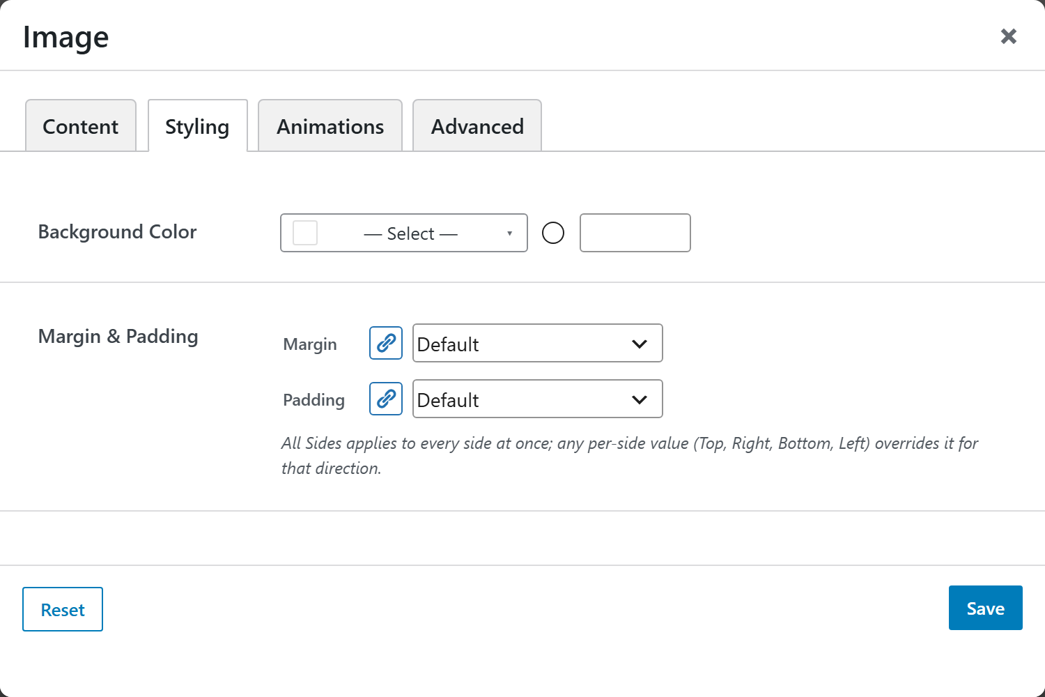
- Background Color — compact color picker (a
bg-*preset or a custom hex) applied to the wrapper. With padding, this renders a colored frame around the image. - Margin & Padding — spacing control. All Sides applies to every side at once; any per-side value (Top, Right, Bottom, Left) overrides it for that direction.
Animations
Standard entrance-animation controls (effect, duration, delay, offset).
Advanced
Custom CSS class/ID, responsive visibility toggles, custom attributes, and margin/padding.