Video Popup
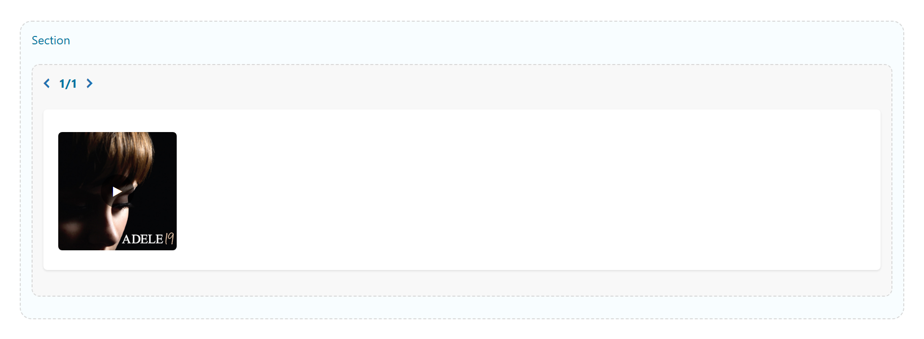
A poster image with a play button that opens a YouTube, Vimeo or self-hosted video in a lightbox. Its options are organized across the Content, Design, Styling, Animations and Advanced tabs.
Content
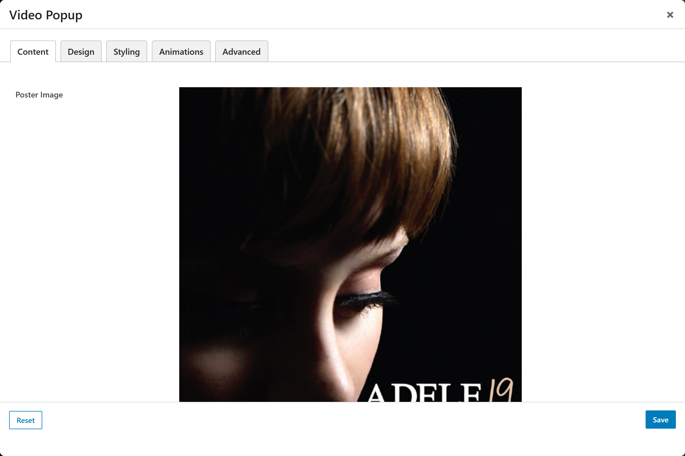
- Poster Image — the image shown before the video plays.
- Video URL — a YouTube or Vimeo page URL, or a direct
.mp4/.webmfile (e.g.https://youtu.be/XXXX,https://vimeo.com/123456,https://site.com/clip.mp4). - Play Label — optional text shown beside the play button (e.g. "Watch the film").
- Caption / Accessible Label — used as the button's screen-reader label. Defaults to "Play video".
Design
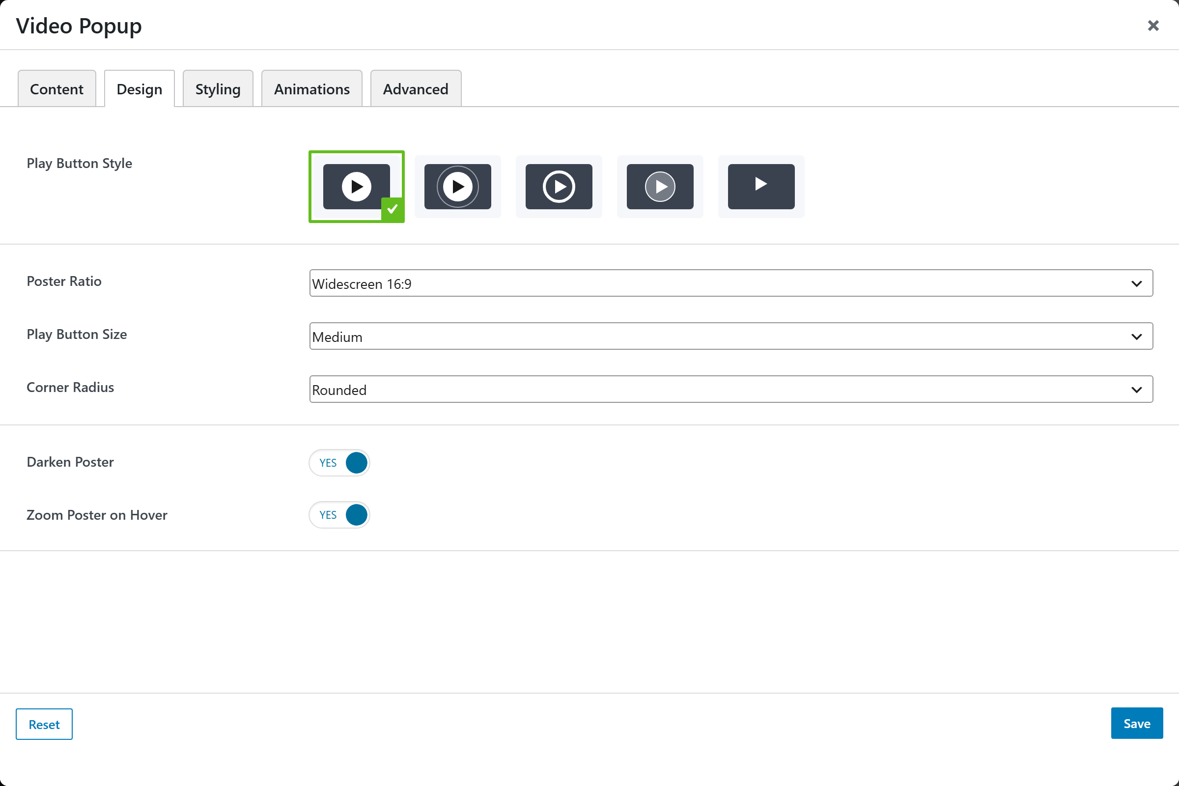
- Play Button Style — an image-picker of play-button presets; defaults to Classic.
- Poster Ratio — crop ratio for the poster: Original (uncropped), Widescreen 16:9 (default), Landscape 4:3, Square 1:1, or Cinematic 21:9.
- Play Button Size — Small, Medium (default), or Large.
- Corner Radius — Square, Rounded (default), or Large.
- Darken Poster — overlays a dark tint on the poster. Defaults to Yes.
- Zoom Poster on Hover — scales the poster up on hover. Defaults to Yes.
Styling
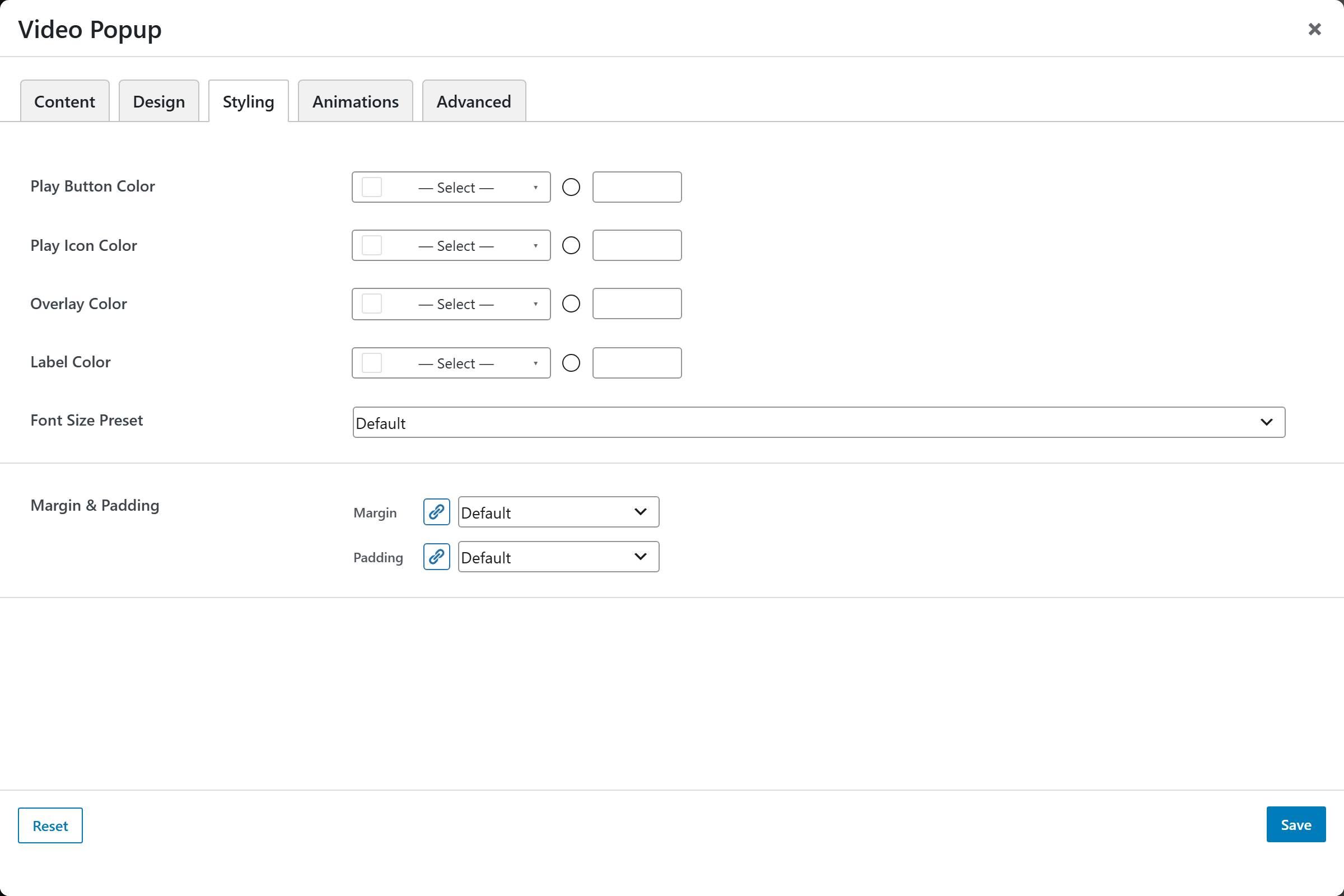
- Play Button Color — background color of the play button.
- Play Icon Color — color of the play icon.
- Overlay Color — color of the darkening overlay.
- Label Color — color of the play label text.
- Font Size — text size preset for the label.
- Margin & Padding — spacing around the element.
Animations
Standard entrance-animation controls (effect, duration, delay, offset).
Advanced
Custom CSS class/ID, responsive visibility toggles, custom attributes, and margin/padding.